Content from Introduction to R and Rstudio
Last updated on 2023-01-24 | Edit this page
Overview
Questions
- How do I use the RStudio IDE?
- What are the basics of R?
- What are the best practices for writing R code?
Objectives
- Understand how to interact with the RStudio IDE
- Demonstrate some R basics: operators, comments, functions, assignment, vectors and types
- Be aware of some good habits for writing R code
Why R?
The R language is one of the most commonly used languages in bioinformatics, and data science more generally. It’s a great choice for you because:
- Reproducibility: Scripting your analysis makes it easier for someone else to repeat and for you to re-use and extend
- Power:
Rcan be used to work with datasets larger than you can in Prism or Excel - Open source: So it’s free!
- Community:
Ris a popular choice for data science, so there are many resources available for learning and debugging - Packages: Since the community is large, many people have written helpful packages that can help you do tasks more easily than if you’d had to start from scratch
The other language most commonly used for data science is python. Some people might even consider it a better choice than R, because it doesn’t have some of the strange quirks that R does, and also has a large community of users (and all of the benefits that come with it).
I use both R and python, and most (but not all) people who do a lot of data science know how to use both. But today we’re learning R because I think it usually what I turn to when someone in the lab asks me for help analysing their data, and I think everyone can learn to use it for those same tasks too.
I made all of the material for this course (including the website and slides) in Rstudio using R. A little bit can take you a long way!
There’s more than one way to skin a cat
This course will teach a particular ‘dialect’ of R called the tidyverse. This is a collection of packages mostly written by Hadley Wickham, that focus on the concept of ‘tidy’ data.
You’ll soon discover that when coding, there are many ways of getting to the same output. Some of them are more efficient than others, and some of them are just easier to code than others. The tidyverse packages are hugely popular in the R community, and when I started I found them easy to work with.
However, if you stick with R long enough, you’ll probably end up needing to learn some additional base R (particularly if you use packages from outside the tidyverse). If you want to get a head start, I’ll include some links to resources at the end of this lesson.
Do I need to do this lesson?
Since we have a variety of skill levels and experiences in this course, every lesson will have a challenge at the start to check if the lesson contains anything new for you. If you can solve it, then you can skip the lesson.
Predict what will happen after every section of the following script (without running it in R).
Also be able to answer the question: what is a comment?
R
# section 1
100 ** 1

# section 2
a <- 4
b <- 3
a + b

# section 3
round(3.1415, digits=2)

# section 4
library(stats)

# section 5
stringr::str_length("what is the output?")

# section 6
as.integer(c(1.96,2.09,3.12))

# section 7
as.numeric(c("one", "two", "three"))
A comment is piece of text where each line starts with a hash (#). These are used to annotate code.
R
# section 1
100 ** 1
OUTPUT
[1] 100100 to the power of 1 is 100
R
# section 2

# assign the value 4 to variable a
a <- 4
# assign the value 3 to variable b
b <- 3
# add the values of a and b
a + b
OUTPUT
[1] 74 + 3 is 7
R
# section 3
round(pi, digits=2)
OUTPUT
[1] 3.14Using the round() function to round \(\pi\) to two decimal places gives the result 3.14
R
# section 4
library(stats)
No output, just loading the stats library.
R
# section 5
stringr::str_length("what is the output?")
OUTPUT
[1] 19You might need the help function for this one - there are 19 characters in the string.
R
# section 6
as.integer(c(1.96,2.09,3.12))
OUTPUT
[1] 1 2 3Coercing a vector of type double to integers truncates numbers to give integers.
R
# section 7
as.numeric(c("one", "two", "three"))
WARNING
Warning: NAs introduced by coercionOUTPUT
[1] NA NA NAThis one is tricky! Trying to coerce a string that isn’t only digits just results in NA values.
Introduction to RStudio
RStudio is an integrated development environment that makes it much easier to work with the R language. It’s free, cross-platform and provides many benefits such as project management and version control integration.
When you open it, you’ll see something like this:
The four main panes are:
- Top left: editor. For editing scripts and other source code
- Bottom left: console. For running code
- Top right: environment. Information about objects you create will appear here
- Bottom right: plots (among other things). Some output (like plots) from the console appears here. Also helpful for browsing files and getting help
Organizing your work into projects
When you work in Rstudio, the program assumes that you’re working in a project. This is a directory that should contain all the files that you’ll need for whatever project you’re currently working.
If you’ve made a fresh install then by default you won’t be in a project. Otherwise, the current project will be the last one you opened.
Let’s make a new project for working in for this course. In the menu bar, click File > New Project, and decide if you’d like to start the new project in a New Directory or an Existing Directory, and then tell Rstudio where you want your project directory to be located.
Using the editor
The editor pane won’t appear in a new project, so open it up by making a new script. In the menu bar, click File > New File > R Script.
Although you can also type commands directly into the console pane (below), keeping your commands together in a script helps organise your analysis.
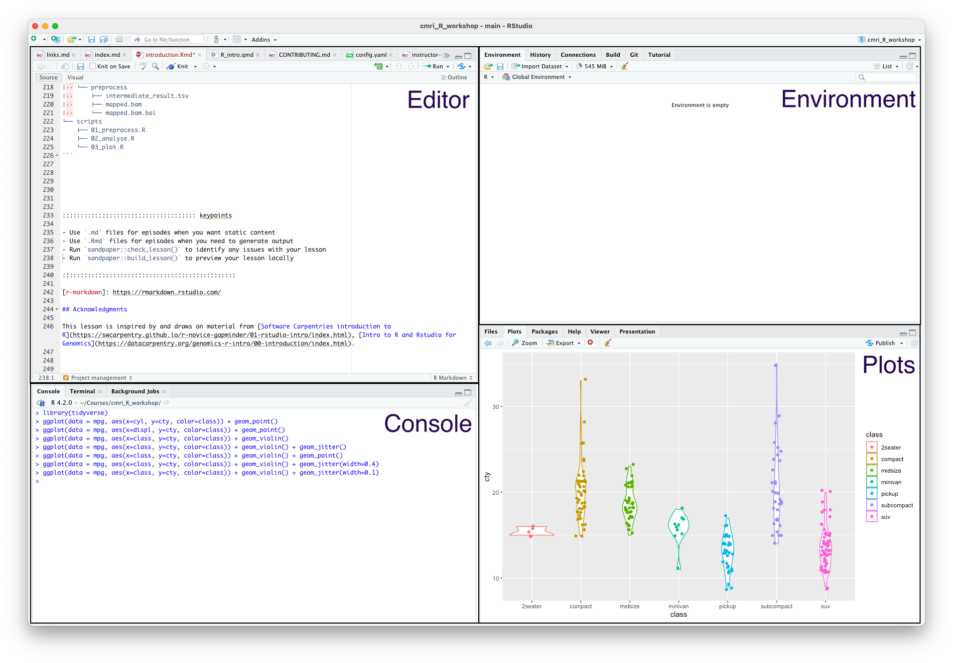
The editor also helps you identify issues with your code by placing a cross where it doesn’t understand something.

Hover over the cross to get more information
Using the console
The console is where you can type in R commands and see their output.
You can type R commands directly in here after the prompt (>). This prompt disappears while the code is running, and re-appears when it is done. To see this, try typing the following line of code into your console:
R
Sys.sleep(5)
The prompt disapers for five seconds, then comes back.
Rather than typing directly into the console, you can ‘send’ a line of code from the editor to the console by pressing Ctrl + Enter.
You can also run the whole script with Ctrl + Shift + Enter.
As a calculator
The most basic way we can use R is as a calculator:
R
1 + 1
OUTPUT
[1] 2If you type an incomplete command, you’ll see a +:
R
1 +OUTPUT
+Finish typing the command to get back to the prompt (>).
The order of operations is as you would expect:
- Parentheses
(,) - Exponents
^or** - Multiply
* - Divide
/ - Add
+ - Subtract
- - Modulus
%%
R
3 / (3 + 6)
OUTPUT
[1] 0.3333333You can also use R for logical expressions, like:
R
3 > 5
OUTPUT
[1] FALSEThe logical operators you’ll most likely use are
- Equal
== - Less than
< - Less than or equal to
<= - Greater than
> - Greater than or equal to
>=
You can also combine multiple logical statements, for example,
R
(3 > 5) | (4 < 5)
OUTPUT
[1] TRUEFor this, we use the operators:
- Logical or
| - Logical and
&
Writing R code
Next, we’ll look at some of the building blocks of R code. You can use these to write scripts, or type them directly into the console.
When performing data analysis, it’s best to record the steps you took by writing a script, which can be re-run if you need to reproduce or update your work.
Comments
The first building block is actually lines that are ignored by R: comments. Anything that comes after a # character won’t be executed. Use this to annotate your code.
R
# this is a comment
1 + 2 # this is also a comment
OUTPUT
[1] 3R
# the line below won't be executed
1 + 1
OUTPUT
[1] 2Comments is very important!!! A key part of reproducibility is knowing what code does. Make it easier for others and your future self by adding lots of comments to your code.
Assignment
If you want R to remember something, you can assign it to a variable:
R
my_var <- 1+1
print(my_var)
OUTPUT
[1] 2R
a <- 3
b <- 2
c <- (a * b) / b + 1
print(c)
OUTPUT
[1] 4Functions
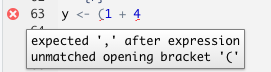
A function is just something that takes zero or more inputs, does something with it, and gives you back zero or more outputs.
R comes with many useful functions that you can use in your code. A function is always called with parentheses ().
For example, the getwd() function takes no inputs, and returns the current working directory.
R
# a function that takes no inputs
getwd()
Base R also has many mathematical and statistical functions:
R
# natural logarithm
log(1)
OUTPUT
[1] 0R
# rounding
round(0.555555, digits=3)
OUTPUT
[1] 0.556R
# statistical analysis
sample1 <- c(1, 2.5, 3, 1, 1.3, 4.6)
sample2 <- c(1000, 1001, 3000, 5000, 2022, 4000)
t.test(sample1, sample2)
OUTPUT
	Welch Two Sample t-test

data:  sample1 and sample2
t = -4.0073, df = 5, p-value = 0.01025
alternative hypothesis: true difference in means is not equal to 0
95 percent confidence interval:
 -4379.9127  -956.6206
sample estimates:
  mean of x   mean of y
   2.233333 2670.500000
You don’t need to memorize all these functions: Google is your friend.
RStudio can also help you with function usage. If you know what the name of a function is but can’t remember how to use it, you can type ? before the function name in the console to get help on that function.
R
?sin
If you don’t know what the name of a function is, you can type ?? before a key word to search the documentation for that key word.
R
??trig
Named arguments
Function arguments can be named implicitly or explicitly. When calling a function, explicitly named arguments are matched first, then any other arguments are matched in order.
For example, the documentation for the round function gives its signature: round(x, digits = 0).
The following function calls are all equivalent:
R
round(1/3, 3)
round(1/3, digits=3)
round(x=1/3, digits=3)
round(digits=3, x=1/3)
However, the last is not best practice: reversing the order of the arguments will likely be confusing for someone else reading your code.
In general, try to match the documentation when you call a function.
Which of the calls above matches the documentation for round()?
You can also write your own functions:
R
# function to add two numbers
my_add <- function(num1, num2) {
  return(num1 + num2)
}
my_add(1,1)
OUTPUT
[1] 2R
?rnorm
R
rnorm(5, mean=1, sd=2)
OUTPUT
[1] -1.2508197 0.8529519 1.4416727 1.2751230 0.2460887Nested function calls
You can also nest function calls inside each other, for example:
R
mean(c(1,2,3))
OUTPUT
[1] 2This is equivalent to:
R
nums <- c(1,2,3)
mean(nums)
OUTPUT
[1] 2R
t.test( c(1, 2.5, 3, 1, 1.3, 4.6),
       c(1000, 1001, 3000, 5000, 2022, 4000)
)
OUTPUT
	Welch Two Sample t-test

data:  c(1, 2.5, 3, 1, 1.3, 4.6) and c(1000, 1001, 3000, 5000, 2022, 4000)
t = -4.0073, df = 5, p-value = 0.01025
alternative hypothesis: true difference in means is not equal to 0
95 percent confidence interval:
 -4379.9127  -956.6206
sample estimates:
  mean of x   mean of y
   2.233333 2670.500000
Notice that we can spread one ‘line’ of code over multiple lines of text. This can help with readability, by visually separating the two samples we’re comparing.
Using libraries
One of the great things about R is that a lot of other people use it, so often somebody has worked out an efficient way of doing things that you can use. This way, you don’t have to build your code from the ground up; instead you can use functions that other people have written.
When you use other peoples’ functions, they will be packaged in to libraries (also called packages) that you can import. In order to use library, it first must be installed. R provides the function install.packages() which you can use to install libraries from CRAN (an online repository of libraries).
R
install.packages("library_name")
Note the use of quotation marks around the library name - this tells R that this is a string, rather than a variable (more on strings in the next section).
R
install.packages("tidyverse")
Package-ception
Most of the packages that you’ll use will come from CRAN, but you might come across other sources of packages that are also useful. These are usually installed by packages that you can get from CRAN.
For example, the Bioconductor suite consists of packages that are useful for bioinformatics. To install any Bioconductor libraries, you’ll first need to install the BiocManager package from CRAN, and then use functions from this library to install Bioconductor packages.
R
# install BiocManager package
install.packages("BiocManager")

# use the install function from BiocManager to install the GenomicFeatures and karyoploteR libraries
BiocManager::install(c("GenomicFeatures", "karyoploteR"))
Another place you might install packages from is github. Many developers host their code for their package on github, and then release it to CRAN when they think it’s ready.
If you want to use the development version of a package (for example if you want to use a feature that hasn’t been released yet), you can get it directly from github using the devtools package. Be careful when you do this - you’ll get all the shiny newest features, but you might also run into new bugs that haven’t been fixed yet!
For example, if you want to install the development version of readr from github:
R
# install the devtools package
install.packages("devtools")

# use the install function from devtools to install readr
devtools::install_github("tidyverse/readr")
By default, the only functions that when you start up R are the base R functions. If you want to use any functions from libraries that you’ve installed, you’ll need to tell R which library they come from.
One way to do this is is to use the :: syntax: packagename::functionname(). For example, we can use the str_length() function from the stringr package as follows
R
stringr::str_length("testing")
OUTPUT
[1] 7R
str_length("testing")
ERROR
Error in str_length("testing"): could not find function "str_length"We get an error because R doesn’t know what the str_length() function is by default.
The other way to use functions from a library is to import all the functions in the library using the library() function. It’s best practice to put all the library() calls together at the top of your code, rather than sprinkling them throughout.
R
# import whole library
library(stringr)

# use the str_length function without ::
str_length("testing")
OUTPUT
[1] 7You can still use the packagename::functionname() syntax even if you’ve loaded the library. This makes it clear which library the function comes from, and some style guides recommend that you do this for every function you use.
Function conflicts
The order you load your packages is important. If two functions from two different packages you’ve loaded have the same name, the one you loaded last will be used. Sometimes packages will warn you about this - for example, when you load the tidyverse package (which is actually a collection of packages), you’ll see something like this.
R
library(tidyverse)
OUTPUT
── Attaching packages ─────────────────────────────────────── tidyverse 1.3.2 ──
✔ ggplot2 3.4.0      ✔ purrr   1.0.1
✔ tibble  3.1.8      ✔ dplyr   1.0.10
✔ tidyr   1.2.1      ✔ forcats 0.5.2
✔ readr   2.1.3
── Conflicts ────────────────────────────────────────── tidyverse_conflicts() ──
✖ dplyr::filter() masks stats::filter()
✖ dplyr::lag()    masks stats::lag()
This tells us that the filter() function from dplyr has overwritten (or ‘masked’) the filter() function from the stats package, and there is a similar conflict for lag().
You can still use stats::filter() in your code, but you must explicitly specify that you want to use thestats package by prefixing it with stats::. If you just use filter(), you’ll get the version from dplyr.
Not all packages warn you about conflicts, so be careful you’re using the function that you think you’re using! This can be a source of strange errors, so try adding packagename:: in front of your function calls if you this this might be happening.
There’s no wrong or right answers here, but you might come across people that have (strong) opinions in this area.
Usually, if I’m only using one or two functions from a library, I won’t import the whole library, but just use the packagename::functionname() syntax. If I’m going to be using a lot of functions from a library, I’ll use library().
Some people consider it best practice to always use packagename::functionname(), since then it’s clear which packages are being used and where. This also helps avoid conflicts between functions with the same name in different packages.
However, this style is quite verbose (and a little distracting), and some people might say that this makes code written this way less readable. In practice, I haven’t come across much code that always uses explicit package names.
Vectors
One of the most common data structures R is the vector. These are collections of elements (technically called ‘atomic vectors’) like numbers, which are arranged in a particular order.
Vectors are often created with the concatenation function c():
R
# create a vector of three numbers
a_vector <- c(1,2,3)

# order matters!
a_different_vector <- c(2,1,3)
In R, vectors contain data of only one type. Some of the types you might see are:
- Double: real numbers which can take on any value (like 1.13, 6, -1004.29)
- Integer: whole real numbers (like 1, 2, -1)
- Character: strings of characters, enclosed in either single or double quotes
- Logical: booleans, either
TRUEorFALSE
R
# we can use the seq function to create vectors with numbers in them
double_vec <- seq(1, 10)

# add 'L' to the end of a number to tell R that it's an integer
integer_vec <- seq(1L, 10L)

# strings can be enclosed in single or double quotes
character_vec <- c("this", 'is', "a", 'vector')

# logicals are either TRUE or FALSE
logical_vec <- c(TRUE, FALSE)
You can get at the individual elements of a vector using brackets ([):
R
# first element of double_vec
double_vec[1]

# third to fifth elements of integer_vec
integer_vec[3:5]

#first and fourth elements of character_vec
character_vec[c(1,4)]
Declaring types
In some programming languages, like C and java, the programmer must declare the type of a variable when it’s created. In these statically typed languages, a variable declared as an integer can’t store any other types of data. As a dynamically typed language, R takes a looser approach to variable types.
If you try to create a vector that contains more than one type of element, all the elements will be transformed into the ‘lowest common denominator’ type. For example, concatenating an integer and double will result in a double vector.
R
# concatenating a double and an integer
numeric_vec <- c(5.8, 10L)

# the typeof function tells you the type of a variable
typeof(numeric_vec)
OUTPUT
[1] "double"One way to think about this is that elements are always coerced into the type that results in the least amount of information loss. The integers are a subset of all real numbers, so we can easily represent an integer 10L as the numeric 10. But if we tried to convert the real number 5.8 to an integer, how do we deal with the .8 part?
R
unknown_type <- c(1L, 1, "one")
print(unknown_type)
OUTPUT
[1] "1" "1" "one"R
typeof(unknown_type)
OUTPUT
[1] "character"It’s a character vector.
Character vectors can be used to represent numbers, but numbers can’t easily be used to represent characters.
R also has a way of representing missing data: there’s a special value in every type called NA (not available).
R
vec <- c(1, 3, NA)
Having NA values can change the way that functions interact with your data. For example, how would you take the mean of three values: 1, 2, and NA?
R
nums <- c(1, 2, NA)
mean(nums)
OUTPUT
[1] NAR doesn’t know how to do this, so it just returns NA.
R
mean(nums, na.rm=TRUE)
OUTPUT
[1] 1.5Use the additional named argument na.rm=TRUE
Best practices
Now you know the basics of R, there are a few best practices that you should follow on your journey. These aren’t hard and fast rules, but principles that you should aim to follow to make your code better and more reproducible.
Formatting and readability matters
You should always be able to come back to your code after a long break (months, years) and easily understand what it does.
One thing that helps with this is to follow a style guide like this one for the tidyverse
This covers things like:
- Commenting: do this a lot! It’s better to have more comments than fewer
- Each script should start with a description of what it does or what it’s for
- When you have to name something, use a name that makes sense. You’re more likely to understand what is contained in variable
my_peptidethan you are if it was calledporxorowobljldfibllkmb - Syntax and spacing: use spaces and newlines to make your code more readable, not less
- Line length: try to make horizontal scrolling unnecessary, which usually means lines are less than 80 characters
Don’t copy/paste code
In general, try to avoid copy-pasting blocks of code.
If you find you need to make a change to that code, you’ll need to edit all the copies. If you do this, it’s easy to miss somewhere that you copied it, or make a mistake when you change it.
If you find yourself needing to do the same task many times, it’s usually better to write a function instead.
Fail fast
This is a concept from the world of start-ups, in which it refers to the practice of trying things out at an early stage.
If it works already, great, but if it doesn’t, then you can move on more quickly to something that might work better.

Test your expectations
Try to frequently test your code to see that it does what you expect it to do. Getting into this habit helps guard against bugs.
There are lots of different ways to do this, from just trying out the code with a few different inputs to automated unit testing
Don’t forget also to test that your code doesn’t do things that you don’t expect it to do as well!
R
# define a function
plus_three <- function(num) {
  return( num + 3 )
}

# should return 11
plus_three(8)

# should return 2
plus_three(-1)

# should raise an error
plus_three("ten")
You can use the function stopifnot to help you check things automatically.
Project management
Aim to keep your data, scripts and output organized. RStudio helps you with this with Projects, which can be used to store all of the files related to a particular piece of analysis. People write whole papers about this, but here are a few suggestions:
- Treat raw data and metadata as read-only. Put it in a folder called
dataand don’t write anything to that folder except for more raw data - Put source code in a folder called
src - Put files generated during analysis in a folder called
outorresults. It shouldn’t matter if this folder gets deleted, since you should be able to re-create its contents using your data and scripts - A
READMEfile can be useful for a broad overview of the project, and for explaining how to run the analysis - Keep track of the packages required for your analysis using
renv(forRprojects only), orconda(more general but has a few gotchas forRpackages)
That is, an organized project might look something like this:
my_great_project
├── README.md
├── data
│   ├── dataset_1
│   │   ├── dataset_1.R1.fq.gz
│   │   └── dataset_1.R2.fq.gz
│   ├── dataset_2
│   │   ├── dataset_2_1.R1.fq.gz
│   │   ├── dataset_2_1.R2.fq.gz
│   │   ├── dataset_2_2.R1.fq.gz
│   │   └── dataset_2_2.R2.fq.gz
│   └── metadata
│       ├── metadata_1.tsv
│       └── metadata_2.tsv
├── renv
│   └── activate.R
├── results
│   ├── analyse
│   │   └── fold_change.tsv
│   ├── plot
│   │   ├── phylogeny.pdf
│   │   └── taxa.pdf
│   └── preprocess
│       ├── intermediate_result.tsv
│       ├── mapped.bam
│       └── mapped.bam.bai
└── scripts
    ├── 01_preprocess.R
    ├── 02_analyse.R
    └── 03_plot.R
Links and acknowledgements
As you begin your journey with R, you might find it helpful to refer to one-page summaries (or ‘cheat sheets’) that other people have compiled. For example, there are cheat sheets for:
Here are some other useful links
- R for data science
- fasteR, a course teaching (mainly) base R
- Ten Simple Rules for Reproducible Computational Research
- More information about installing R packages
This lesson is inspired by and draws on some material from Software Carpentries introduction to R, Intro to R and Rstudio for Genomics.
Keypoints
- Use RStudio for writing and executing
Rcode - Add comments to your code by starting a line with
# - Assign values to variables using the assignment operator
<- - Functions covert inputs to outputs
- Vectors are a collection of values of the same type
- Following best practices will help the with the correctness and readability of your
Rcode
Content from Reading in data
Last updated on 2023-01-24 | Edit this page
Overview
Questions
- How can we get data into
R?
Objectives
- Understand the advantages of tidy data
- Use
readxlto import data from Microsoft Excel - Use
readrto import data from text files
Do I need to do this lesson?
If you’ve already used readr and readxl and here, you’ll probably already know the material covered in this section. If you can complete the following excercises, you can skip this lesson.
Codon table
Load in the data in human_codon_table.xlsx (the column names are codon, frequency and count).
Make sure to specify the column types and names. Make use of here::here() to generate the file path relative to the project root.
Weather data
Load the data in the two files weather_brisbane.csv and weather_sydney.csv into one data frame, creating a column called ‘file’ that contains the file from which each row originated.
Make sure to specify the column types and names. Make use of here::here() to generate the file path relative to the project root.
Loading the file human_codon_table.xlsx:
R
# this might be different depending on where you saved the data
cdn_path <- here::here("episodes", "data", "human_codon_table.xlsx")

df <- readxl::read_xlsx(cdn_path,
                        col_names=c("codon", "frequency", "count"),
                        col_types = c('text', "numeric", "numeric"))

glimpse(df)
ERROR
Error in glimpse(df): could not find function "glimpse"And the weather data:
R
library(readr)

wthr_path <- here::here("episodes", "data", c("weather_brisbane.csv", "weather_sydney.csv"))

# column types
col_types <- list(
  date = col_date(format="%Y-%m-%d"),
  min_temp_c = col_double(),
  max_temp_c = col_double(),
  rainfall_mm = col_double(),
  evaporation_mm = col_double(),
  sunshine_hours = col_double(),
  dir_max_wind_gust = col_character(),
  speed_max_wind_gust_kph = col_double(),
  time_max_wind_gust = col_time(),
  temp_9am_c = col_double(),
  rel_humid_9am_pc = col_integer(),
  cloud_amount_9am_oktas = col_double(),
  wind_direction_9am = col_character(),
  wind_speed_9am_kph = col_double(),
  MSL_pressure_9am_hPa = col_double(),
  temp_3pm_c = col_double(),
  rel_humid_3pm_pc = col_double(),
  cloud_amount_3pm_oktas = col_double(),
  wind_direction_3pm = col_character(),
  wind_speed_3pm_kph = col_double(),
  MSL_pressure_3pm_hPa = col_double()
)

# read in data
weather <- read_csv(wthr_path, skip=10,
                           col_types=col_types, col_names = names(col_types))

glimpse(weather)
ERROR
Error in glimpse(weather): could not find function "glimpse"Reading in data
So you want to make some awesome plots using R. The first step you’ll need to take is to import your data.
When I first learnt R in a first-year statistics course, the way we did this was:
- Open an Excel spreadsheet with the data
- Select the data to be imported
- Copy to the clipboard (Cmd + c)
- Open an R terminal
- Enter the command
read.table(pipe("pbpaste"), header = TRUE)
This is a pretty convoluted way to do things! This weird process was part of the reason that, after I finished the course, I didn’t touch R again for almost ten years.
Luckily, in the meantime people worked out better ways of doing things. This lesson will cover two awesome packages which can help you import your data: readxl for Excel files, and readr for text files.
Reading in data from Excel: readxl
If you’ve entered data into a digital format, chances are that you’ve used spreadsheet software like Microsoft Excel. Excel makes data entry easy because it takes care of all of the formatting for you. But at some point, you’ll probably want to get your data out of Excel and into R. That’s where the readxl package comes in!
The workhorse of this package is the read_xlsx() function (or read_xls() for older excel files). It takes as input a path to the file you want to read.
R
# define path to excel file to read - this will probably be different for you
my_excel_sheet <- here::here("episodes", "data", "readxl_example_1.xlsx")

# read in data
my_excel_data <- readxl::read_xlsx(my_excel_sheet)
my_excel_data
OUTPUT
# A tibble: 3 × 3
  word           count number
  <chr>          <chr>  <dbl>
1 prematurely    one        4
2 airconditioned two        5
3 supermarket    three      6
File paths with here::here()
Note that I use a function called here to create the file path to the excel file. You can read more about this function here.
Using this function helps with cross-platform compatibility (so it works on Windows as well as MacOSX and Linux). This is because directories on Windows are usually separated with a backslash \, whereas on Unix-based distributions (like MacOS and Linux) directories are separated by a slash /.
You can check what the file path looks like on your platform by printing out the variable we defined with the file path:
R
my_excel_sheet
OUTPUT
[1] "/home/runner/work/cmri_R_workshop/cmri_R_workshop/episodes/data/readxl_example_1.xlsx"Using here::here() always generates paths relative to the project root (the file created by RStudio when you make a new project, which has the file extension .Rproj). If you move the project around on your filesystem (or send it to someone else), the import will still work. This wouldn’t be the case if you manually specified the absolute path to the file.
Note that this example file path is a little convoluted, because of the way the lessons are created. Yours should be more straightforward and look more like this:
R
my_excel_sheet <- here::here("data", "readxl_example_1.xlsx")
Tibbles
Coming back to the output of the call to readxl::read_xlsx() - calls to this function return a tibble object with the data contained in the excel spreadsheet.
The tibble object is a convenient way of storing rectangular data, where column has a type, (which is shown when you print the table). Ideally, in a tibble each column should contain data from one variable, and each row consists of observations of each variables - this is known as ‘tidy data’ (more on this in the next lesson).
If you don’t specify the types (like character, integer, double) of each column, readxl will try to guess them based on the types in the excel spreadsheet. This can lead to unexpected behaviour, especially if you mix numbers and strings in the same columns.
Check the documentation to read more about how to specify column types in readxl.
R
# read in data
data <- readxl::read_xlsx(here::here("episodes", "data", "readxl_example_2.xlsx"))
head(data)
OUTPUT
# A tibble: 3 × 5
  replicate `drug concentration` `assay 1` `assay 2` `assay 3`
      <dbl> <chr>                <chr>     <chr>     <lgl>
1         1 10 uM                ++        1         TRUE
2         2 20 uM                +++       medium    FALSE
3         2 20 uM                +         high      FALSE
Note that:
- The ‘replicate’ column has a type of
dbleven though it contains only integers. - The ‘drug concentration’ column is of type
chrbecause R doesn’t know that ‘uM’ is a unit. - Mixing numbers and characters in the ‘assay 2’ column results in a column of characters (why do you think this is?)
The type of the columns is important to be aware of because some functions in R expect that you feed them columns of a particular type. For example, we can extract the ‘drug concentration’ column from the second file we imported using the $ operator.
R
conc <- data$`drug concentration`
conc
OUTPUT
[1] "10 uM" "20 uM" "20 uM"We can then extract the first two characters of each string in this column using stringr::str_sub():
R
nums <- stringr::str_sub(conc, 1, 2)
But we can’t add one to this column:
R
conc + 1
ERROR
Error in conc + 1: non-numeric argument to binary operatorSpecifying column types
Since the guessing of types can result in unexpected behaviour, it’s best to always specify the types of data when you import it. You can do this in a verbose way:
R
data <- readxl::read_xlsx(here::here("episodes", "data", "readxl_example_2.xlsx"),
                           col_types = c("numeric", "text", "text", "text", "numeric"))
WARNING
Warning: Coercing boolean to numeric in E2 / R2C5WARNING
Warning: Coercing boolean to numeric in E3 / R3C5WARNING
Warning: Coercing boolean to numeric in E4 / R4C5R
data
OUTPUT
# A tibble: 3 × 5
  replicate `drug concentration` `assay 1` `assay 2` `assay 3`
      <dbl> <chr>                <chr>     <chr>         <dbl>
1         1 10 uM                ++        1                 1
2         2 20 uM                +++       medium            0
3         2 20 uM                +         high              0
Note that the last column (‘assay 3’) contains Boolean (TRUE/FALSE) values, but we coerced it to a numeric type when we imported it. R prints a warning to let us know.
Other options
readxl::read_xlsx() also has lots of other options to deal with other aspects of data imports - for example, you can:
- Use the
sheetandrangenamed arguments to specify which parts of the sheet to import - Skip a number of header rows using the
skipoption, - Provide a vector of your own column names using the
col_namesargument - Pass
col_names=FALSEto avoid using the first line of the file as your column names if your data doesn’t have column names
Challenge 2: readxl
Open the file human_codon_table.xlsx in Excel. The columns of this table contain codons, frequencies of observations of each codon, and counts of each codon.
How do you think it should be imported?
Import this data, including the col_names, col_types, sheet and range named arguments.
R
readxl::read_xlsx(here::here("episodes", "data", "human_codon_table.xlsx"),
                  col_names = c("codon", "frequency", "count"),
                  col_types = c('text', 'numeric', 'numeric'),
                  sheet = 'human_codon_table',
                  range = 'A2:C65' )
OUTPUT
# A tibble: 64 × 3
   codon frequency  count
   <chr>     <dbl>  <dbl>
 1 UCU        15.2 618711
 2 UAU        12.2 495699
 3 UGU        10.6 430311
 4 UUC        20.3 824692
 5 UCC        17.7 718892
 6 UAC        15.3 622407
 7 UGC        12.6 513028
 8 UUA         7.7 311881
 9 UCA        12.2 496448
10 UAA         1    40285
# … with 54 more rows
Reading in data from text files: readr
Alternatively, you might have tabular data in a text file. In these kinds of files, each row of the file is a row of the table, and usually either tabs or commas separate the values in each column.
If you have comma-separated data (like a .csv file) the readr::read_csv() function will be most convenient, and if your data is tab-separated (like a .tsv file), you’ll want readr::read_tsv(). If you have a different delimiter, you can use readr::read_delim(file, delim=delimiter), where delimiter is a string containing your delimiter.
The syntax is very similar to read_xlsx(), and you should specify the column types here as well. Here I use the short form of the column specification - ‘c’ for character and ‘i’ for integer.
R
data <- readr::read_csv(here::here("episodes", "data", "readr_example_1.csv"),
                           col_types = c("cci"))
data
OUTPUT
# A tibble: 3 × 3
  word           count number
  <chr>          <chr>  <int>
1 prematurely    one        4
2 airconditioned two        5
3 supermarket    three      6
You can read more about the column specification for readr functions here.
The other options for read_csv() are also similar to those for read_xslx, including col_names and skip.
Reading multiple files
If you have multiple files with the same columns and column types, you can pass a vector of file paths rather than an atomic vector. To add an extra column with the file name (so you know which rows came from which files), use the id parameter.
R
files <- c(here::here("episodes", "data", "sim_0_counts.txt"),
           here::here("episodes", "data", "sim_1_counts.txt"))

data <- readr::read_tsv(files, col_types = 'cci', id="file")

head(data)
OUTPUT
# A tibble: 6 × 4
  file                                                         test0 test1 count
  <chr>                                                        <chr> <chr> <int>
1 /home/runner/work/cmri_R_workshop/cmri_R_workshop/episodes/… test… PRR       2
2 /home/runner/work/cmri_R_workshop/cmri_R_workshop/episodes/… test… AVSM      1
3 /home/runner/work/cmri_R_workshop/cmri_R_workshop/episodes/… test… IGLF      1
4 /home/runner/work/cmri_R_workshop/cmri_R_workshop/episodes/… test… no_i…  1039
5 /home/runner/work/cmri_R_workshop/cmri_R_workshop/episodes/… test… R        82
6 /home/runner/work/cmri_R_workshop/cmri_R_workshop/episodes/… test… DI        3
Resources
Content from Tidy data
Last updated on 2023-01-24 | Edit this page
Overview
Questions
- What is tidy data?
- How can we pivot data frames to make them tidy?
Objectives
- Understand the principles of tidy data
- Use
pivot_longer()andpivot_wider()to create longer or wider data frames
Check Challenge 1 for the solution!
Tidy data
When recording observations, we don’t often give that much thought to how we record the data. Usually we enter data into an excel spreadsheet and care most about entering the data in the easiest way. However, this often results in ‘messy’ data that requires a little bit of massaging before analysis.
There are many possible ways to structure a dataset. For example, if we conducted an experiment where we made two sequencing libraries, in which we have counted the instances of six different barcodes, we could structure the data like this:
OUTPUT
# A tibble: 2 × 7
  library    b1    b2    b3    b4    b5    b6
  <chr>   <int> <int> <int> <int> <int> <int>
1 lib1      384   796   109   404   106   812
2 lib2      102   437   391   782   101   789
In this table, the counts for each barcode are stored in a separate column. The ‘library’ column tells us which library the counts on each row are from.
Conversely, we could keep the counts for each library in a separate column, and the rows can tell us which barcode is being counted:
OUTPUT
# A tibble: 6 × 3
  barcode  lib1  lib2
  <chr>   <int> <int>
1 b1        384   102
2 b2        796   437
3 b3        109   391
4 b4        404   782
5 b5        106   101
6 b6        812   789
We could even structure the table like this:
OUTPUT
# A tibble: 2 × 13
  library `384` `796` `109` `404` `106` `812` `102` `437` `391` `782` `101`
  <chr>   <chr> <chr> <chr> <chr> <chr> <chr> <chr> <chr> <chr> <chr> <chr>
1 lib1    b1    b2    b3    b4    b5    b6    <NA>  <NA>  <NA>  <NA>  <NA>
2 lib2    <NA>  <NA>  <NA>  <NA>  <NA>  <NA>  b1    b2    b3    b4    b5
# … with 1 more variable: `789` <chr>
This is one of the least intuitive ways to structure the data - the columns are the counts (except for the library column), and the rows tell us which barcode had which count.
These are all examples of messy ways to structure the data. There are usually very many ways to make the data messy, but only one ‘Tidy’ format. Being tidy means a dataset has:
- Each variable forms a column.
- Each observation forms a row.
- Each type of observational unit forms a table.
Here, variables record all the values that measure the same attribute (for example library, sample, count), and an observation contains all the measurements on a single unit (like a sequencing run, or a single experiment). Each observational unit (like independent experiments with different variables) should get its own table. This just means that if we ran another experiment with different variables, it should go in a different table.
In our this case, the tidy version looks like this:
R
table1
OUTPUT
# A tibble: 12 × 3
   library barcode count
   <chr>   <chr>   <int>
 1 lib1    b1        384
 2 lib1    b2        796
 3 lib1    b3        109
 4 lib1    b4        404
 5 lib1    b5        106
 6 lib1    b6        812
 7 lib2    b1        102
 8 lib2    b2        437
 9 lib2    b3        391
10 lib2    b4        782
11 lib2    b5        101
12 lib2    b6        789
This is tidy because each column represents a variable (library, barcode and count), each row is an observation (count for a given library and barcode), and we have all the data from this experiment in the one table.
tidyr for tidying data
So if tidy data is the goal, how do we get there? One way is to go back and edit the original file manually. But this is problematic for several reasons:
- You should treat your original data as read-only, and never change it
- Manual edits are not reproducible
- Manual edits can be time-consuming
Instead, we can use tools from the tidyr and dplyr packages for tidying and manipulating tables of data.
Pivoting
The variants on the tables that we saw above are all generated by pivoting the tidy (or ‘long’) version to untidy (in this case, ‘wide’) versions. For example, looking at table1b:
R
table1b
OUTPUT
# A tibble: 6 × 3
  barcode  lib1  lib2
  <chr>   <int> <int>
1 b1        384   102
2 b2        796   437
3 b3        109   391
4 b4        404   782
5 b5        106   101
6 b6        812   789
Another way to think about tidiness is if the names of the column can reflect the data contained in them. It’s a bit misleading to call the columns lib1 and lib2, they actually store counts (and not some other property of the library, such as the barcodes it contains).
We can see that if we were to restructure the lib1 and lib2 columns into two different columns, one that tell us from which library the count came, and one that contains the count value, the dataset would be tidy.
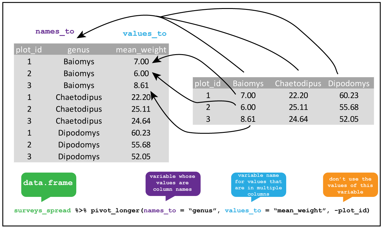
Consolidating columns with pivot_longer()
Knowing this, we can tidy the dataset up using pivot_longer().
R
library(tidyverse)

table1b %>%
  pivot_longer(lib1:lib2, names_to="library", values_to="count")
OUTPUT
# A tibble: 12 × 3
   barcode library count
   <chr>   <chr>   <int>
 1 b1      lib1      384
 2 b1      lib2      102
 3 b2      lib1      796
 4 b2      lib2      437
 5 b3      lib1      109
 6 b3      lib2      391
 7 b4      lib1      404
 8 b4      lib2      782
 9 b5      lib1      106
10 b5      lib2      101
11 b6      lib1      812
12 b6      lib2      789
We can tell that this data is tidy because the column names accurately reflect the data they contain: the count column stores counts, the library column tells us which library the counts came from, and the barcode column tells us which barcode we’re measuring.
Data pipelines with pipes (%>%)
In the code block above, we saw a strange collection of symbols (%>%) after the variable that contained our data. What does it do?
This construct is called the pipe, and comes from the magrittr package (which is part of the tidyverse). You can either type out the three characters seperatly, or use the shortcut Ctrl + Shift + m to insert a pipe.
Let’s consider an example. Say that we have a vector called counts that represents the counts for several vectors in a selection experiment, and we wanted to identify the unique counts, take their log, and then take the mean.
One way to do this is to call each function sequentially, assigning each to an intermediate variable:
R
# generate binomial data to play with
counts <- rbinom(10000, 50, 0.5)

unique_counts <- unique(counts)
log_counts <- log(unique_counts, 10)
mean_log_counts <- mean(log_counts)
This is a bit inefficient because we’ve had to type out the same variable name twice. I often find that when I do things this way, when I change one of the steps but forget to change both the variable names, and end up with weird bugs.
An alternative is to nest all the function calls inside each other:
R
mean_log_counts <- mean(log(unique(counts), 10))
Hopefully you can see why this isn’t a good idea - nested function calls can get very messy, very quickly, especially if the functions have multiple arguments (like log()).
A third way is using the pipe %>% operator, which feeds the output of each function into the next:
R
mean_log_counts <- counts %>%
  unique() %>%
  log(10) %>%
  mean()
This version of the code is cleaner, and the top-to-bottom flow makes the order the functions are applied in more obvious. This way of doing things is very popular, and you’ll see it a lot (for example, in code sample on stack overflow).
There are a few complications to using the pipe which you can read more about here. One that’s worth being aware of is that using lots of pipes can result in long pipelines, and if something goes wrong somewhere in the middle it can be hard to track down exactly where the issue is. In this case, you can use a few intermediate variables to try to figure out which step is going wrong.
Creating more columns with pivot_wider()
We can also do the reverse operation using pivot_wider() (this was how I generated the untidy versions of the tables). But haven’t we just been saying that we should always aspire to keep our data tidy? So why would we ever want to do this?
When working with data in R, the long format does tend to be the most useful, because this is the format that most functions expect data to be in. However, if you want to display the data for a person (rather than for a function in code), the wide format can sometimes be useful for making comparisons. For example, we can easily compare the counts for each barcode in the two libraries in table1b, but the comparison is easy for a person to make when the table is in a long form.
R
table1
OUTPUT
# A tibble: 12 × 3
   library barcode count
   <chr>   <chr>   <int>
 1 lib1    b1        384
 2 lib1    b2        796
 3 lib1    b3        109
 4 lib1    b4        404
 5 lib1    b5        106
 6 lib1    b6        812
 7 lib2    b1        102
 8 lib2    b2        437
 9 lib2    b3        391
10 lib2    b4        782
11 lib2    b5        101
12 lib2    b6        789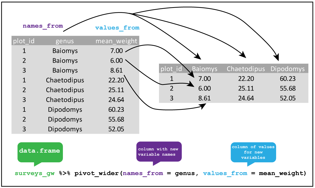
We can pivot our long table to a wide one using pivot_longer().
R
table1 %>%
  pivot_wider(names_from = "library", values_from = "count")
OUTPUT
# A tibble: 6 × 3
  barcode  lib1  lib2
  <chr>   <int> <int>
1 b1        384   102
2 b2        796   437
3 b3        109   391
4 b4        404   782
5 b5        106   101
6 b6        812   789
Other tidyr functions
Tidyr also has a number of other useful functions for tidying up datasets, which include: - Combining columns where multiples pieces of information are spread out (unite()), or spreading out columns which contain data that should be in separate column (separate()) - Adding extra rows to create all possible combinations of the values in multiple columns (expand() and complete) - Handling missing values, for example replacing NA values with something else (replace_na()) or dropping rows that contain NA (drop_na()) - Nesting data within list-columns (nest()), and unnesting such columns (unnest())
While useful, I tend to use these less frequently compared to the pivoting functions, so I leave these to you to explore on your own. You can get an overview of these functions on the tidyr cheatsheet, and in the tidyr documentation.
R
fp <- here::here("episodes", "data", "untidy_data.xlsx")
df <- readxl::read_xlsx(fp, col_names = c("batch_1", "batch_2"),
                        col_types = c("numeric", "numeric"))
ERROR
Error: `path` does not exist: '/home/runner/work/cmri_R_workshop/cmri_R_workshop/site/built/episodes/data/untidy_data.xlsx'R
df %>%
  # we don't know what the values represent, so just call the column 'value'
  pivot_longer(contains("batch"), names_to = "batch", values_to = "value") %>%
  # drop rows that have an NA value
  drop_na(value)
ERROR
Error in UseMethod("pivot_longer"): no applicable method for 'pivot_longer' applied to an object of class "function"Resources and acknowledgments
- tidyr cheatsheet
- Tidy data vignette
- Tidy data paper
- I’ve borrowed figures (and inspiration) from the excellent coding togetheR course material
Content from Data wrangling
Last updated on 2023-01-24 | Edit this page
Overview
Questions
- What are the main
dplyrverbs? - How can I analyse data within groups?
Objectives
- Know how to use the main
dplyrverbs - Use
group_by()to aggregate and manipulate within groups
Do I need to do this lesson?
If you already have experience with dplyr, you can skip this lesson if you can answer all the following questions.
- Load in the weather data from the
readrandreadxl‘do I need to do this lesson’ challenge. In the process, create a column calledfilethat contains the filename for each row. - Create a column called
citywith the name of the city (‘brisbane’, or ‘sydney’). - What is the median minimum (
min_temp_c) and maximum (max_temp_c) temperature in the observations for each city? - Count the number of days when there were more than 10 hours of sunshine (
sunshine_hours) in each city. - A cold cloudy day is one where there were fewer than 10 hours of sunshine, and the maximum temperature was less than 15 degrees. A hot sunny day is one where there were more than 10 hours of sunshine, and the maximum temperature was more than than 25 degrees. Calculate the the mean relative humidity at 9am (
rel_humid_9am_pc) and 3pm (rel_humid_3pm_pc) on days that were hot and sunny, cold and cloudy, or neither. - What is the mean maximum temperature on the 5 hottest days in each city?
- Add a column ranking the days by minimum temperature for each city, where the coldest day for each is rank 1, the next coldest is rank 2, etc.
- Generate a forecast for each city using the code below. If a cloudy day is one where there are 10 or fewer hours of sunshine, on how many days was the forecast accurate?
R
library(lubridate)
OUTPUT
Loading required package: timechangeOUTPUT
Attaching package: 'lubridate'OUTPUT
The following objects are masked from 'package:base':

    date, intersect, setdiff, union
R
# generate days
days <- seq(ymd('2022-11-01'),ymd('2022-11-29'), by = '1 day')

# forecast is the same in each city - imagine it's a country-wide forecast
forecast <- tibble(
  date = rep(days)
) %>%
  # toss a coin
  mutate(forecast = sample(c("cloudy", "sunny"), size = n(), replace=TRUE))
ERROR
Error in tibble(date = rep(days)) %>% mutate(forecast = sample(c("cloudy", : could not find function "%>%"R
# 1. Load in the weather data from the `readr` and `readxl` 'do I need to do this lesson' challenge

library(tidyverse)
OUTPUT
── Attaching packages ─────────────────────────────────────── tidyverse 1.3.2 ──
✔ ggplot2 3.4.0      ✔ purrr   1.0.1
✔ tibble  3.1.8      ✔ dplyr   1.0.10
✔ tidyr   1.2.1      ✔ stringr 1.4.1
✔ readr   2.1.3      ✔ forcats 0.5.2
── Conflicts ────────────────────────────────────────── tidyverse_conflicts() ──
✖ lubridate::as.difftime() masks base::as.difftime()
✖ lubridate::date()        masks base::date()
✖ dplyr::filter()          masks stats::filter()
✖ lubridate::intersect()   masks base::intersect()
✖ dplyr::lag()             masks stats::lag()
✖ lubridate::setdiff()     masks base::setdiff()
✖ lubridate::union()       masks base::union()
R
wthr_path <- here::here("episodes", "data", c("weather_brisbane.csv", "weather_sydney.csv"))

# column types
col_types <- list(
  date = col_date(format="%Y-%m-%d"),
  min_temp_c = col_double(),
  max_temp_c = col_double(),
  rainfall_mm = col_double(),
  evaporation_mm = col_double(),
  sunshine_hours = col_double(),
  dir_max_wind_gust = col_character(),
  speed_max_wind_gust_kph = col_double(),
  time_max_wind_gust = col_time(),
  temp_9am_c = col_double(),
  rel_humid_9am_pc = col_integer(),
  cloud_amount_9am_oktas = col_double(),
  wind_direction_9am = col_character(),
  wind_speed_9am_kph = col_double(),
  MSL_pressure_9am_hPa = col_double(),
  temp_3pm_c = col_double(),
  rel_humid_3pm_pc = col_double(),
  cloud_amount_3pm_oktas = col_double(),
  wind_direction_3pm = col_character(),
  wind_speed_3pm_kph = col_double(),
  MSL_pressure_3pm_hPa = col_double()
)

# read in data
weather <- read_csv(wthr_path, skip=10,
                    col_types=col_types, col_names = names(col_types),
                    id = "file"
                    )
ERROR
Error: '/home/runner/work/cmri_R_workshop/cmri_R_workshop/site/built/episodes/data/weather_brisbane.csv' does not exist.R
glimpse(weather)
ERROR
Error in glimpse(weather): object 'weather' not foundNothing much new here if you already did the readr episode.
R
# 2. Create a column with the name of the city ('brisbane', or 'sydney').

weather <- weather %>%
  mutate(city = stringr::str_extract(file, "brisbane|sydney"))
ERROR
Error in mutate(., city = stringr::str_extract(file, "brisbane|sydney")): object 'weather' not foundR
# 3. What is the median minimum (`min_temp_c`) and maximum (`max_temp_c`)
# temperature in the observations for each city?

weather %>%
  group_by(city) %>%
  summarise(median_min_temp = median(min_temp_c),
            median_max_temp = median(max_temp_c, na.rm=TRUE))
ERROR
Error in group_by(., city): object 'weather' not foundWe need na.rm=TRUE for the maximum column because this column contains NA values
R
#4. Count the number of days when there were more than 10 hours of sunshine
# (`sunshine_hours`) in each city.

weather %>%
  mutate(sunny = sunshine_hours > 10) %>%
  count(sunny, city)
ERROR
Error in mutate(., sunny = sunshine_hours > 10): object 'weather' not foundHere I did count() as a shortcut for group_by() and summarise(), but the long way works too.
R
#5. A cold cloudy day is one where there were fewer than 10 hours of sunshine,
# and the maximum temperature was less than 15 degrees.
# A hot sunny day is one where there were more than 10 hours of sunshine,
# and the maximum temperature was more than than 25 degrees.
# Calculate the the mean relative humidity at 9am (`rel_humid_9am_pc`) and
# 3pm (`rel_humid_3pm_pc`) on days that were hot and sunny, cold and cloudy, or neither.

weather %>%
  mutate(day = case_when(
    sunshine_hours > 10 & max_temp_c > 25 ~ "hot_sunny",
    sunshine_hours <= 10 & max_temp_c < 15 ~ "cold_cloudy",
    TRUE ~ "neither"
  )) %>%
  group_by(day) %>%
  summarise(mean_humid_9am = mean(rel_humid_9am_pc),
            mean_humid_3pm = mean(rel_humid_3pm_pc, na.rm=TRUE))
ERROR
Error in mutate(., day = case_when(sunshine_hours > 10 & max_temp_c > : object 'weather' not foundThere were no cold cloudy days in this dataset.
R
# 6. What is the mean maximum temperature on the 5 hottest days in each city?
weather %>%
  group_by(city) %>%
  slice_max(order_by = max_temp_c, n = 5, with_ties=FALSE) %>%
  summarise(mean_max_temp = mean(max_temp_c, na.rm=TRUE))
ERROR
Error in group_by(., city): object 'weather' not foundHere I use slice_max(), but there are more complicated ways to solve this using other dplyr verbs.
R
#7. Add a column ranking the days by minimum temperature for each city,
# where the coldest day for each is rank 1, the next coldest is rank 2, etc.

weather %>%
  group_by(city) %>%
  arrange(min_temp_c) %>%
  mutate(rank = row_number())
ERROR
Error in group_by(., city): object 'weather' not foundI tend to use the combination of arrange(), mutate() and row_number() for adding ranks, but there are probably other ways of achieving the same end.
R
# 8.  If a cloudy day is one where there are 10 or fewer hours of sunshine,
# on how many days was the forecast accurate?

weather %>%
  left_join(forecast, by="date") %>%
  mutate(cloudy_or_sunny = ifelse(sunshine_hours > 10, "sunny", "cloudy")) %>%
  mutate(forecast_accurate = forecast == cloudy_or_sunny) %>%
  count(forecast_accurate)
ERROR
Error in left_join(., forecast, by = "date"): object 'weather' not foundSee challenge 7 for an alternative way of solving this problem.
Manipulating data with dplyr
So once we have our data in a tidy format, what do we do with it? For analysis, I often turn to the dplyr package, which contains several useful functions for manipulating tables of data.
To illustrate the functions of this package, we’ll use a dataset of weather observations in Brisbane and Sydney from the Bureau of Meterology.
These files are called weather_brisbane.csv and weather_sydney.csv.
First, we load both files using readr:
R
# load tidyverse
library(tidyverse)

# data files
# data files - readr can also read data from the internet
data_dir <- "https://raw.githubusercontent.com/szsctt/cmri_R_workshop/main/episodes/data/"
data_files <- file.path(data_dir, c("weather_sydney.csv", "weather_brisbane.csv"))


# column types
col_types <- list(
  date = col_date(format="%Y-%m-%d"),
  min_temp_c = col_double(),
  max_temp_c = col_double(),
  rainfall_mm = col_double(),
  evaporation_mm = col_double(),
  sunshine_hours = col_double(),
  dir_max_wind_gust = col_character(),
  speed_max_wind_gust_kph = col_double(),
  time_max_wind_gust = col_time(),
  temp_9am_c = col_double(),
  rel_humid_9am_pc = col_integer(),
  cloud_amount_9am_oktas = col_double(),
  wind_direction_9am = col_character(),
  wind_speed_9am_kph = col_double(),
  MSL_pressure_9am_hPa = col_double(),
  temp_3pm_c = col_double(),
  rel_humid_3pm_pc = col_double(),
  cloud_amount_3pm_oktas = col_double(),
  wind_direction_3pm = col_character(),
  wind_speed_3pm_kph = col_double(),
  MSL_pressure_3pm_hPa = col_double()
)

# read in data
weather <- readr::read_csv(data_files, skip=10,
                           col_types=col_types, col_names = names(col_types),
                           id="file")
Creating summaries with summarise()
First, we would like to know what the mean minimum and maximum temperatures were overall. For this, we can use summarise():
R
weather %>%
  summarise(mean_min_temp = mean(min_temp_c),
            mean_max_temp = mean(max_temp_c))
OUTPUT
# A tibble: 1 × 2
  mean_min_temp mean_max_temp
          <dbl>         <dbl>
1          16.0            NA
Notice that the mean_max_temp is NA, because we had some NA values in this column. In R we use NA for missing values. So how does one take the mean of some numbers, some of which are missing? We can’t so the answer is also a missing value. We can, however, tell the mean() function to ignore the missing values using na.rm=TRUE:
R
weather %>%
  summarise(mean_min_temp = mean(min_temp_c),
            mean_max_temp = mean(max_temp_c, na.rm=TRUE))
OUTPUT
# A tibble: 1 × 2
  mean_min_temp mean_max_temp
          <dbl>         <dbl>
1 16.0 26.2R
weather %>%
  summarise(median_min_temp = median(min_temp_c),
            median_max_temp = median(max_temp_c, na.rm=TRUE))
OUTPUT
# A tibble: 1 × 2
  median_min_temp median_max_temp
            <dbl>           <dbl>
1            15.9            25.3
dplyr also has some special functions that are designed to be used inside of other functions. For example, if we want to know how many observations there were of the minimum and maximum temperatures, we could use n(). Or if we wanted to know how many different directions the maximum wind gust had, we can use n_distinct().
R
weather %>%
  summarise(n_days_observed = n(),
            n_wind_dir = n_distinct(dir_max_wind_gust))
OUTPUT
# A tibble: 1 × 2
  n_days_observed n_wind_dir
            <int>      <int>
1              57         15
Grouped summaries with group_by()
However, all of these summaries have combined the observations for Sydney and Brisbane. It probably makes sense to group the observations by city, and then compute the summary statistics. For this, we can use group_by().
If you use group_by() on a tibble, it doesn’t actually look like it changes that much.
R
weather %>%
  group_by(file)
OUTPUT
# A tibble: 57 × 22
# Groups: file [2]
file date min_t…¹ max_t…² rainf…³ evapo…⁴ sunsh…⁵ dir_m…⁶ speed…⁷
<chr> <date> <dbl> <dbl> <dbl> <dbl> <dbl> <chr> <dbl>
1 https://r… 2022-11-01 18.2 24 0.2 4.6 9.5 WNW 69
2 https://r… 2022-11-02 11.1 20.5 0.6 13 12.8 W 67
3 https://r… 2022-11-03 11.1 22 0 7.8 8.9 W 56
4 https://r… 2022-11-04 13.4 23.1 1 6 5.7 SSE 26
5 https://r… 2022-11-05 13.4 23.6 0.2 4.4 11.8 ENE 37
6 https://r… 2022-11-06 13.3 24 0 4 12.1 ENE 39
7 https://r… 2022-11-07 15.4 24.2 0 9.8 12.3 NE 41
8 https://r… 2022-11-08 16 24.2 1.2 8 11 ENE 35
9 https://r… 2022-11-09 14.9 24.2 0.2 8 10.3 E 33
10 https://r… 2022-11-10 14.9 24.4 0 7.8 9.3 ENE 43
# … with 47 more rows, 13 more variables: time_max_wind_gust <time>,
# temp_9am_c <dbl>, rel_humid_9am_pc <int>, cloud_amount_9am_oktas <dbl>,
# wind_direction_9am <chr>, wind_speed_9am_kph <dbl>,
# MSL_pressure_9am_hPa <dbl>, temp_3pm_c <dbl>, rel_humid_3pm_pc <dbl>,
# cloud_amount_3pm_oktas <dbl>, wind_direction_3pm <chr>,
# wind_speed_3pm_kph <dbl>, MSL_pressure_3pm_hPa <dbl>, and abbreviated
# variable names ¹min_temp_c, ²max_temp_c, ³rainfall_mm, ⁴evaporation_mm, …The only difference is that when you print it out, it tells you that it’s grouped by file. However, a grouped data frame interacts differently with other dplyr verbs, such as summary.
R
weather %>%
  group_by(file) %>%
  summarise(median_min_temp = median(min_temp_c),
            median_max_temp = median(max_temp_c, na.rm=TRUE))
OUTPUT
# A tibble: 2 × 3
file media…¹ media…²
<chr> <dbl> <dbl>
1 https://raw.githubusercontent.com/szsctt/cmri_R_workshop/main… 16.7 27.7
2 https://raw.githubusercontent.com/szsctt/cmri_R_workshop/main… 15.4 24.2
# … with abbreviated variable names ¹median_min_temp, ²median_max_tempNow we get the median temperature for both Sydney and Brisbane.
R
weather %>%
  group_by(file, dir_max_wind_gust) %>%
  summarise(max_max_wind_gust = max(speed_max_wind_gust_kph))
OUTPUT
`summarise()` has grouped output by 'file'. You can override using the
`.groups` argument.
OUTPUT
# A tibble: 24 × 3
# Groups: file [2]
file dir_m…¹ max_m…²
<chr> <chr> <dbl>
1 https://raw.githubusercontent.com/szsctt/cmri_R_workshop/mai… E 35
2 https://raw.githubusercontent.com/szsctt/cmri_R_workshop/mai… ENE 37
3 https://raw.githubusercontent.com/szsctt/cmri_R_workshop/mai… ESE 35
4 https://raw.githubusercontent.com/szsctt/cmri_R_workshop/mai… NE 26
5 https://raw.githubusercontent.com/szsctt/cmri_R_workshop/mai… NNE 35
6 https://raw.githubusercontent.com/szsctt/cmri_R_workshop/mai… NW 48
7 https://raw.githubusercontent.com/szsctt/cmri_R_workshop/mai… S 39
8 https://raw.githubusercontent.com/szsctt/cmri_R_workshop/mai… W 44
9 https://raw.githubusercontent.com/szsctt/cmri_R_workshop/mai… WNW 33
10 https://raw.githubusercontent.com/szsctt/cmri_R_workshop/mai… WSW 43
# … with 14 more rows, and abbreviated variable names ¹dir_max_wind_gust,
# ²max_max_wind_gustR
weather %>%
  group_by(file, dir_max_wind_gust) %>%
  summarise(max_max_wind_gust = max(speed_max_wind_gust_kph)) %>%
  ungroup() %>%
  pivot_wider(id_cols=file, names_from = "dir_max_wind_gust", values_from = "max_max_wind_gust")
OUTPUT
`summarise()` has grouped output by 'file'. You can override using the
`.groups` argument.
OUTPUT
# A tibble: 2 × 16
  file       E   ENE   ESE    NE   NNE    NW     S     W   WNW   WSW  `NA`   NNW
  <chr>  <dbl> <dbl> <dbl> <dbl> <dbl> <dbl> <dbl> <dbl> <dbl> <dbl> <dbl> <dbl>
1 https…    35    37    35    26    35    48    39    44    33    43    NA    NA
2 https…    33    50    26    41    NA    NA    54    83    69    54    NA    46
# … with 3 more variables: SSE <dbl>, SSW <dbl>, SW <dbl>
Do you prefer the long or wide form of the table?
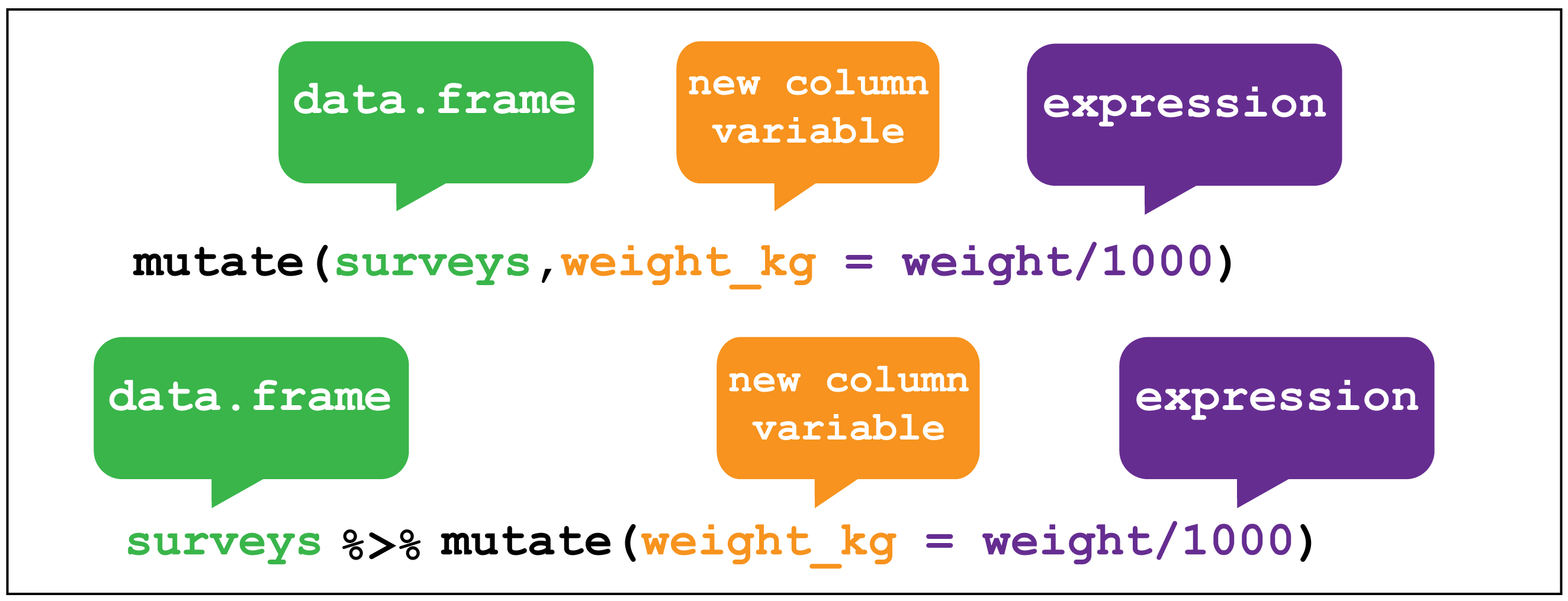
Creating new columns with mutate()
It’s kind of annoying that we have the whole file names, rather than just the names of the cities. To fix this, we can create (or overwrite) columns with mutate().
dplyr::mutate() image creditFor example, the stringr::str_extract() function extracts a matching pattern from a string:
R
stringr::str_extract(data_files, "sydney|brisbane")
OUTPUT
[1] "sydney" "brisbane"Regular expressions for pattern matching in strings
The second argument to str_extract() is a regular expression, or regex. Using regular expressions is a hugely flexible way to specify a pattern to match in a string, but it’s a somewhat complicated topic that I won’t go into here. If you’re interested in learning more, you can look at the stringr documentation on regular expressions.
We can use mutate() to apply the str_extract() function to the file column
R
weather <- weather %>%
  mutate(city = stringr::str_extract(file, "sydney|brisbane"))
weather
OUTPUT
# A tibble: 57 × 23
file date min_t…¹ max_t…² rainf…³ evapo…⁴ sunsh…⁵ dir_m…⁶ speed…⁷
<chr> <date> <dbl> <dbl> <dbl> <dbl> <dbl> <chr> <dbl>
1 https://r… 2022-11-01 18.2 24 0.2 4.6 9.5 WNW 69
2 https://r… 2022-11-02 11.1 20.5 0.6 13 12.8 W 67
3 https://r… 2022-11-03 11.1 22 0 7.8 8.9 W 56
4 https://r… 2022-11-04 13.4 23.1 1 6 5.7 SSE 26
5 https://r… 2022-11-05 13.4 23.6 0.2 4.4 11.8 ENE 37
6 https://r… 2022-11-06 13.3 24 0 4 12.1 ENE 39
7 https://r… 2022-11-07 15.4 24.2 0 9.8 12.3 NE 41
8 https://r… 2022-11-08 16 24.2 1.2 8 11 ENE 35
9 https://r… 2022-11-09 14.9 24.2 0.2 8 10.3 E 33
10 https://r… 2022-11-10 14.9 24.4 0 7.8 9.3 ENE 43
# … with 47 more rows, 14 more variables: time_max_wind_gust <time>,
# temp_9am_c <dbl>, rel_humid_9am_pc <int>, cloud_amount_9am_oktas <dbl>,
# wind_direction_9am <chr>, wind_speed_9am_kph <dbl>,
# MSL_pressure_9am_hPa <dbl>, temp_3pm_c <dbl>, rel_humid_3pm_pc <dbl>,
# cloud_amount_3pm_oktas <dbl>, wind_direction_3pm <chr>,
# wind_speed_3pm_kph <dbl>, MSL_pressure_3pm_hPa <dbl>, city <chr>, and
# abbreviated variable names ¹min_temp_c, ²max_temp_c, ³rainfall_mm, …Now if we repeat the same summary as before, we get an output that’s a bit easier to read.
R
weather %>%
  group_by(city) %>%
  summarise(median_min_temp = median(min_temp_c),
            median_max_temp = median(max_temp_c, na.rm=TRUE))
OUTPUT
# A tibble: 2 × 3
  city     median_min_temp median_max_temp
  <chr>              <dbl>           <dbl>
1 brisbane            16.7            27.7
2 sydney              15.4            24.2
Mutating multiple columns with across()
Let’s imagine that the calibration was wrong for both temperature sensors, and all the temperature measurements are out by 1°C. We’d like to add 1 to each of the temperature measurements. There are multiple columns that contain temperatures, so we could do this:
R
weather %>%
  mutate(min_temp_c = min_temp_c + 1,
         max_temp_c = max_temp_c + 1,
         temp_9am_c = temp_9am_c + 1,
         temp_3pm_c = temp_3pm_c + 1)
OUTPUT
# A tibble: 57 × 23
file date min_t…¹ max_t…² rainf…³ evapo…⁴ sunsh…⁵ dir_m…⁶ speed…⁷
<chr> <date> <dbl> <dbl> <dbl> <dbl> <dbl> <chr> <dbl>
1 https://r… 2022-11-01 19.2 25 0.2 4.6 9.5 WNW 69
2 https://r… 2022-11-02 12.1 21.5 0.6 13 12.8 W 67
3 https://r… 2022-11-03 12.1 23 0 7.8 8.9 W 56
4 https://r… 2022-11-04 14.4 24.1 1 6 5.7 SSE 26
5 https://r… 2022-11-05 14.4 24.6 0.2 4.4 11.8 ENE 37
6 https://r… 2022-11-06 14.3 25 0 4 12.1 ENE 39
7 https://r… 2022-11-07 16.4 25.2 0 9.8 12.3 NE 41
8 https://r… 2022-11-08 17 25.2 1.2 8 11 ENE 35
9 https://r… 2022-11-09 15.9 25.2 0.2 8 10.3 E 33
10 https://r… 2022-11-10 15.9 25.4 0 7.8 9.3 ENE 43
# … with 47 more rows, 14 more variables: time_max_wind_gust <time>,
# temp_9am_c <dbl>, rel_humid_9am_pc <int>, cloud_amount_9am_oktas <dbl>,
# wind_direction_9am <chr>, wind_speed_9am_kph <dbl>,
# MSL_pressure_9am_hPa <dbl>, temp_3pm_c <dbl>, rel_humid_3pm_pc <dbl>,
# cloud_amount_3pm_oktas <dbl>, wind_direction_3pm <chr>,
# wind_speed_3pm_kph <dbl>, MSL_pressure_3pm_hPa <dbl>, city <chr>, and
# abbreviated variable names ¹min_temp_c, ²max_temp_c, ³rainfall_mm, …But it’s a bit annoying to type out each column. Instead, we can use across() inside mutate() to apply the same transformation to all columns whose name contains the string “temp”. The syntax is a little complicated, so don’t worry if you don’t get it straight away. We use the contains() function to get the columns we want (by matching the regex “temp”), and then to each of these columns we add one - the . will be replaced by the name of each column when the expression is evaluated.
R
weather %>%
  mutate(across(contains("temp"), ~.+1))
OUTPUT
# A tibble: 57 × 23
file date min_t…¹ max_t…² rainf…³ evapo…⁴ sunsh…⁵ dir_m…⁶ speed…⁷
<chr> <date> <dbl> <dbl> <dbl> <dbl> <dbl> <chr> <dbl>
1 https://r… 2022-11-01 19.2 25 0.2 4.6 9.5 WNW 69
2 https://r… 2022-11-02 12.1 21.5 0.6 13 12.8 W 67
3 https://r… 2022-11-03 12.1 23 0 7.8 8.9 W 56
4 https://r… 2022-11-04 14.4 24.1 1 6 5.7 SSE 26
5 https://r… 2022-11-05 14.4 24.6 0.2 4.4 11.8 ENE 37
6 https://r… 2022-11-06 14.3 25 0 4 12.1 ENE 39
7 https://r… 2022-11-07 16.4 25.2 0 9.8 12.3 NE 41
8 https://r… 2022-11-08 17 25.2 1.2 8 11 ENE 35
9 https://r… 2022-11-09 15.9 25.2 0.2 8 10.3 E 33
10 https://r… 2022-11-10 15.9 25.4 0 7.8 9.3 ENE 43
# … with 47 more rows, 14 more variables: time_max_wind_gust <time>,
# temp_9am_c <dbl>, rel_humid_9am_pc <int>, cloud_amount_9am_oktas <dbl>,
# wind_direction_9am <chr>, wind_speed_9am_kph <dbl>,
# MSL_pressure_9am_hPa <dbl>, temp_3pm_c <dbl>, rel_humid_3pm_pc <dbl>,
# cloud_amount_3pm_oktas <dbl>, wind_direction_3pm <chr>,
# wind_speed_3pm_kph <dbl>, MSL_pressure_3pm_hPa <dbl>, city <chr>, and
# abbreviated variable names ¹min_temp_c, ²max_temp_c, ³rainfall_mm, …Equivalently, we could also use a function to make the transformation.
R
weather %>%
  mutate(across(contains("temp"), function(x){
    return(x+1)
  }))
OUTPUT
# A tibble: 57 × 23
file date min_t…¹ max_t…² rainf…³ evapo…⁴ sunsh…⁵ dir_m…⁶ speed…⁷
<chr> <date> <dbl> <dbl> <dbl> <dbl> <dbl> <chr> <dbl>
1 https://r… 2022-11-01 19.2 25 0.2 4.6 9.5 WNW 69
2 https://r… 2022-11-02 12.1 21.5 0.6 13 12.8 W 67
3 https://r… 2022-11-03 12.1 23 0 7.8 8.9 W 56
4 https://r… 2022-11-04 14.4 24.1 1 6 5.7 SSE 26
5 https://r… 2022-11-05 14.4 24.6 0.2 4.4 11.8 ENE 37
6 https://r… 2022-11-06 14.3 25 0 4 12.1 ENE 39
7 https://r… 2022-11-07 16.4 25.2 0 9.8 12.3 NE 41
8 https://r… 2022-11-08 17 25.2 1.2 8 11 ENE 35
9 https://r… 2022-11-09 15.9 25.2 0.2 8 10.3 E 33
10 https://r… 2022-11-10 15.9 25.4 0 7.8 9.3 ENE 43
# … with 47 more rows, 14 more variables: time_max_wind_gust <time>,
# temp_9am_c <dbl>, rel_humid_9am_pc <int>, cloud_amount_9am_oktas <dbl>,
# wind_direction_9am <chr>, wind_speed_9am_kph <dbl>,
# MSL_pressure_9am_hPa <dbl>, temp_3pm_c <dbl>, rel_humid_3pm_pc <dbl>,
# cloud_amount_3pm_oktas <dbl>, wind_direction_3pm <chr>,
# wind_speed_3pm_kph <dbl>, MSL_pressure_3pm_hPa <dbl>, city <chr>, and
# abbreviated variable names ¹min_temp_c, ²max_temp_c, ³rainfall_mm, …Filtering rows with filter()
Let’s say that now we want information about days that were cloudy - for example, those where there were fewer than 10 sunshine hours. We can use filter() to get only those rows.
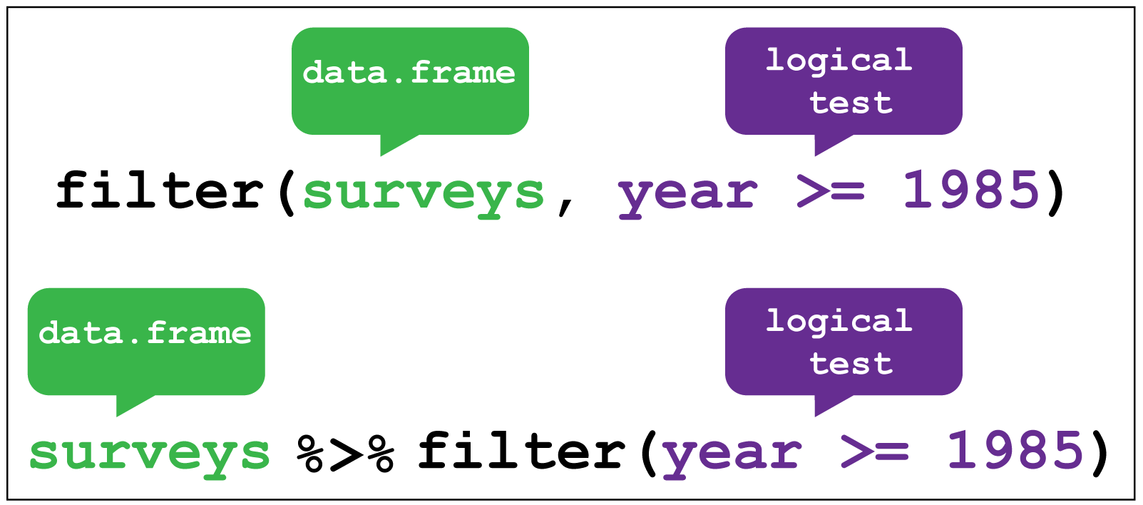
dplyr::filter() image creditR
weather %>%
  filter(sunshine_hours < 10)
OUTPUT
# A tibble: 19 × 23
file date min_t…¹ max_t…² rainf…³ evapo…⁴ sunsh…⁵ dir_m…⁶ speed…⁷
<chr> <date> <dbl> <dbl> <dbl> <dbl> <dbl> <chr> <dbl>
1 https://r… 2022-11-01 18.2 24 0.2 4.6 9.5 WNW 69
2 https://r… 2022-11-03 11.1 22 0 7.8 8.9 W 56
3 https://r… 2022-11-04 13.4 23.1 1 6 5.7 SSE 26
4 https://r… 2022-11-10 14.9 24.4 0 7.8 9.3 ENE 43
5 https://r… 2022-11-11 14.9 24.9 0 7.8 9.1 ENE 39
6 https://r… 2022-11-12 16 27.9 0 7.8 9.5 ESE 26
7 https://r… 2022-11-13 18.9 25.6 0 6.4 1.7 NNW 46
8 https://r… 2022-11-15 16.2 24.9 0.2 9.6 9.2 SW 33
9 https://r… 2022-11-16 13 21.6 0.8 8 9.1 S 54
10 https://r… 2022-11-27 17 26.8 0 8 3.7 WSW 54
11 https://r… 2022-11-28 17.1 23.8 8.8 3.8 8.9 SSW 31
12 https://r… 2022-11-08 14.7 25.2 0 10 9.9 ESE 33
13 https://r… 2022-11-14 20.6 28.8 0 9.8 8.4 ENE 26
14 https://r… 2022-11-20 20.8 34.5 0 8.8 5.7 NW 48
15 https://r… 2022-11-22 20.6 30.7 0 11.6 9.2 ENE 28
16 https://r… 2022-11-23 18.4 27.6 0 8.8 4.4 WNW 22
17 https://r… 2022-11-24 16.9 28.6 0 8 2.7 NE 20
18 https://r… 2022-11-27 19.8 29.4 0 8.8 6.1 NW 24
19 https://r… 2022-11-28 21.1 31 21.4 5.4 6.1 S 39
# … with 14 more variables: time_max_wind_gust <time>, temp_9am_c <dbl>,
# rel_humid_9am_pc <int>, cloud_amount_9am_oktas <dbl>,
# wind_direction_9am <chr>, wind_speed_9am_kph <dbl>,
# MSL_pressure_9am_hPa <dbl>, temp_3pm_c <dbl>, rel_humid_3pm_pc <dbl>,
# cloud_amount_3pm_oktas <dbl>, wind_direction_3pm <chr>,
# wind_speed_3pm_kph <dbl>, MSL_pressure_3pm_hPa <dbl>, city <chr>, and
# abbreviated variable names ¹min_temp_c, ²max_temp_c, ³rainfall_mm, …R
weather %>%
  filter(sunshine_hours > 10) %>%
  group_by(city) %>%
  summarise(n_days = n())
OUTPUT
# A tibble: 2 × 2
  city     n_days
  <chr>     <int>
1 brisbane     19
2 sydney       17
There were more days with more than 10 hours of sunlight in Brisbane than in Sydney. I’ll let you draw your own conclusions.
Complex filters with case_when()
Let’s say we wanted to keep only the rows from sunny, warm days and cloudy, cold days. We could do this just with one logical expression.
R
weather %>%
  filter((sunshine_hours > 10 & max_temp_c > 25) | (sunshine_hours < 10 & max_temp_c < 15))
OUTPUT
# A tibble: 19 × 23
file date min_t…¹ max_t…² rainf…³ evapo…⁴ sunsh…⁵ dir_m…⁶ speed…⁷
<chr> <date> <dbl> <dbl> <dbl> <dbl> <dbl> <chr> <dbl>
1 https://r… 2022-11-14 18.1 27.9 37.6 4.2 10.8 W 67
2 https://r… 2022-11-20 18 27.4 0.8 7.8 13.3 W 70
3 https://r… 2022-11-23 13.7 28.3 0 8 12.4 W 54
4 https://r… 2022-11-24 15.8 25.4 0 11.2 12 E 33
5 https://r… 2022-11-05 15.5 25.1 0 8.6 12.2 E 30
6 https://r… 2022-11-06 15.6 25.6 0 8.2 12.7 E 31
7 https://r… 2022-11-07 15.5 25.7 0 7.4 12.6 ENE 37
8 https://r… 2022-11-09 14.7 25.3 0 8.4 12.4 ESE 30
9 https://r… 2022-11-10 15.9 25.7 0 8.6 12.5 E 35
10 https://r… 2022-11-11 14.4 26.2 0 9.4 12.1 E 22
11 https://r… 2022-11-12 15.8 28.4 0 7.4 10.5 NE 26
12 https://r… 2022-11-13 17.6 27.7 0 7.2 12.4 NNE 33
13 https://r… 2022-11-15 20 33.3 0 5.6 12.9 WNW 30
14 https://r… 2022-11-16 16.6 30.1 0 8.2 12.5 WSW 43
15 https://r… 2022-11-18 13.7 27 0 7.4 12.7 ENE 24
16 https://r… 2022-11-19 15.1 28.3 0 8 12.5 NNE 35
17 https://r… 2022-11-21 21.2 34.3 6.6 10.4 10.9 WNW 33
18 https://r… 2022-11-25 17.6 32.4 0 4.2 12.5 NE 26
19 https://r… 2022-11-26 17.3 33.9 0 9.6 12.8 E 35
# … with 14 more variables: time_max_wind_gust <time>, temp_9am_c <dbl>,
# rel_humid_9am_pc <int>, cloud_amount_9am_oktas <dbl>,
# wind_direction_9am <chr>, wind_speed_9am_kph <dbl>,
# MSL_pressure_9am_hPa <dbl>, temp_3pm_c <dbl>, rel_humid_3pm_pc <dbl>,
# cloud_amount_3pm_oktas <dbl>, wind_direction_3pm <chr>,
# wind_speed_3pm_kph <dbl>, MSL_pressure_3pm_hPa <dbl>, city <chr>, and
# abbreviated variable names ¹min_temp_c, ²max_temp_c, ³rainfall_mm, …But you can imagine that with more conditions, this can get a bit messy. I prefer to use case_when() in such situations:
R
weather %>%
  filter(case_when(
    sunshine_hours > 10 & max_temp_c > 25 ~ TRUE,
    sunshine_hours < 10 & max_temp_c < 15 ~ TRUE,
    TRUE ~ FALSE
  ))
OUTPUT
# A tibble: 19 × 23
file date min_t…¹ max_t…² rainf…³ evapo…⁴ sunsh…⁵ dir_m…⁶ speed…⁷
<chr> <date> <dbl> <dbl> <dbl> <dbl> <dbl> <chr> <dbl>
1 https://r… 2022-11-14 18.1 27.9 37.6 4.2 10.8 W 67
2 https://r… 2022-11-20 18 27.4 0.8 7.8 13.3 W 70
3 https://r… 2022-11-23 13.7 28.3 0 8 12.4 W 54
4 https://r… 2022-11-24 15.8 25.4 0 11.2 12 E 33
5 https://r… 2022-11-05 15.5 25.1 0 8.6 12.2 E 30
6 https://r… 2022-11-06 15.6 25.6 0 8.2 12.7 E 31
7 https://r… 2022-11-07 15.5 25.7 0 7.4 12.6 ENE 37
8 https://r… 2022-11-09 14.7 25.3 0 8.4 12.4 ESE 30
9 https://r… 2022-11-10 15.9 25.7 0 8.6 12.5 E 35
10 https://r… 2022-11-11 14.4 26.2 0 9.4 12.1 E 22
11 https://r… 2022-11-12 15.8 28.4 0 7.4 10.5 NE 26
12 https://r… 2022-11-13 17.6 27.7 0 7.2 12.4 NNE 33
13 https://r… 2022-11-15 20 33.3 0 5.6 12.9 WNW 30
14 https://r… 2022-11-16 16.6 30.1 0 8.2 12.5 WSW 43
15 https://r… 2022-11-18 13.7 27 0 7.4 12.7 ENE 24
16 https://r… 2022-11-19 15.1 28.3 0 8 12.5 NNE 35
17 https://r… 2022-11-21 21.2 34.3 6.6 10.4 10.9 WNW 33
18 https://r… 2022-11-25 17.6 32.4 0 4.2 12.5 NE 26
19 https://r… 2022-11-26 17.3 33.9 0 9.6 12.8 E 35
# … with 14 more variables: time_max_wind_gust <time>, temp_9am_c <dbl>,
# rel_humid_9am_pc <int>, cloud_amount_9am_oktas <dbl>,
# wind_direction_9am <chr>, wind_speed_9am_kph <dbl>,
# MSL_pressure_9am_hPa <dbl>, temp_3pm_c <dbl>, rel_humid_3pm_pc <dbl>,
# cloud_amount_3pm_oktas <dbl>, wind_direction_3pm <chr>,
# wind_speed_3pm_kph <dbl>, MSL_pressure_3pm_hPa <dbl>, city <chr>, and
# abbreviated variable names ¹min_temp_c, ²max_temp_c, ³rainfall_mm, …Essentially, case_when() looks at each condition in turn, and if the left part of the expression (before the ~) evaluates to TRUE, then it returns whatever is on the right of the ~.
- We first ask if this row has more than ten sunshine hours and a maximum temperature of more than 25 - if this is the case, we return
TRUE(andfilter()retains this row).
- Next, we ask if the row has less than ten sunshine hours and a maximum temperature of less than 15, in which case we also return
TRUE.
- If both these statements are
FALSE, then theTRUEon the next line ensures that we don’t keep those rows by always returningFALSE.
Challenge 4: Using case_when() with mutate()
case_when() is also quite useful in combination with mutate().
For example, let’s suppose you want to compare the mean relative humidity on about cloudy cold days and sunny hot days.
You can first use mutate() and case_when() to create a column that tells which of these categories the day belongs to (hot_sunny, cold_cloudy, or neither), and then use group_by() and summarise() to get the mean relative humidity at 9am and 3pm.
Write the code to compute this.
R
weather %>%
  mutate(day_type = case_when(
    sunshine_hours > 10 & max_temp_c > 25 ~ "hot_sunny",
    sunshine_hours < 10 & max_temp_c < 15 ~ "cold_cloudy",
    TRUE ~ "neither"
  )) %>%
  group_by(day_type) %>%
  summarise(mean_rel_humid_9am = mean(rel_humid_9am_pc, na.rm=TRUE),
            mean_rel_humid_3pm = mean(rel_humid_3pm_pc, na.rm=TRUE))
OUTPUT
# A tibble: 2 × 3
  day_type  mean_rel_humid_9am mean_rel_humid_3pm
  <chr>                  <dbl>              <dbl>
1 hot_sunny               48.3               41.2
2 neither                 58.3               49.5
Notice that we didn’t actually have any cold cloudy days, but hot sunny days seem to be less humid.
Filter within groups with slice_xxx()
There are three slice functions that you can use to filter your data: slice_min(), slice_max() and slice_sample(). I usually use them together with group_by() to filter within groups.
use slice_max()
R
weather %>%
  group_by(city) %>%
  slice_max(order_by=max_temp_c, n=1)
OUTPUT
# A tibble: 2 × 23
# Groups: city [2]
file date min_t…¹ max_t…² rainf…³ evapo…⁴ sunsh…⁵ dir_m…⁶ speed…⁷
<chr> <date> <dbl> <dbl> <dbl> <dbl> <dbl> <chr> <dbl>
1 https://ra… 2022-11-20 20.8 34.5 0 8.8 5.7 NW 48
2 https://ra… 2022-11-23 13.7 28.3 0 8 12.4 W 54
# … with 14 more variables: time_max_wind_gust <time>, temp_9am_c <dbl>,
# rel_humid_9am_pc <int>, cloud_amount_9am_oktas <dbl>,
# wind_direction_9am <chr>, wind_speed_9am_kph <dbl>,
# MSL_pressure_9am_hPa <dbl>, temp_3pm_c <dbl>, rel_humid_3pm_pc <dbl>,
# cloud_amount_3pm_oktas <dbl>, wind_direction_3pm <chr>,
# wind_speed_3pm_kph <dbl>, MSL_pressure_3pm_hPa <dbl>, city <chr>, and
# abbreviated variable names ¹min_temp_c, ²max_temp_c, ³rainfall_mm, …If you want the minimum values instead, use slice_min() and if you want a random sample, use slice_sample().
R
weather %>%
  group_by(city) %>%
  # use with_ties to ensure we only get five rows
  slice_max(order_by=max_temp_c, n=5, with_ties = FALSE) %>%
  summarise(
    mean_temp = mean(max_temp_c)
  )
OUTPUT
# A tibble: 2 × 2
  city     mean_temp
  <chr>        <dbl>
1 brisbane      33.7
2 sydney        27.7
Ooof, Brisbane was hot! Maybe this changes your conclusion about which city is better.
Selecting columns with select()
If you want to drop or only retain columns from your table, use select().
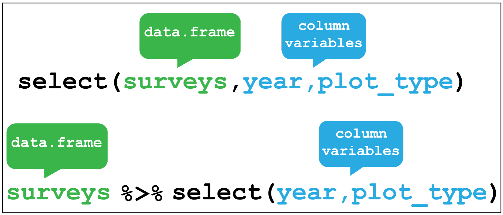
dplyr::select() image creditFor example, we added a city column to our table, so we can drop the file column that also contains this information.
R
weather %>%
  select(-file)
OUTPUT
# A tibble: 57 × 22
date min_temp_c max_t…¹ rainf…² evapo…³ sunsh…⁴ dir_m…⁵ speed…⁶ time_…⁷
<date> <dbl> <dbl> <dbl> <dbl> <dbl> <chr> <dbl> <time>
1 2022-11-01 18.2 24 0.2 4.6 9.5 WNW 69 06:50
2 2022-11-02 11.1 20.5 0.6 13 12.8 W 67 12:54
3 2022-11-03 11.1 22 0 7.8 8.9 W 56 07:41
4 2022-11-04 13.4 23.1 1 6 5.7 SSE 26 23:24
5 2022-11-05 13.4 23.6 0.2 4.4 11.8 ENE 37 15:20
6 2022-11-06 13.3 24 0 4 12.1 ENE 39 16:12
7 2022-11-07 15.4 24.2 0 9.8 12.3 NE 41 11:44
8 2022-11-08 16 24.2 1.2 8 11 ENE 35 15:55
9 2022-11-09 14.9 24.2 0.2 8 10.3 E 33 12:37
10 2022-11-10 14.9 24.4 0 7.8 9.3 ENE 43 17:10
# … with 47 more rows, 13 more variables: temp_9am_c <dbl>,
# rel_humid_9am_pc <int>, cloud_amount_9am_oktas <dbl>,
# wind_direction_9am <chr>, wind_speed_9am_kph <dbl>,
# MSL_pressure_9am_hPa <dbl>, temp_3pm_c <dbl>, rel_humid_3pm_pc <dbl>,
# cloud_amount_3pm_oktas <dbl>, wind_direction_3pm <chr>,
# wind_speed_3pm_kph <dbl>, MSL_pressure_3pm_hPa <dbl>, city <chr>, and
# abbreviated variable names ¹max_temp_c, ²rainfall_mm, ³evaporation_mm, …Alternatively, if we only wanted to keep the date, city and the 3pm observations, we can do this as well.
R
weather %>%
  select(date, city, contains("3pm"))
OUTPUT
# A tibble: 57 × 8
date city temp_3pm_c rel_humid_3pm_pc cloud…¹ wind_…² wind_…³ MSL_p…⁴
<date> <chr> <dbl> <dbl> <dbl> <chr> <dbl> <dbl>
1 2022-11-01 sydney 23.1 30 2 WNW 31 992
2 2022-11-02 sydney 19.7 29 1 SW 22 1006.
3 2022-11-03 sydney 20 42 7 SE 20 1017.
4 2022-11-04 sydney 22.8 55 5 ENE 17 1027.
5 2022-11-05 sydney 22.2 60 2 ENE 24 1027.
6 2022-11-06 sydney 23.1 59 1 E 26 1023.
7 2022-11-07 sydney 23.4 58 2 ENE 24 1021.
8 2022-11-08 sydney 24 59 2 ENE 24 1020.
9 2022-11-09 sydney 23.6 46 1 ENE 26 1022.
10 2022-11-10 sydney 24.1 55 1 ENE 24 1019.
# … with 47 more rows, and abbreviated variable names ¹cloud_amount_3pm_oktas,
# ²wind_direction_3pm, ³wind_speed_3pm_kph, ⁴MSL_pressure_3pm_hPaSorting rows with arrange()
You can re-order the rows in a table by the values in one or more columns using arrange().
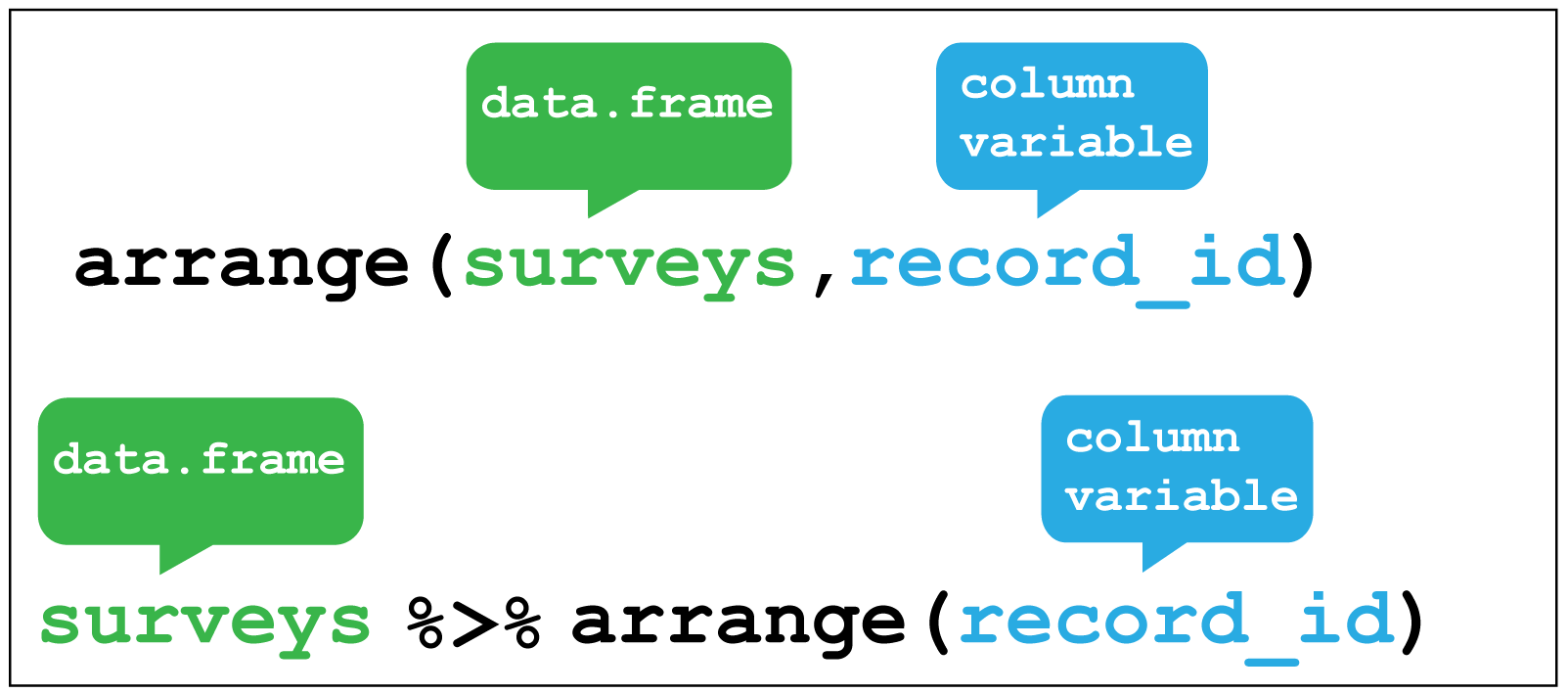 Here I sort for the hottest days, using
 desc() to get the maximum temperatures in descending order.R
weather %>%
  arrange(desc(max_temp_c))
OUTPUT
# A tibble: 57 × 23
file date min_t…¹ max_t…² rainf…³ evapo…⁴ sunsh…⁵ dir_m…⁶ speed…⁷
<chr> <date> <dbl> <dbl> <dbl> <dbl> <dbl> <chr> <dbl>
1 https://r… 2022-11-20 20.8 34.5 0 8.8 5.7 NW 48
2 https://r… 2022-11-21 21.2 34.3 6.6 10.4 10.9 WNW 33
3 https://r… 2022-11-26 17.3 33.9 0 9.6 12.8 E 35
4 https://r… 2022-11-15 20 33.3 0 5.6 12.9 WNW 30
5 https://r… 2022-11-25 17.6 32.4 0 4.2 12.5 NE 26
6 https://r… 2022-11-28 21.1 31 21.4 5.4 6.1 S 39
7 https://r… 2022-11-22 20.6 30.7 0 11.6 9.2 ENE 28
8 https://r… 2022-11-16 16.6 30.1 0 8.2 12.5 WSW 43
9 https://r… 2022-11-27 19.8 29.4 0 8.8 6.1 NW 24
10 https://r… 2022-11-14 20.6 28.8 0 9.8 8.4 ENE 26
# … with 47 more rows, 14 more variables: time_max_wind_gust <time>,
# temp_9am_c <dbl>, rel_humid_9am_pc <int>, cloud_amount_9am_oktas <dbl>,
# wind_direction_9am <chr>, wind_speed_9am_kph <dbl>,
# MSL_pressure_9am_hPa <dbl>, temp_3pm_c <dbl>, rel_humid_3pm_pc <dbl>,
# cloud_amount_3pm_oktas <dbl>, wind_direction_3pm <chr>,
# wind_speed_3pm_kph <dbl>, MSL_pressure_3pm_hPa <dbl>, city <chr>, and
# abbreviated variable names ¹min_temp_c, ²max_temp_c, ³rainfall_mm, …R
weather %>%
  group_by(city) %>%
  arrange(min_temp_c) %>%
  mutate(rank = row_number()) %>%
  # select only the relevant columns to verify that it worked
  select(city, date, min_temp_c, rank)
OUTPUT
# A tibble: 57 × 4
# Groups:   city [2]
   city     date       min_temp_c  rank
   <chr>    <date>          <dbl> <int>
 1 sydney   2022-11-17       10       1
 2 sydney   2022-11-02       11.1     2
 3 sydney   2022-11-03       11.1     3
 4 sydney   2022-11-22       11.7     4
 5 sydney   2022-11-18       12.4     5
 6 brisbane 2022-11-03       12.8     1
 7 sydney   2022-11-19       12.9     6
 8 sydney   2022-11-16       13       7
 9 sydney   2022-11-06       13.3     8
10 sydney   2022-11-04       13.4     9
# … with 47 more rows
Joining data frames
So far, we’ve only dealt with methods that work on one data frame. Sometimes it’s useful to combine information from two tables together to get a more complete picture of the data.
There are several joining functions, which fall into two categories:
- mutating joins, which add extra columns to tables based on matching values
- filtering joins, which don’t add extra columns but change the number of rows
Here, I’ll only cover the join I use the most, left_join(), but there are several joins of each type, which I will leave to you to explore more using the links above.
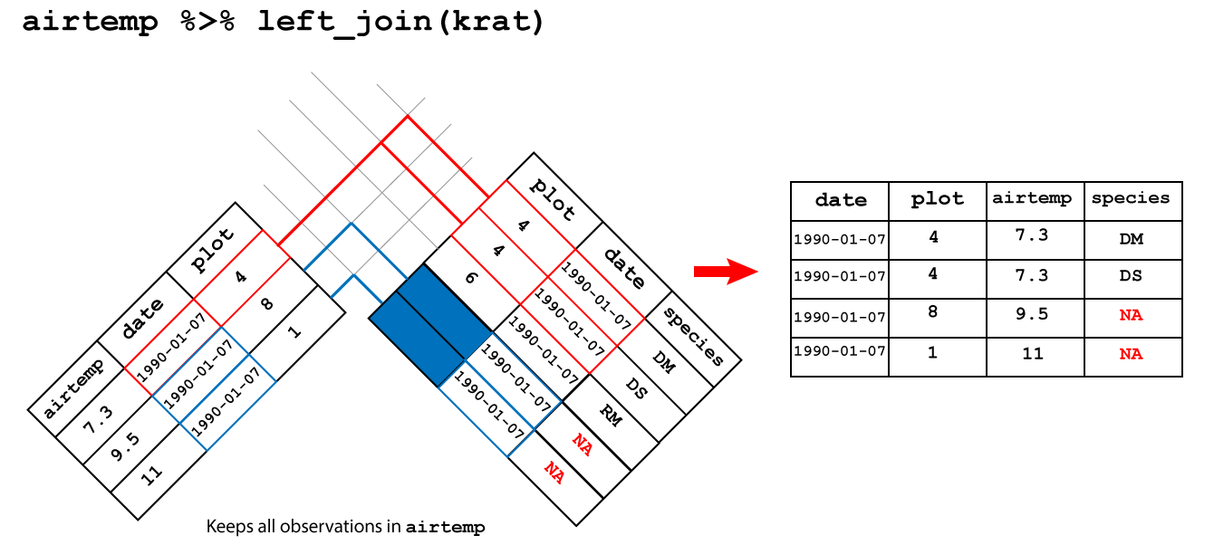
Let’s say we have a second table which contains the forecast for each day. Here I generate this randomly, but you could equally use readr or readxl to load this data in if you have it in a file.
R
forecast <- weather %>%
  select(date, city) %>%
  mutate(forecast = sample(c("cloudy", "sunny"), size = n(), replace=TRUE))

forecast
OUTPUT
# A tibble: 57 × 3
   date       city   forecast
   <date>     <chr>  <chr>
 1 2022-11-01 sydney cloudy
 2 2022-11-02 sydney sunny
 3 2022-11-03 sydney sunny
 4 2022-11-04 sydney sunny
 5 2022-11-05 sydney cloudy
 6 2022-11-06 sydney sunny
 7 2022-11-07 sydney sunny
 8 2022-11-08 sydney cloudy
 9 2022-11-09 sydney cloudy
10 2022-11-10 sydney cloudy
# … with 47 more rows
Now we would like to join this to our data frame of observations, so we can compare the forecast to what actually happened.
R
weather %>%
  left_join(forecast, by=c("date", "city")) %>%
  select(city, date, sunshine_hours, forecast)
OUTPUT
# A tibble: 57 × 4
   city   date       sunshine_hours forecast
   <chr>  <date>              <dbl> <chr>
 1 sydney 2022-11-01            9.5 cloudy
 2 sydney 2022-11-02           12.8 sunny
 3 sydney 2022-11-03            8.9 sunny
 4 sydney 2022-11-04            5.7 sunny
 5 sydney 2022-11-05           11.8 cloudy
 6 sydney 2022-11-06           12.1 sunny
 7 sydney 2022-11-07           12.3 sunny
 8 sydney 2022-11-08           11   cloudy
 9 sydney 2022-11-09           10.3 cloudy
10 sydney 2022-11-10            9.3 cloudy
# … with 47 more rows
Challenge 7: Blame it on the weatherman
If a cloudy day is one where there are 10 or fewer hours of sunshine, on how many days was the forecast accurate?
R
weather %>%
  # join forecast information
  left_join(forecast, by=c("date", "city")) %>%
  # was forecast accurate
  mutate(forecast_accurate = case_when(
    sunshine_hours > 10 & forecast == "sunny" ~ TRUE,
    sunshine_hours <= 10 & forecast == "cloudy" ~ TRUE,
    TRUE ~ FALSE
  )) %>%
  # count accurate and inaccurate forecasts
  group_by(forecast_accurate) %>%
  summarise(count = n())
OUTPUT
# A tibble: 2 × 2
  forecast_accurate count
  <lgl>             <int>
1 FALSE                28
2 TRUE                 29
Statistical tests
Chances are, you don’t just want to compute means and medians of columns, but actually check if those means or medians are different between groups. For performing statistical tests in R, I have found the rstatix package to be easy to use and well-documented.
For example, if we wanted to do a t-test to check if the maximum temperatures in Brisbane were higher than those in Sydney, we could do:
R
library(rstatix)
OUTPUT
Attaching package: 'rstatix'OUTPUT
The following object is masked from 'package:stats':

    filter
R
weather %>%
  t_test(max_temp_c ~ city,
         alternative="greater")
OUTPUT
# A tibble: 1 × 8
  .y.        group1   group2    n1    n2 statistic    df          p
* <chr>      <chr>    <chr>  <int> <int>     <dbl> <dbl>      <dbl>
1 max_temp_c brisbane sydney    27    28      5.28  43.1 0.00000203
I won’t go into any more detail now, but check out the reference page for the large list of statistical tests that rstatix can perform for you.
Working with large tables
dplyr works well if you have small tables, but when they get large (millions of rows), you might start to notice that your code takes a while to execute. If you start to notice this is an issue (and not before), I’d recommend you check out the dtplyr package](https://dtplyr.tidyverse.org/), which translates dplyr verbs into code used by another, faster package called data.table.
Of course, you could also just learn the data.table package and use it directly, but I find the syntax a little more cryptic than dplyr.
Resources and acknowlegements
- dplyr cheatsheet
- dplyr documentation
- Data transformation in R for data science
- I’ve borrowed figures (and inspiration) from the excellent coding togetheR course material
Keypoints
- Use
summarise()to summarise your data - Use
mutate()to add new columns - Use
filter()to filter rows by a condition - Use
select()to remove or only retain certain rows - Use
arrange()to re-order rows - Use
group_by()to group data by the values in particular columns - Use joins to combine two data frames
Content from Data visualization
Last updated on 2023-01-24 | Edit this page
Overview
Questions
- How do you visualize data using
ggplot2? - How can you combine individual plots?
Objectives
- Understand how to use aesthetics to create plots
- Use geoms to create visualizations
- Know how to facet to split by grouping variables
- Modify visual elements using themes
- Combine plots using
patchwork
Do I need to do this lesson?
If you’ve already used ggplot2 for making plots, chances are you already know most of the material covered.
Load the weather data we used in the previous lesson, and then make a plot (with points and lines) of the temperature on each day. Show both the minimum and maximum temperature on the same axes (using different colours for each), and facet on city. Remove the x axis title, change the colours to something other than the default, set the y axis label and title manually, and use a custom theme.
R
# pivot longer
weather %>%
  select(city, date, max_temp_c, min_temp_c) %>%
  pivot_longer(contains("temp"), names_to = "temp_type", values_to="temp") %>%
  # compare minimum and maximum temps in two cities
  ggplot(aes(x=date, y=temp, colour=temp_type)) +
  geom_point() +
  geom_line() +
  # facet on city
  facet_wrap(vars(city)) +
  # add label
  labs(y="Temperature (°C)", title = "November temperatures") +
  # change colour scale
  scale_colour_discrete(type=c("coral", "deepskyblue"), name = "Type", labels=c("max", "min")) +
  # custom theme
  theme_minimal() +
  # remove x axis label
  theme(axis.title.x = element_blank())
WARNING
Warning: Removed 2 rows containing missing values (`geom_point()`).WARNING
Warning: Removed 1 row containing missing values (`geom_line()`).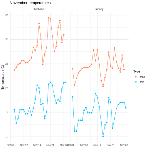
After all of that data manipulation perhaps you, like me, are a bit sick of looking at tables. Using visualizations is essential for communicating your results, because summary statistics can be misleading, and because large datasets don’t display well in tables.
I won’t go into too much theory here about the best way of visually representing different kinds of datasets, but I’d recommend everyone take a look at Claus Wilke’s excellent book ‘Fundamentals of data visualization’.
One popular framework for generating plots is the ‘grammar of graphics’ approach. The idea here is to build up a graphic from multiple layers of components, including:
- data and aesthetic mappings
- geometric objects
- scales
- facets
In this lesson we explore how to use these elements to make informative and visually appealing graphs.
We’ll again use the weather data for Brisbane and Sydney, so let’s load this dataset.
R
# load tidyverse
library(tidyverse)

# data files - readr can also read data from the internet
data_dir <- "https://raw.githubusercontent.com/szsctt/cmri_R_workshop/main/episodes/data/"
data_files <- file.path(data_dir, c("weather_sydney.csv", "weather_brisbane.csv"))

# column types
col_types <- list(
  date = col_date(format="%Y-%m-%d"),
  min_temp_c = col_double(),
  max_temp_c = col_double(),
  rainfall_mm = col_double(),
  evaporation_mm = col_double(),
  sunshine_hours = col_double(),
  dir_max_wind_gust = col_character(),
  speed_max_wind_gust_kph = col_double(),
  time_max_wind_gust = col_time(),
  temp_9am_c = col_double(),
  rel_humid_9am_pc = col_integer(),
  cloud_amount_9am_oktas = col_double(),
  wind_direction_9am = col_character(),
  wind_speed_9am_kph = col_double(),
  MSL_pressure_9am_hPa = col_double(),
  temp_3pm_c = col_double(),
  rel_humid_3pm_pc = col_double(),
  cloud_amount_3pm_oktas = col_double(),
  wind_direction_3pm = col_character(),
  wind_speed_3pm_kph = col_double(),
  MSL_pressure_3pm_hPa = col_double()
)

# read in data
weather <- readr::read_csv(data_files, skip=10,
                           col_types=col_types, col_names = names(col_types),
                           id="file") %>%
  mutate(city = stringr::str_extract(file, "brisbane|sydney")) %>%
  select(-file)

glimpse(weather)
OUTPUT
Rows: 57
Columns: 22
$ date                    <date> 2022-11-01, 2022-11-02, 2022-11-03, 2022-11-0…
$ min_temp_c              <dbl> 18.2, 11.1, 11.1, 13.4, 13.4, 13.3, 15.4, 16.0…
$ max_temp_c              <dbl> 24.0, 20.5, 22.0, 23.1, 23.6, 24.0, 24.2, 24.2…
$ rainfall_mm             <dbl> 0.2, 0.6, 0.0, 1.0, 0.2, 0.0, 0.0, 1.2, 0.2, 0…
$ evaporation_mm          <dbl> 4.6, 13.0, 7.8, 6.0, 4.4, 4.0, 9.8, 8.0, 8.0, …
$ sunshine_hours          <dbl> 9.5, 12.8, 8.9, 5.7, 11.8, 12.1, 12.3, 11.0, 1…
$ dir_max_wind_gust       <chr> "WNW", "W", "W", "SSE", "ENE", "ENE", "NE", "E…
$ speed_max_wind_gust_kph <dbl> 69, 67, 56, 26, 37, 39, 41, 35, 33, 43, 39, 26…
$ time_max_wind_gust      <time> 06:50:00, 12:54:00, 07:41:00, 23:24:00, 15:20…
$ temp_9am_c              <dbl> 19.2, 14.0, 15.9, 15.8, 17.7, 19.0, 20.4, 21.1…
$ rel_humid_9am_pc        <int> 45, 44, 50, 82, 76, 75, 80, 67, 77, 76, 60, 77…
$ cloud_amount_9am_oktas  <dbl> 2, 1, 1, 6, 3, 1, 5, 4, 7, 7, 4, 1, 8, 1, 2, 2…
$ wind_direction_9am      <chr> "WNW", "W", "WSW", "E", "WSW", "ESE", "E", "EN…
$ wind_speed_9am_kph      <dbl> 35, 31, 31, 6, 4, 6, 15, 15, 6, 7, 7, 4, 2, 11…
$ MSL_pressure_9am_hPa    <dbl> 992.9, 1003.2, 1014.7, 1026.9, 1029.7, 1026.6,…
$ temp_3pm_c              <dbl> 23.1, 19.7, 20.0, 22.8, 22.2, 23.1, 23.4, 24.0…
$ rel_humid_3pm_pc        <dbl> 30, 29, 42, 55, 60, 59, 58, 59, 46, 55, 56, 51…
$ cloud_amount_3pm_oktas  <dbl> 2, 1, 7, 5, 2, 1, 2, 2, 1, 1, 7, 3, 7, 2, 7, 7…
$ wind_direction_3pm      <chr> "WNW", "SW", "SE", "ENE", "ENE", "E", "ENE", "…
$ wind_speed_3pm_kph      <dbl> 31, 22, 20, 17, 24, 26, 24, 24, 26, 24, 17, 19…
$ MSL_pressure_3pm_hPa    <dbl> 992.0, 1005.9, 1016.6, 1026.8, 1026.9, 1023.3,…
$ city                    <chr> "sydney", "sydney", "sydney", "sydney", "sydne…
Data and aesthetic mappings
Any graph has to start with a dataset - and in the case of ggplot, this has to be a data frame (or tibble). We also start by specifying the aesthetic using aes(), which tells ggplot which columns should go on the x and y axes.
Let’s say that we want to plot the daily maximum temperature over the month for both cities. You can pipe the data into ggplot().
R
weather %>%
  ggplot(aes(x=date, y=max_temp_c))
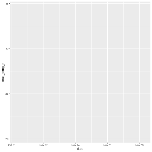
But we just get a blank graph! We have to tell ggplot how we want the data to be plotted (lines, points, violins, density, etc).
geoms
We use geoms to tell ggplot how we want to plot the data. In this case, we can use points:
R
weather %>%
  ggplot(aes(x=date, y=max_temp_c)) +
  geom_point()
WARNING
Warning: Removed 2 rows containing missing values (`geom_point()`).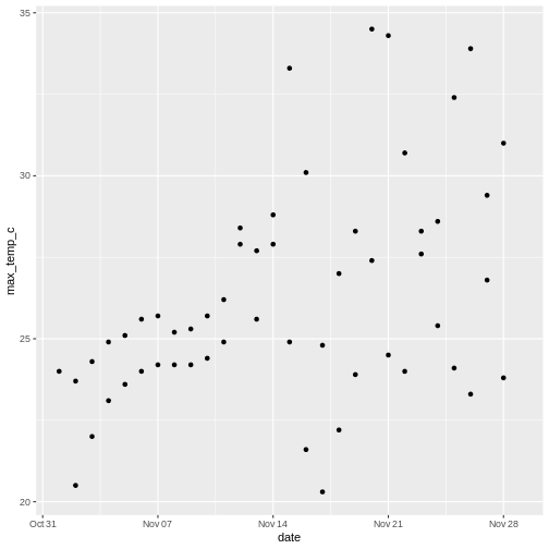
Note that we use a + to add layers to a ggplot, not the pipe (%>%). The ggplot2 package was developed before the magrittr package that contains %>%, so it uses the addition operator instead.
ggplot doesn’t know how to plot missing values, so it removes those rows and warns you that it’s doing so. Those warnings about missing values are going to get annoying, so I use a tidyr function to remove rows with NA in any column.
R
weather <- weather %>%
  # everything() means do this on all columns
  drop_na(everything())
There are a large number of geoms for displaying data in different ways - we will explore some here, but you can find more in the ggplot documentation.
Geoms and aesthetics
There are also other aesthetics you can specify, including colour (e.g. the colour of lines), fill (e.g. the colour used to fill a boxplot), size (e.g. the size of a point) and shape (e.g. the shape of a point).
Not all aesthetics are used by all geoms. In the documentation for each geom there will always be a section that tells you which aesthetics a geom understands. For example, the reference page for geom_point() tells us that this geom understands:
- x
- y
- alpha (transparency)
- colour
- fill
- group
- shape
- size
- stroke
R
weather %>%
  ggplot(aes(x=speed_max_wind_gust_kph, colour=city)) +
  geom_freqpoly(bins=10)
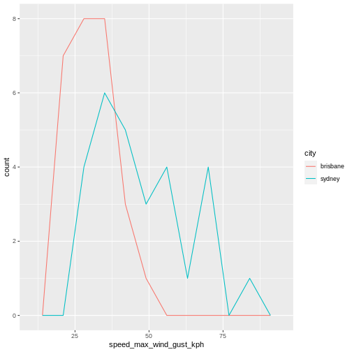
Layering geoms
Our initial graph looks OK, but we might want to know which temperature belongs to which city. Let’s add some colour to the aesthetic so we can compare the temperatures, as well as some lines to make it easier to see the change in temperature over time.
R
# plot temp over time with lines and points
weather %>%
  ggplot(aes(x=date, y=max_temp_c, colour=city)) +
  geom_point() +
  geom_line()
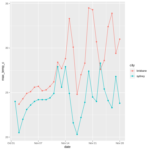
If we didn’t care about the time aspect and just wanted to compare the distribution of temperatures instead, we could plot city on the x axis, temperature on the y axis. To avoid points being on top of each other when the temperature is the same , I use geom_jitter() instead of geom_point(), which adds random jitter to each point before plotting.
R
# show differences between temps in Brisbane and Sydney
weather %>%
  ggplot(aes(x=city, y=max_temp_c, colour=city)) +
  geom_violin() +
  geom_jitter(height=0, width=0.1)
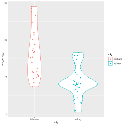
Notice that the geoms can also take arguments - for example, I’ve used geom_jitter(height=0, width=0.1 to control the amount of jitter added to each point (none in the y direction, a little bit in the x direction).
R
weather %>%
  ggplot(aes(x = max_temp_c, colour=city)) +
  geom_density() +
  geom_rug()
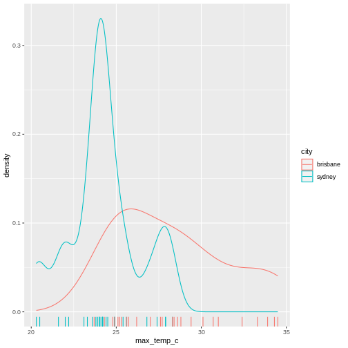
Summary statistics
Also notice that ggplot automatically calculates the density for us when it plots the violins. There are a number of other statistical transformations that ggplot can calculate for us. For example, we can plot the proportion of wind directions at 9am for each city:
R
# count number of observation of each direction in each city
weather %>%
  group_by(city, wind_direction_9am) %>%
  summarise(count = n()) %>%
  # make plot
  ggplot(aes(x=city, y = count, fill=wind_direction_9am)) +
  geom_col(position="fill")
OUTPUT
`summarise()` has grouped output by 'city'. You can override using the
`.groups` argument.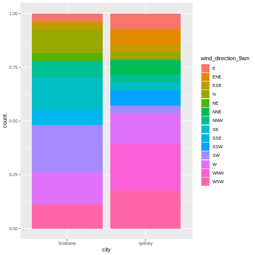
Notice that although we summarized the count of observations of each direction (i.e. number of days), ggplot plots the proportion of observations.
R
# count number of observation of each direction in each city
weather %>%
  group_by(city, wind_direction_9am) %>%
  summarise(count = n()) %>%
  # make plot
  ggplot(aes(x=city, y = count, fill=wind_direction_9am)) +
  geom_col()
OUTPUT
`summarise()` has grouped output by 'city'. You can override using the
`.groups` argument.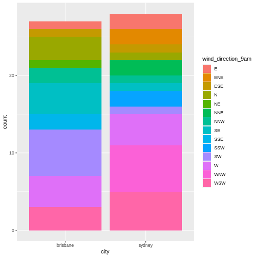
Now we get a count rather than a proportion - the y axis has a different scale and the bars are different heights.
Using multiple datasets
You can also use independent data and aesthetics for different geoms. For example, returning to our plot of temperature over time, we could add a horizontal line for each city to show the mean temperature.
R
# get mean temp for each city
mean_temps <- weather %>%
  group_by(city) %>%
  summarise(mean_temp = mean(max_temp_c, na.rm=TRUE))

# make plot
weather %>%
  ggplot(aes(x=date, y=max_temp_c, colour=city)) +
  # data and aesthetics are inherited from ggplot call
  geom_point() +
  geom_line() +
  # add horizontal line with different data and aesthetic
  geom_hline(data = mean_temps, mapping = aes(yintercept=mean_temp, colour=city))
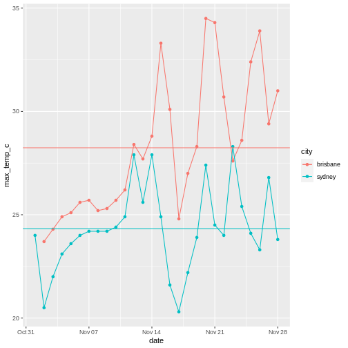
Non-gglot geoms
With the popularity of ggplot2, there are a number of other packages that provide geoms that you can use in your ggplot.
I won’t go into any detail about these, but a few that I’ve used include ggforce::geom_sina(), ggbeeswarm::geom_beeswarm() and ggwordcloud::geom_wordcloud(). If you want to make a particular kind of graph, somebody has probably made a geom for it.
Facets
Let’ say we want to compare the minimum and maximum temperatures for the two cities over time. We could make a plot with time on the x axis and temperature on the y axis, where the shape of the point indicates the city and the colour indicates whether the temperature was minimum or maximum.
However, currently our temperature data is spread out over two columns: mean_temp_c and max_temp_c, but in ggplot we need to assign the colour using colour=temp_type. So in order to make this plot, we need to rearrange the data a little using dplyr functions.
R
# pivot longer to facilitate plotting
weather %>%
  select(city, date, max_temp_c, min_temp_c) %>%
  pivot_longer(contains("temp"), names_to = "temp_type", values_to="temp") %>%
  # compare minimum and maximum temps in two cities
  ggplot(aes(x=date, y=temp, shape=city, colour=temp_type)) +
  geom_point() +
  geom_line()
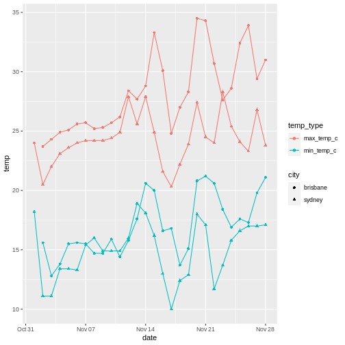
This works, but it’s a little difficult to tell the circles and the triangles apart. Instead, we can use facets to plot the data from each city side by side.
R
# pivot longer
weather %>%
  select(city, date, max_temp_c, min_temp_c) %>%
  pivot_longer(contains("temp"), names_to = "temp_type", values_to="temp") %>%
  # compare minimum and maximum temps in two cities
  ggplot(aes(x=date, y=temp, colour=temp_type)) +
  geom_point() +
  geom_line() +
  # facet on city
  facet_wrap(vars(city))
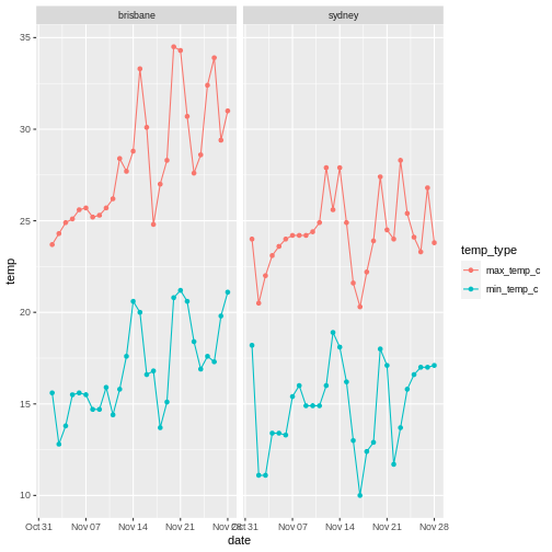
You can facet on multiple variables, for example:
R
# pivot longer
weather %>%
  select(city, date, max_temp_c, min_temp_c) %>%
  pivot_longer(contains("temp"), names_to = "temp_type", values_to="temp") %>%
  # compare minimum and maximum temps in two cities
  ggplot(aes(x=date, y=temp, colour=temp_type)) +
  geom_point() +
  geom_line() +
  # facet on city
  facet_grid(cols=vars(city), rows=vars(temp_type), scales="free_y")
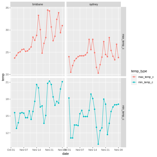
The scales="free_y" argument allows the y-axis scales on each row to be different.
In this case I think the comparison is clearer without the extra faceting variable. Don’t go too crazy with your faceting, but instead think about what story you are trying to tell.
R
weather %>%
  ggplot(aes(x=speed_max_wind_gust_kph, colour=dir_max_wind_gust)) +
  geom_density() +
  facet_grid(rows = vars(city), scales="free")
WARNING
Warning: Groups with fewer than two data points have been dropped.
Groups with fewer than two data points have been dropped.
Groups with fewer than two data points have been dropped.
Groups with fewer than two data points have been dropped.
Groups with fewer than two data points have been dropped.
Groups with fewer than two data points have been dropped.
Groups with fewer than two data points have been dropped.
Groups with fewer than two data points have been dropped.
Groups with fewer than two data points have been dropped.
Groups with fewer than two data points have been dropped.
WARNING
Warning in max(ids, na.rm = TRUE): no non-missing arguments to max; returning
-Inf

Warning in max(ids, na.rm = TRUE): no non-missing arguments to max; returning
-Inf

Warning in max(ids, na.rm = TRUE): no non-missing arguments to max; returning
-Inf

Warning in max(ids, na.rm = TRUE): no non-missing arguments to max; returning
-Inf

Warning in max(ids, na.rm = TRUE): no non-missing arguments to max; returning
-Inf

Warning in max(ids, na.rm = TRUE): no non-missing arguments to max; returning
-Inf

Warning in max(ids, na.rm = TRUE): no non-missing arguments to max; returning
-Inf

Warning in max(ids, na.rm = TRUE): no non-missing arguments to max; returning
-Inf

Warning in max(ids, na.rm = TRUE): no non-missing arguments to max; returning
-Inf

Warning in max(ids, na.rm = TRUE): no non-missing arguments to max; returning
-Inf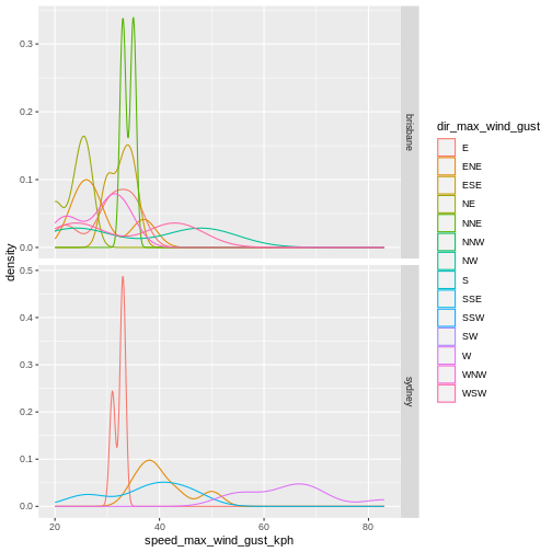
This is not a particularly informative graphs because there are so few points for each direction.
Visual customization: Labels, themes and scales
There are a number of other customization that you can use to display your data more clearly.
Axes labels
It’s important to always label your x and y axes - ggplot does this for you using the column names, but usually the column names are short for ease of coding but you want your labels to be more informative/pretty.
Use the labs() function to add labels, and scale_colour_discrete() to change the title and label for the legend.
R
# pivot longer
weather %>%
  select(city, date, max_temp_c, min_temp_c) %>%
  pivot_longer(contains("temp"), names_to = "temp_type", values_to="temp") %>%
  # compare minimum and maximum temps in two cities
  ggplot(aes(x=date, y=temp, colour=temp_type)) +
  geom_point() +
  geom_line() +
  # facet on city
  facet_wrap(vars(city)) +
  # add label
  labs(x="Date", y="Temperature (°C)", title = "November temperatures") +
  # change legend
  scale_colour_discrete(name = "Type", labels=c("max", "min"))
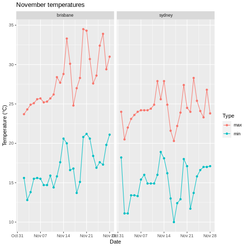
Note that when changing the legend, you have to match the function to the aesthetic. So scale_colour_disrete() acts on a discrete colour scale, scale_colour_continuous() acts on a continuous colour scale, scale_fill_discrete() acts on a discrete fill scale, etc.
If you’re trying to change a legend but it doesn’t seem to be working, check that you used the correct function for your data type and aesthetic!
Scales
We used scale_colour_disrete() to change the labels in the legend earlier, but there are a number of scale functions in ggplot2 that can be used to change many other aspects of graphs.
Colour scales
If you are unhappy with the default colour scale that ggplot provides, you can change it using an appropriate scaling function - for example, scale_colour_discrete() for discrete colour scales, scale_fill_continuous for continuous fill scales, etc.
R
# pivot longer
weather %>%
  select(city, date, max_temp_c, min_temp_c) %>%
  pivot_longer(contains("temp"), names_to = "temp_type", values_to="temp") %>%
  # compare minimum and maximum temps in two cities
  ggplot(aes(x=date, y=temp, colour=temp_type)) +
  geom_point() +
  geom_line() +
  # facet on city
  facet_wrap(vars(city)) +
  # add label
  labs(x="Date", y="Temperature (°C)", title = "November temperatures") +
  # change colour scale
  scale_colour_discrete(type=c("red", "blue"), name = "Type", labels=c("max", "min"))
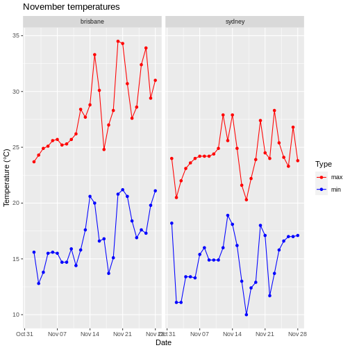
Specifying colors
There are a number of different ways you can specify colours to use. One is to use colour names, as above, although this requires you to know what the allowed colour names are. I tend to use this list of colour names for R.
Another is to use a package to generate colour names for you. For example, I tend to use virids for continuous scales because it’s colourblind-friendly. Another favourite is wesanderson, which makes palettes from Wes Anderson movies.
Finally, you can also use RGB hexidecimal values to specify colours (as a string, e.g. ‘#52934D’). There are several websites you can use to create colours and find their codes, for example htmlcolorcodes.com.
When choosing colors, it’s worth thinking about how colour blind people might see your plot. There are lots of resources on the internet about colourblind-friendly palettes, and you can upload your plot to coblis to see how it might appear to people with various kinds of colorblindness.
Applying logarithmic scales
Let’s say we now have exponentially distributed data. None of our weather data really is, so let’s simulate some by drawing from two different exponential distributions with different rates.
R
exp_data <- tibble(
  # two groups
  group = c(rep("a", 50),
            rep("b", 50)),
  # rexp samples from exponential distribution
  freq = c(rexp(n=50, rate=500),
            rexp(n=50, rate=10))
)

# compare freq between groups
exp_data %>%
  ggplot(aes(x=group, y=freq)) +
  geom_violin() +
  geom_jitter(height = 0, width=0.1)
This plot isn’t so nice because the two groups are on different scales. Changing the scale on your plot to logarithmic is easy with ggplot. Just add scale_x_log10(), scale_y_log10(), etc:
R
# compare freq between groups on log scale
exp_data %>%
  ggplot(aes(x=group, y=freq)) +
  geom_violin() +
  geom_jitter(height = 0, width=0.1) +
  scale_y_log10()
Themes
ggplot also allows you to customize the appearance of the plot in other ways. Getting back to our weather example, if you wanted to remove the x axis labels because you decided that it’s already clear what is on that axis, you can do that with theme().
R
# pivot longer
weather %>%
  select(city, date, max_temp_c, min_temp_c) %>%
  pivot_longer(contains("temp"), names_to = "temp_type", values_to="temp") %>%
  # plot lines and points
  ggplot(aes(x=date, y=temp, colour=temp_type)) +
  geom_point() +
  geom_line() +
  # facet on city
  facet_wrap(vars(city)) +
  # add label
  labs(x="Date", y="Temperature (°C)", title = "November temperatures") +
  # change colour scale
  scale_colour_discrete(type=c("red", "blue"), name = "Type", labels=c("max", "min")) +
  # remove x axis label
  theme(axis.title.x = element_blank())
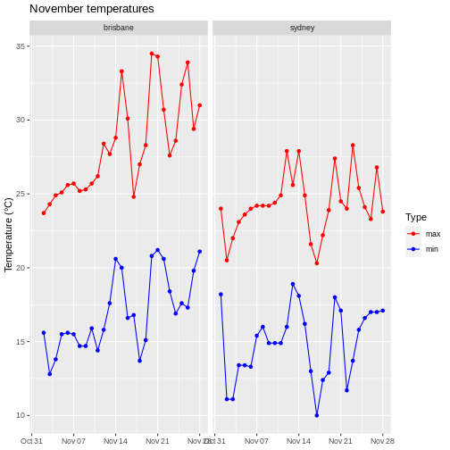
There are many aspects of the plot you can customize this way: check the ggplot2 documentation for more information.
You can also change many aspects of the plot at once with pre-configured themes, for example theme_light().
R
# pivot longer
weather %>%
  select(city, date, max_temp_c, min_temp_c) %>%
  pivot_longer(contains("temp"), names_to = "temp_type", values_to="temp") %>%
  # plot lines and points
  ggplot(aes(x=date, y=temp, colour=temp_type)) +
  geom_point() +
  geom_line() +
  # facet on city
  facet_wrap(vars(city)) +
  # add label
  labs(x="Date", y="Temperature (°C)", title = "November temperatures") +
  # change colour scale
  scale_colour_discrete(type=c("red", "blue"), name = "Type", labels=c("max", "min")) +
  # change to theme classic
  theme_light() +
  # remove x axis label
  theme(axis.title.x = element_blank())
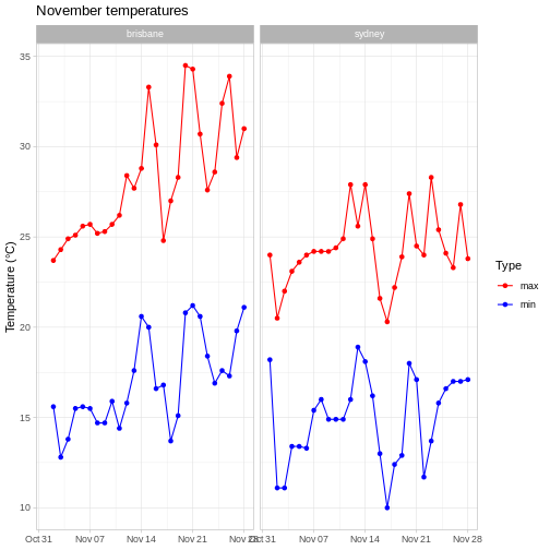
Note that we have to do this before we remove the x axis label, because in theme_light(), the axis.title.x parameter is set to something other than element_blank(), so this would overwrite our call to theme().
You can find out more about the other available themes in the ggplot2 documentation.
This is open-ended, but one solution is:
R
# pivot longer
weather %>%
  select(city, date, max_temp_c, min_temp_c) %>%
  pivot_longer(contains("temp"), names_to = "temp_type", values_to="temp") %>%
  # compare minimum and maximum temps in two cities
  ggplot(aes(x=date, y=temp, colour=temp_type)) +
  geom_point() +
  geom_line() +
  # facet on city
  facet_wrap(vars(city)) +
  # add label
  labs(x="Date", y="Temperature (°C)", title = "November temperatures") +
  # change colour scale
  scale_colour_discrete(type=c("coral", "deepskyblue"), name = "Type", labels=c("max", "min")) +
  # add minimal theme
  theme_minimal() +
  # remove x axis label
  theme(axis.title.x = element_blank())
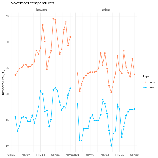
Saving plots
Saving plots with ggplot is easy - just use ggsave(). This will either save the last plot you generated, or you can assign the plot to a variable and use that to tell the function while plot to save.
It works with a variety of formats - I usually use .pdf as a vector format (e.g. for publications) and .png as a raster format (e.g. for slides). The function will infer the format you want from the file name you provide. You can also specify the width and height of the output file (you’ll probably want units="cm").
R
# assign the result to variable p
 p <- weather %>%
  # pivot longer
  select(city, date, max_temp_c, min_temp_c) %>%
  pivot_longer(contains("temp"), names_to = "temp_type", values_to="temp") %>%
  # plot lines and points
  ggplot(aes(x=date, y=temp, colour=temp_type)) +
  geom_point() +
  geom_line() +
  # facet on city
  facet_wrap(vars(city)) +
  # add label
  labs(x="Date", y="Temperature (°C)", title = "November temperatures") +
  # change colour scale
  scale_colour_discrete(type=c("red", "blue"), name = "Type", labels=c("max", "min")) +
  # change to theme classic
  theme_light() +
  # remove x axis label
  theme(axis.title.x = element_blank())

ggsave(here::here("my_great_plot.png"), plot=p, height=10, width=17, units="cm")
Combining plots with patchwork
Making individual plots is well and good, but sometime it’s useful to combine them together to make a figure with multiple panels. Although it’s possible to do this with Illustrator, doing your whole figure generation process in R (or another language) will allow you to easily reproduce your figures (for example, when adding new data or for visual tweaks). To quote Claus Wilke
I think figures should be autogenerated as part of the data analysis pipeline (which should also be automated), and they should come out of the pipeline ready to be sent to the printer, no manual post-processing needed. I see a lot of trainees autogenerate rough drafts of their figures, which they then import into Illustrator for sprucing up. There are several reasons why this is a bad idea. First, the moment you manually edit a figure, your final figure becomes irreproducible. A third party cannot generate the exact same figure you did. While this may not matter much if all you did was change the font of the axis labels, the lines are blurry, and it’s easy to cross over into territory where things are less clear cut. As an example, let’s say you want to manually replace cryptic labels with more readable ones. A third party may not be able to verify that the label replacement was appropriate. Second, if you add a lot of manual post-processing to your figure-preparation pipeline then you will be more reluctant to make any changes or redo your work. Thus, you may ignore reasonable requests for change made by collaborators or colleagues, or you may be tempted to re-use an old figure even though you actually regenerated all the data. These are not made-up examples. I’ve seen all of them play out with real people and real papers. Third, you may yourself forget what exactly you did to prepare a given figure, or you may not be able to generate a future figure on new data that exactly visually matches your earlier figure.
To combine plots together, I often use the patchwork package (although there are also good alternatives, such as cowplot for the aforementioned Claus Wilke). In this package, we can combine plots using the + and / operators.
R
# import patchwork library
library(patchwork)

# plot max and min temperatures
p1 <- weather %>%
  select(city, date, max_temp_c, min_temp_c) %>%
  pivot_longer(contains("temp"), names_to = "temp_type", values_to="temp") %>%
  # compare minimum and maximum temps in two cities
  ggplot(aes(x=date, y=temp, colour=temp_type)) +
  geom_point() +
  geom_line() +
  # facet on city
  facet_wrap(vars(city)) +
  # add label
  labs(x="Date", y="Temperature (°C)") +
  # change colour scale
  scale_colour_discrete(name = "Type", labels=c("max", "min"))

# plot wind directions
p2 <- weather %>%
  # count number of observation of each direction in each city
  group_by(city, wind_direction_9am) %>%
  summarise(count = n(), .groups="drop") %>%
  # make plot
  ggplot(aes(x=city, y = count, fill=wind_direction_9am)) +
  geom_bar(position="fill", stat="identity") +
  # move legend to bottom
  theme(legend.position = "bottom") +
  # axis labels
  labs(x = "City", y="Proportion")

# plot temperatures
p3 <- weather %>%
  #  compare max temps between cities
  ggplot(aes(x=city, y=max_temp_c, colour=city)) +
  geom_violin() +
  geom_jitter(height=0, width=0.1) +
  # change colours to avoid confusion with p1
  scale_colour_discrete(type=wesanderson::wes_palette("GrandBudapest1", n=2)) +
  # axis labels
  labs(x = "City", y="Max. temperature (°C)")

combined_plot <- p1 / (p2 + p3)
combined_plot
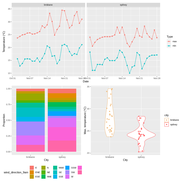
Patchwork also allows you to add annotation to your combined plot, for example labels ‘A’, ‘B’, ‘C’.
R
combined_plot +
  plot_annotation(tag_levels = 'A')
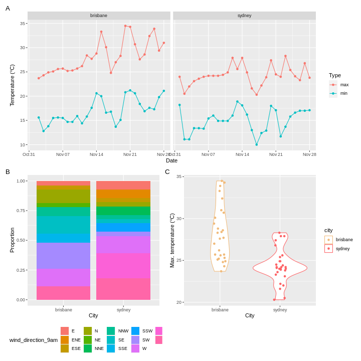
There are many more features of patchwork which I will leave you to explore - the documentation is linked in the resources section. For example, patchwork will combine things other than ggplots if you can convert them to a form that it understands using ggplotify::as_ggplot().
Resources
- ggplot2 cheatsheet
- Fundamentals of data vizualization by Claus Wilke
- ggplot documentation
- patchwork documentation
- wesanderson documentation
- ggplotify documentation
Keypoints
- Use
ggplot()to create a plot and specify the default dataset and aesthetic (aes()) - Use
geomsto specify how the data should be displayed - Use
facet_wrap()andfacet_grid()to create facets - Use
scalesto change the scales in your plot - Use
theme()and theme presets to modify plot appearance - Use
patchworkorcowplotto combine plots into one figure
Content from Bioconductor and other bioinformatics packages
Last updated on 2023-01-24 | Edit this page
Overview
Questions
- What is bioconductor?
- What are some bioconductor packages?
Objectives
- Install bioconductor packages with
BiocManager - Be aware of some
Bioconductor packages
- Use
BiocManager::install(). - In the same way as other
Rpackages. All will have avignettedemonstrating how to use the package, and most will have some other guides demonstrating aspects of the package.
Introduction to Bioconductor
We’ll quickly take a look at theBioconductor ecosystem, a collection of R packages for bioinformatics. Usually these solve specific problems (like RNA-seq analysis or plotting genomic data), so they won’t be as applicable to everyone here.
The goal of this lesson is therefore to let you know about some packages from bioconductor that I’ve found useful, but we won’t actually go into any detail about how to use them. All of the Bioconductor packages have vignettes that will show you how to use the core functionality of the package.
Installing packages with BiocManager
While typically you’d use install.packages() to install R packages, Bioconductor has it’s own package manager. The package manager is called BiocManager, and you can install it as you would any other package:
R
# install BiocManager
install.packages("BiocManager")
You can then use this package to install other Bioconductor packages, for example:
R
BiocManager::install("DESeq2")
Bioconductor also has it’s own release schedule, which are designed to work with particular versions of R.
At the time of writing, the current version is 3.16, which works with R version 4.2.0. If you have an older version of R, you will need to use an older version of Bioconductor as well - there’s a list of the older releases on the Bioconductor website. You can tell BiocManager which release to use:
R
BiocManager::install(version="3.16")
This won’t actually install anything, but all future installs will use version 3.16.
Biostrings
A common task (at least for me) is working with biological sequences (e.g. DNA, RNA, amino acid). A useful package for this is Biostrings.
Install this package with the following code
R
BiocManager::install("Biostrings")
Biostrings contains useful variable and functions for working with sequences. For example, you can translate a nucleotide sequence:
R
# load library
library(biostrings)
R
# create DNAString object
my_seq <- DNAString("GTAAGTGTATGC")

# translate to amino acids
translate(my_seq)
OUTPUT
4-letter AAString object
seq: VSVC
Or calculate the frequency of each nucleotide:
R
alphabetFrequency(my_seq)
OUTPUT
A C G T M R W S Y K V H D B N - + .
3 1 4 4 0 0 0 0 0 0 0 0 0 0 0 0 0 0
Or the codon frequencies
R
trinucleotideFrequency(my_seq)
OUTPUT
AAA AAC AAG AAT ACA ACC ACG ACT AGA AGC AGG AGT ATA ATC ATG ATT CAA CAC CAG CAT
  0   0   1   0   0   0   0   0   0   0   0   1   0   0   1   0   0   0   0   0
CCA CCC CCG CCT CGA CGC CGG CGT CTA CTC CTG CTT GAA GAC GAG GAT GCA GCC GCG GCT
  0   0   0   0   0   0   0   0   0   0   0   0   0   0   0   0   0   0   0   0
GGA GGC GGG GGT GTA GTC GTG GTT TAA TAC TAG TAT TCA TCC TCG TCT TGA TGC TGG TGT
  0   0   0   0   2   0   1   0   1   0   0   1   0   0   0   0   0   1   0   1
TTA TTC TTG TTT
  0   0   0   0
It also contains a codon table
R
GENETIC_CODE
OUTPUT
TTT TTC TTA TTG TCT TCC TCA TCG TAT TAC TAA TAG TGT TGC TGA TGG CTT CTC CTA CTG
"F" "F" "L" "L" "S" "S" "S" "S" "Y" "Y" "*" "*" "C" "C" "*" "W" "L" "L" "L" "L"
CCT CCC CCA CCG CAT CAC CAA CAG CGT CGC CGA CGG ATT ATC ATA ATG ACT ACC ACA ACG
"P" "P" "P" "P" "H" "H" "Q" "Q" "R" "R" "R" "R" "I" "I" "I" "M" "T" "T" "T" "T"
AAT AAC AAA AAG AGT AGC AGA AGG GTT GTC GTA GTG GCT GCC GCA GCG GAT GAC GAA GAG
"N" "N" "K" "K" "S" "S" "R" "R" "V" "V" "V" "V" "A" "A" "A" "A" "D" "D" "E" "E"
GGT GGC GGA GGG
"G" "G" "G" "G"
attr(,"alt_init_codons")
[1] "TTG" "CTG"
It has many more features which you can explore if you need to use this package.
Plotting genomic information
Another relatively common task for me is plotting genomic information. There are a number of ways to do this, but here I’ll just give one example - plotting the density of SNPs in the human albumin gene (ALB).
First, I grabbed the SNP information for this gene from gnomAD as a csv, and read in this information using readr::read_csv()
R
# load data
alb <- readr::read_csv(here::here("episodes", "data", "gnomAD_v3.1.2_ENSG00000163631_2022_11_25_11_56_32.csv"), show_col_types = FALSE)
Next, we need to convert the SNP locations into a GRanges object - this is an object from the GenomicRanges package that is designed to store genomic coordinates and associated metadata. I won’t go into detail about this either, but you can find more information about this package in the documentation.
R
# for pipe
library(magrittr, quietly=TRUE)
OUTPUT
Attaching package: 'magrittr'OUTPUT
The following object is masked from 'package:GenomicRanges':

    subtract
R
alb_gr <- alb %>%
  # add "chr" to chromosome number
  dplyr::mutate(Chromosome = paste0("chr", Chromosome)) %>%
  # convert to GRanges object
  GenomicRanges::makeGRangesFromDataFrame(
    seqnames.field="Chromosome",
    start.field = "Position",
    end.field="Position",
    keep.extra.columns = FALSE
  )

alb_gr
OUTPUT
GRanges object with 850 ranges and 0 metadata columns:
        seqnames    ranges strand
           <Rle> <IRanges>  <Rle>
    [1]     chr4  73397115      *
    [2]     chr4  73397120      *
    [3]     chr4  73397122      *
    [4]     chr4  73397122      *
    [5]     chr4  73397123      *
    ...      ...       ...    ...
  [846]     chr4  73421175      *
  [847]     chr4  73421187      *
  [848]     chr4  73421188      *
  [849]     chr4  73421189      *
  [850]     chr4  73421193      *
  -------
  seqinfo: 1 sequence from an unspecified genome; no seqlengths
Now we have the data loaded, we’re ready to start making the plot.
KaryoploteR
Here I’m more or less following part of the karyploteR tutorial.
This is human data, so we plot the albumin locus in the human genome. I used the UCSC genome brower to identify the coordinates for ALB (roughly chr4:73,394,000-73,425,000), but you could equally use Ensembl.
R
library(karyoploteR)
# this package contains transcript information for the human genome
library(TxDb.Hsapiens.UCSC.hg38.knownGene)
R
# region to plot
region <- "chr4:73,394,000-73,425,000"

# draw axis
kp <- plotKaryotype(zoom = region)

# transcript information
genes.data <- makeGenesDataFromTxDb(TxDb.Hsapiens.UCSC.hg38.knownGene,
                                    karyoplot=kp,
                                    plot.transcripts = TRUE,
                                    plot.transcripts.structure = TRUE)
OUTPUT
  1662 genes were dropped because they have exons located on both strands
  of the same reference sequence or on more than one reference sequence,
  so cannot be represented by a single genomic range.
  Use 'single.strand.genes.only=FALSE' to get all the genes in a
  GRangesList object, or use suppressMessages() to suppress this message.
R
# add gene names
genes.data <- addGeneNames(genes.data)
OUTPUT
Loading required package: org.Hs.eg.dbOUTPUT
R
# merge overlapping transcripts
genes.data <- mergeTranscripts(genes.data)

# draw genes
kpPlotGenes(kp, data=genes.data, r0=0, r1=0.15)
# draw SNP density
kpPlotDensity(kp, data=alb_gr, window=100, r0=0.3, r1=1)
circlize
Another package for plotting genomic information is circlize, which plots chromosome in a circle rather than in a linear format. I won’t cover this in any detail, but you can check out the documentation for more information.
RNA-seq
One common tasks people use Bioconductor packages for is RNA-seq analysis. The steps in RNA-seq analysis are roughly the following:
- Alignment of reads using splice-aware mapper (I use
STAR) - Counting reads aligned to each exon/transcript/gene (I use
htseq-countfromHTSeq) - Downstream analysis with counts - batch correction, differential expression, gene ontology, pathway analysis, etc
While it’s possible to do the entire RNA-seq analysis pipeline, from reads to differential expressed genes, in R, you’ll notice that I usually do the first two steps using other software. This mostly comes down to momentum - this is how I was taught - but also has to do with the perception that R easier to use but slower and more memory-intensive than other languages (like C++, the language in which STAR is written).
We could spend a whole session (or workshop) on RNA-seq, so instead of trying to cover all of this material, I’ll instead link to several resources that might be helpful for experimental design and data processing.
- Notes on RNA-seq experimental design (Very important!! Without proper experimental design you are only wasting time and money.)
- The DESeq2 vignette
- The EdgeR vignette
- Materials from a two-day RNA-seq workshop
- Sample differential gene expression workflow
If you’re more interested in single cell analysis, the workflow is in principle the same, but there is the added complication of counting barcodes from each cell. If your data is from a 10X workflow, the easiest way to go from reads to counts is using their cellranger pipeline. Once you have the count matrices, you can then use R packages for further analysis.
Resources
- BiocManager vignette
- Biostrings lab
- Biostrings documentation
- karyoploteR documentation
- circlize documentation
- Notes on RNA-seq experimental design (Very important!! Without proper experimental design you are only wasting time and money.)
- The DESeq2 vignette
- The EdgeR vignette
- Materials from a two-day RNA-seq workshop
- Sample differential gene expression workflow
- Seurat documentation
- Monocle3 documentation
Content from Using R markdown for notebooks and documents
Last updated on 2023-01-24 | Edit this page
Overview
Questions
- How do you write a notebook or document using R Markdown?
Objectives
- Explain how to use markdown documents and notebooks
- Demonstrate how to include a header, markdown elements, pieces of code and code outputs
- Discuss how to render documents and notebooks
Do I need to do this lesson?
If you can answer the following questions, you can skip this lesson.
- What does a R markdown header look like?
- How do you insert headings in an R markdown file?
- How do you insert chunks in an R markdown file, and what do they look like?
- What is the difference between an R markdown document and notebook?
- How do you render an R markdown file?
- It looks something like this
YAML
---
title: "Habits"
author: Jane Doe
date: March 22, 2005
output: html_document
---- Use one two four hashes (
#) at the start of the line. - Insert code blocks by typing them manually, in the menu bar under Code > Insert Chunk, or with the shortcut Cmd/Ctrl + Option + i. They look like this:
MARKDOWN
```{r chunk-name}
y <- 2
print(y)
```- For a notebook, an output is generated every time you save it. A document is only rendered when you Knit it.
- Use the Knit or Preview buttons, or use the function
rmarkdown::render(). For notebooks, just save the file to automatically render the file with any outputs that currently appear in Rstudio.
Rmarkdown for reproducible, documented analyis
For a long time, most R code was written in scripts. These are just plain old text files, usually with the file extension .R, which contain R code. Any documentation in these scripts was in the form of comments, and any graphic generated had to be saved to file (or viewed in a window, then closed).
This paradigm worked, but it was lacking an integrated view of the results of the analysis. This is the problem that knitr and R markdown were developed to address.
R markdown allows the user to create notebooks and documents that contain text elements (formatted using markdown), and R code. If I’ve ever sent you a .html file containing some results, this is how I generated it. Other formats are possible for data export, including .pdf, but I tend to always use .html for it’s interactive elements.
Documents you create are rendered into the final output format that you’ve specified, by running all the code and combining the outputs it with your markdown text.
Although simple, this approach is powerful; I wrote all the content on this website using R markdown files.
Rmarkdown header
R markdown files always start with a header, which is formatted in YAML, and at it’s most basic looks something like this:
YAML
---
title: "R Notebook"
output: html_notebook
---
That’s it: just a title and an output.
Output types
When you create a .Rmd file, you’ll have to choose if you want it to be a notebook (output: html_notebook), a document (output: html_document), or some other output type (for example, output: pdf_document).
Notebooks and documents are very similar, and the only difference between html documents and notebooks is that a .html file is created with your analysis every time you save a notebook, whereas an output file will only be created for a document when you tell RStudio to render it.
If you want, you can add an author and a date, for example:
YAML
---
title: "Habits"
author: Jane Doe
date: "22 November 2022"
output: html_document
---
Sometimes I want the date to be updated every time I render the document. You can do this by replacing the date with some R code.
YAML
---
title: "Habits"
author: Jane Doe
date: "`r Sys.Date()`"
output: html_document
---
There are also lots of options for html documents and notebooks. I often use:
YAML
---
title: "Habits"
author: Jane Doe
date: "`r Sys.Date()`"
output:
  html_document:
    keep_md: true
    df_print: paged
    toc: true
    toc_float:
      collapsed: false
      smooth_scroll: false
    code_folding: hide
---
You can also add parameters in your header that you can use throughout your code:
YAML
---
title: "Habits"
author: Jane Doe
date: "`r Sys.Date()`"
output:
  html_document:
    keep_md: true
    df_print: paged
    toc: true
    toc_float:
      collapsed: false
      smooth_scroll: false
    code_folding: hide
params:
  test: true
  species: "human"
---
You can then refer to these parameters using the syntax params$test and params$species.
Markdown
Writing the markdown part of the file is are pretty simple. Use # for headings.
MARKDOWN
# Largest heading
## Large heading
### Medium heading
#### Small heading
To create paragraphs, leave at least one blank line between text.
MARKDOWN
This is a paragraph.

This is a different paragraph.
To add a line break (to prevent sentences from running on from one another), add two spaces at the end of the line.
MARKDOWN
This is a line.
This is another line.
To add emphasis, use * or _.
MARKDOWN
This text is **bold**.
This text is __also bold__.
This text is in *italics*.
This text is also in _italics_.
This text is both ***bold and in italics***.
___Same here___.
To create a block quote, add > to the start of each line.
MARKDOWN
> This will be a quote
>
> that's all in the same block
To make a list, use numbers or dashes.
MARKDOWN
This is an unordered list:

 - element a
 - element b
 - element c

This is an ordered list:

1. element 1
2. element 2
3. element 3
If you want to display code, use backticks:
MARKDOWN
This is `inline` code.

```r
print("this is an R code block")
```
To add images, use this syntax:
MARKDOWN
You can add links using parentheses and brackets:
MARKDOWN
You can read more in the [documentation](https://www.markdownguide.org/basic-syntax/)Adding code
Adding code blocks is also easy. Use the shortcut Cmd/ctrl + Option + i. You can also check what the shortcut is on your machine in the menu bar under Code > Insert Chunk.
Code blocks look like this:
MARKDOWN
```{r chunk-name}
y <- 2
print(y)
```
There are lots of options to control how the code block and it’s output is displayed. For example:
MARKDOWN
```{r chunk-name2, echo=FALSE}
print("this code block won't appear in the output, but its output will")
```MARKDOWN
```{r chunk-name3, include=FALSE}
print("this code block won't appear in the output, and neither will it's output")
```If your code block produces a plot, the plot will appear in the report. You can change the size of the plot with options as well.
MARKDOWN
```{r chunk-name4, fig.width=8, fig.height=8}
tibble(
group = c("A", "A", "B", "B"),
y = runif(4)
) %>%
ggplot(aes(x=group, y = y)) +
geom_point()
```You can also apply options to all chunks using knitr::set_opts() at the top of your file.
MD
```r
knitr::opts_chunk$set(
echo=FALSE, fig.width = 6, fig.height = 6
)
```Inline code
You can also insert inline code in R markdown by using the syntax r my_expression. However, I don’t tend to do this much in documents because every time I re-open the file, using variables in these code blocks cause problems (because they don’t exist yet).
If you’re going to use inline code a lot, I’d recommend you stick to using R markdown documents instead of notebooks.
Rendering notebooks
There are a few different ways you can render your R markdown file. The easiest is to use the dedicated button in Rstudio. For documents, it’ at the top of your document and looks like this:
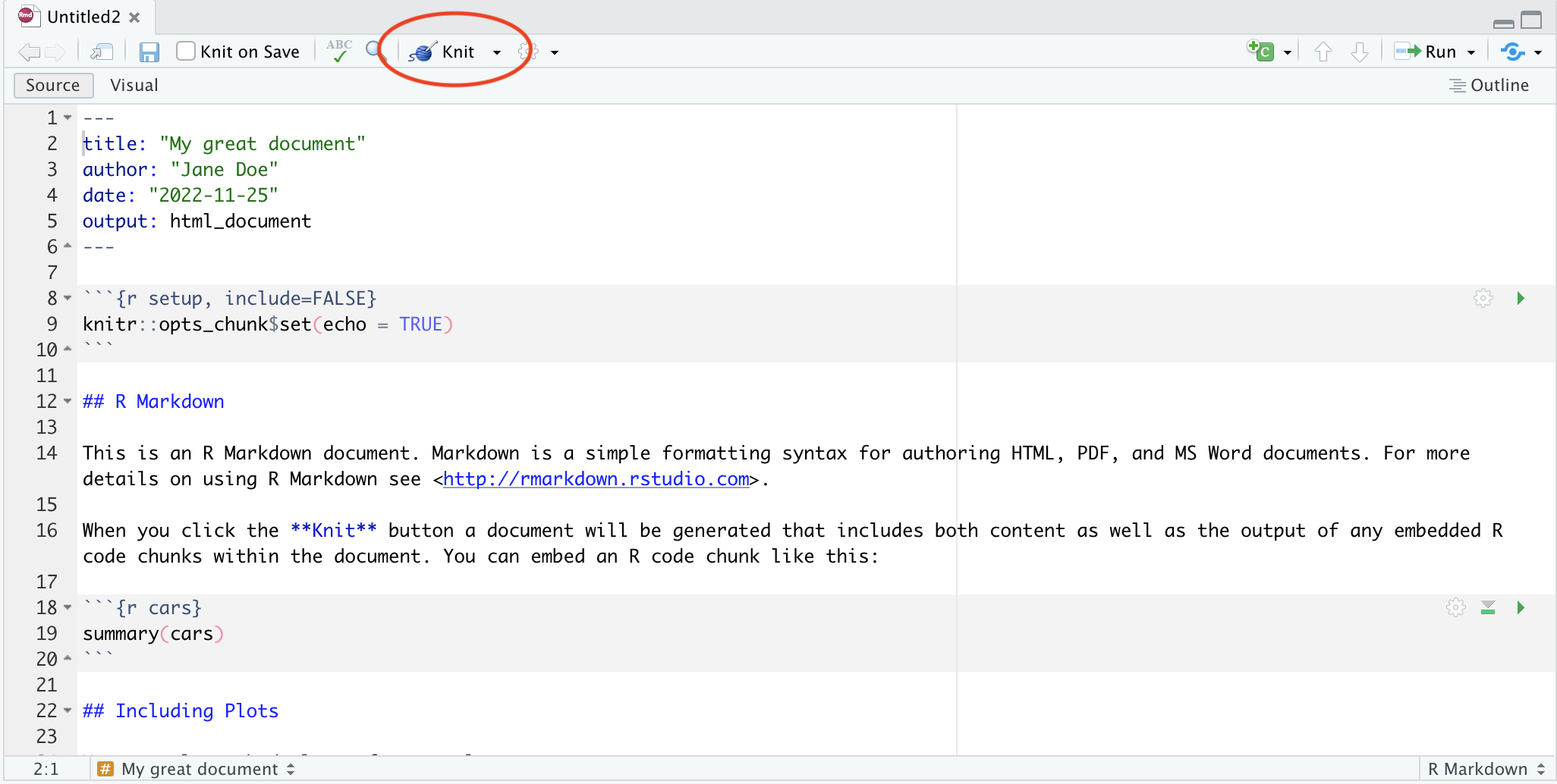
For notebooks, you don’t need to manually render - every time you save the file, R will knit it for you. But if you want to see what the notebook will look like, you can press the preview button:
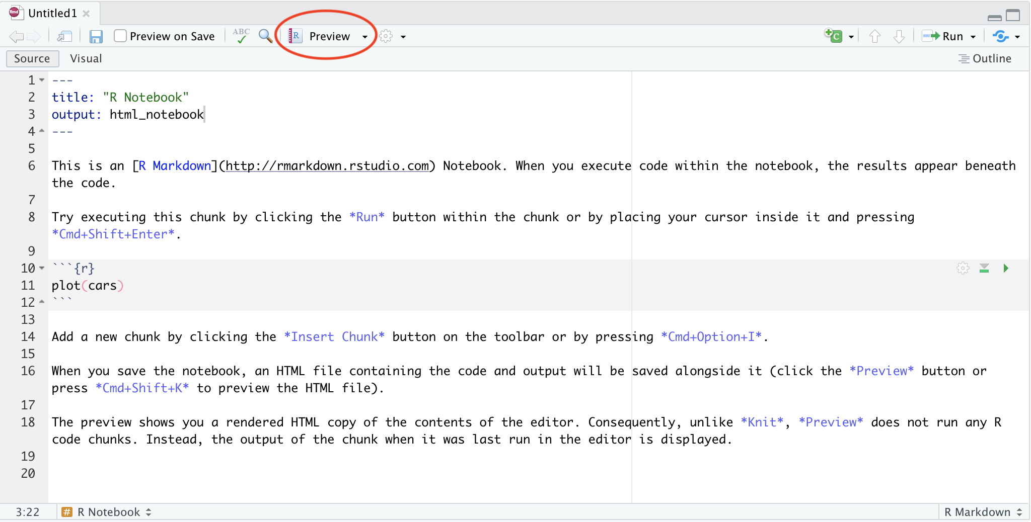
You can also render your notebook using code:
R
rmarkdown::render("/path/to/file.Rmd")
If you set parameters, you can change them when you render the notebook:
R
rmarkdown::render("/path/to/file.Rmd", params = list(test=FALSE, speces="macaque"))
Other file types
There are also a number of other outputs you can produce from your R markdown other than html notebooks and documents. In particular, I’ve been playing around with slides using Quatro and ioslides. They can be a little tricky compared to power point, and a bit slow to render if your analysis is compute-heavy, but I think they’re worth considering!
This area is actively being developed, so it’s worth trying out new technologies when they are available.
References
Content from Version control with git
Last updated on 2023-01-24 | Edit this page
Overview
Questions
- What is version control?
- How to use git in Rstudio?
Objectives
- Explain the basics of git
- Demonstrate how stage and commit files
- Demonstrate pulls and pushes from a remote repository
Read the rest of the lesson if you don’t know how to stage, commit, push or pull changes!
Version control with git
Have you ever needed to refer back to the edit history of a document to restore a change you’d made? Or maybe you’ve sometimes worried about losing files that are only on your computer? Do you waste lots of time deploying software manually?
OK, so maybe most of you probably haven’t wasted time deploying software manually, but perhaps the other two are concerns you’ve had at some point.
All of these issues can be solved with the version control software git, when used together with a cloud-based repository such as github, bitbucket or gitlab.
git keeps track of all the revisions to a repository that contains your code, allowing you to see when and where changes were made.

It also allows you to collaborate easily with other people with branches and methods for merging changes.

In my opinion, it’s an essential part of any project that involves code. So how does it work?
Creating a repository
We’ll be working with git through Rstudio (there is a command line interface that I usually use, but it’s used differently for each OS and has a bit more of a learning curve).
After you’ve installed git, you’ll need to let Rstudio know how to find it.
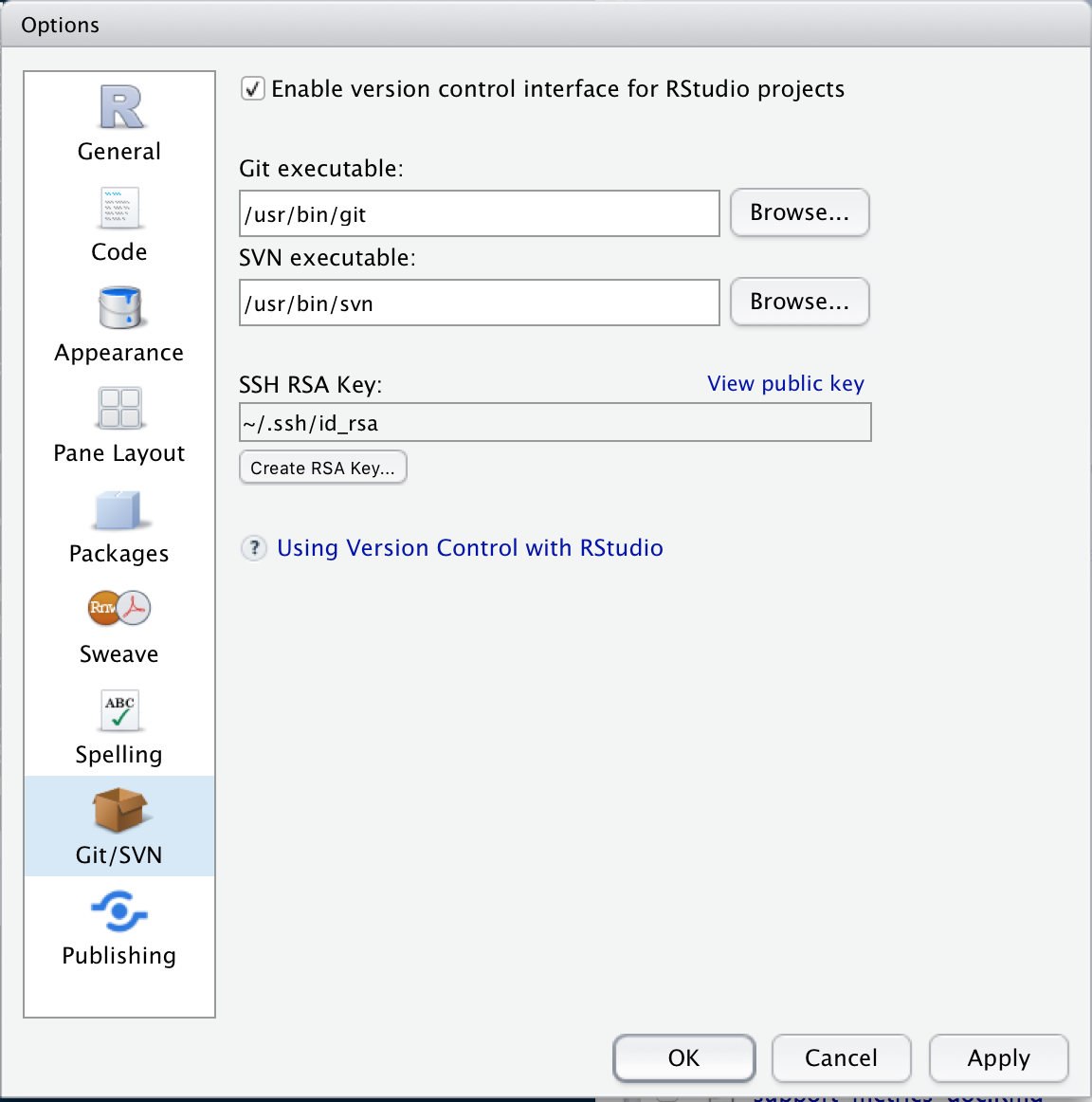
- Open Tools > Global Options and click on Git/SVN.
- Check Enable version control interface for Rstudio projects.
- Set the path for the git executable. If you don’t know where this is, click on the
Terminaltab in the bottom left pane and type:
- Windows:
where git- it’ll be something likeC:/Program Files (x86)/Git/bin/git.exe - MacOSX:
which git- it’ll be something like/usr/bin/git
- Restart Rstudio
The easiest way to start working with a project is to initialize an empty repository. I’ll walk you though the process with github, but you can also use bitbucket or gitlab if you prefer (although I’m not as familiar with these).
Head to github and if you aren’t already logged in, look for the Sign in and Sign up buttons in the top right corner. Make an account if necessary, and then sign in. On the left hand side next to Top Repositories, click New. Give your new repository a name and a description, and decide if you want it to be public or private. Check the Add a README file box, then create the repository.
Back in Rstudio,
- Open File > New Project
- Select Version Control > Git
- Grab the HTTPS URL from github (see picture below) and fill in the Repository URL box
- Set a name for your project directory - I usually make it the same as the name of the repository on github
- Choose where you want the project directory to be located
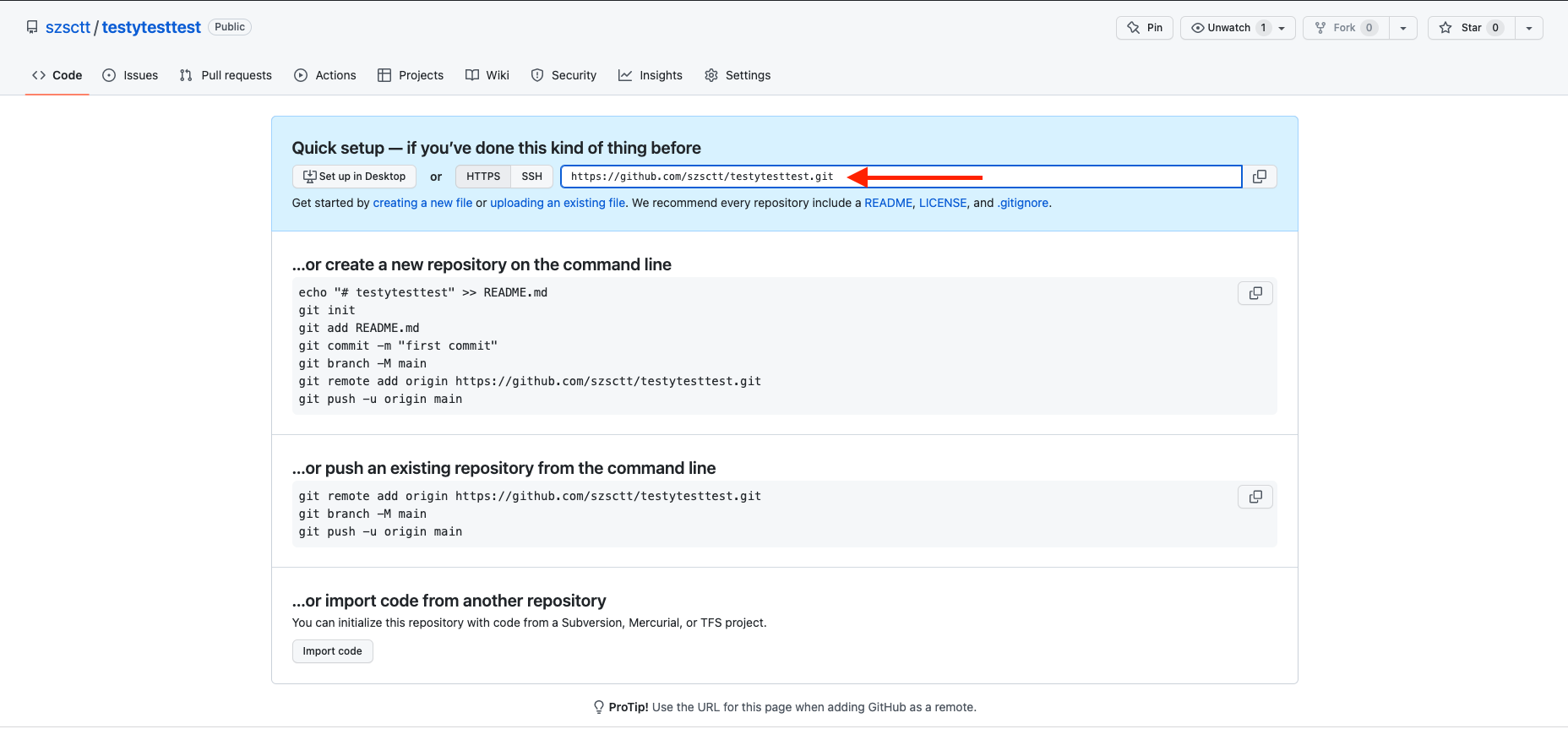
Making changes
After you’ve set up your project, you’ll probably want to add the .Rproj file to version control. A new Git tab is available in the top right pane where you can do this. You’ll see in this panel that RStudio has created an .Rproj file for you when it created the project directory, and there’ll be some ? next to the file name.
At this point, you need to know how Git thinks about your files. There are three statuses that your files can have:
- Before you have told git about any of your changes, they only exist in your working directory.
- To tell get that you’ve made some changes to your file, you need to stage it (
git add). - Tell git that you’re happy with the changed files by committing them.
You can reset the files in your repository to an earlier version using the checkout process.
Staging
So how do we stage a file? Just check the box next to the file name in the Git panel.
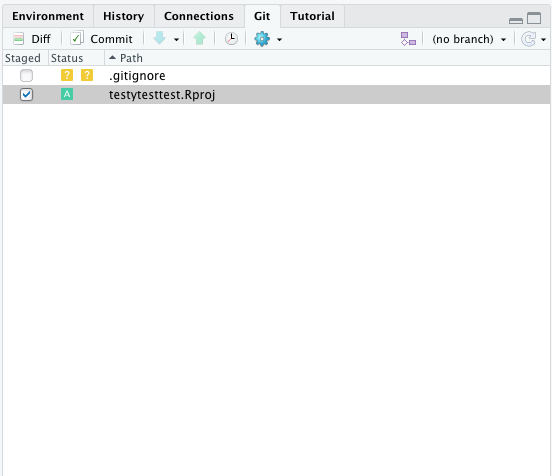
Diff
At any time, you can check what you changed relative to the latest commit by clicking on Diff.
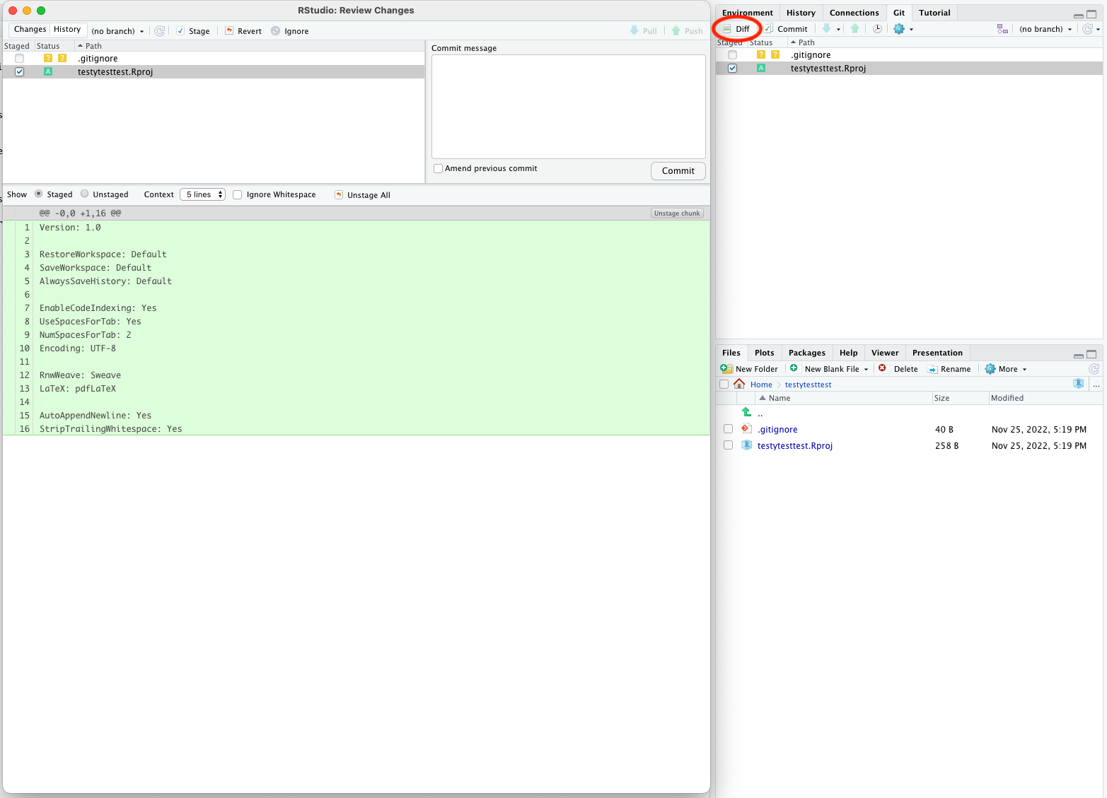
In this case, all the lines are green because we’re adding a new file.
Commit
If you’re happy with the changes you’ve made, you can commit them using the Commit button (next to Diff). You will see the same view with your changes as you did with Diff, and an additional box to add a commit message - this is required for all commits. Try to make it as informative as possible!
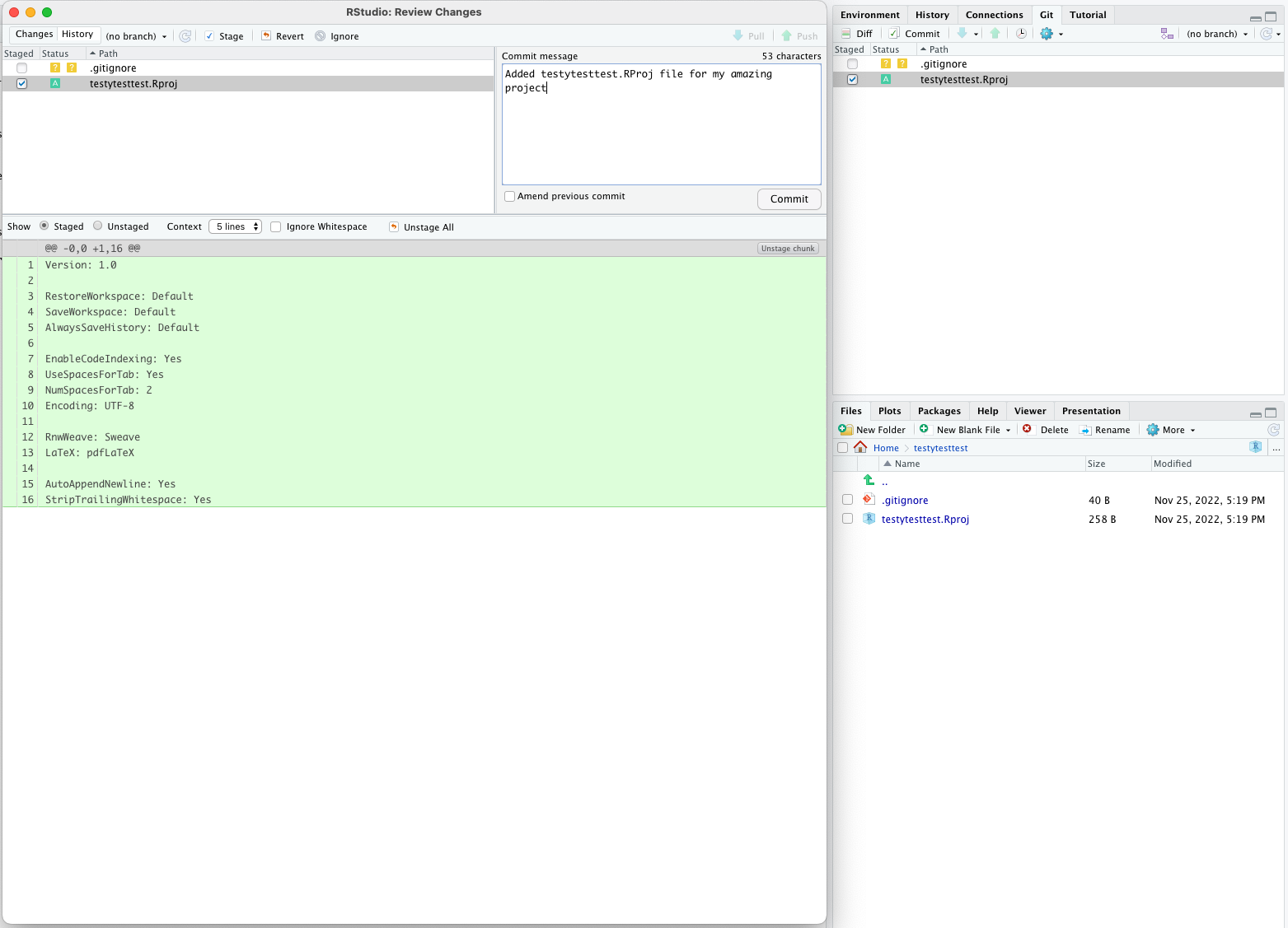 You should get a pop-up telling you the commit was successful.
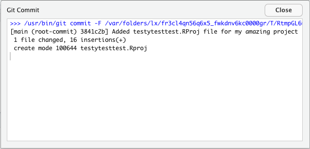
Push/pull
So far all the changes we’ve made have been to the local repository (that exists only on your computer). After you’ve made some commits, you should push the changes to your remote repository so that your collaborators can see them, and they’re backed up in the cloud. If someone else has made changes to the same branch, you might need to pull and merge any changes that are in the repository but not on your local computer first.
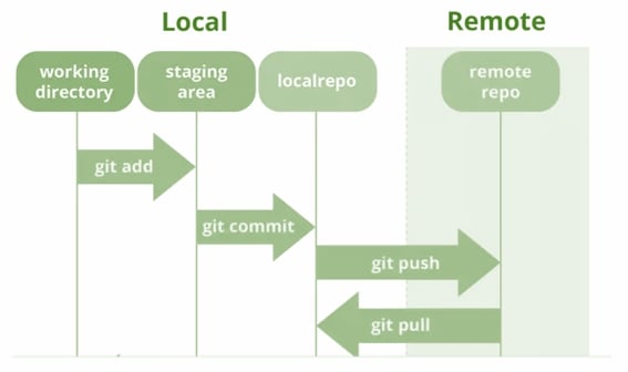
You can push and pull from the same pop-up panel you get when you click Commit, or int the Git tab in the top-right pane.
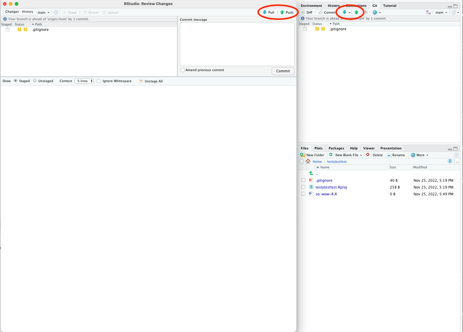
Your first push should be pretty straightforward.
Generating a token
The first time you try to push to a remote repo, you will be prompted for your password. This is somewhat misleading, because this git isn’t asking your account password, but a token that you’ll need to generate.
To generate a token, head to github, log in and click the circle icon with a down arrow next to it in the top right hand corner of your screen. Select Settings, and from the left-hand menu select Developer Settings. On the left-hand menu on the new page, select Personal Access Tokens > Tokens (classic) . On the right hand side, click Generate new token > Generate new token (classic). Fill in a name for the token in the Note box, select an Expiration period (I usually use 90 days, and I don’t recommend ‘No expiration’), and tick the repo box.
This will generate a token that you’ll only be able to see once. Save it to a password manager in case you need it again, and then use it as your password if prompted.
If there are changes in the remote repository that you don’t have in your local repository, you’ll need to pull them before you can push any changes.
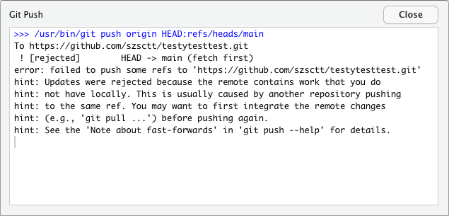
The first time you try a pull like this, you might get this message:
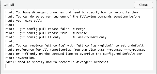
This just means that you have to open a terminal and type in one of those options. I won’t go into details about what they all mean, but I usually use git config pull.rebase false. You’ll have to open a shell from the menu with Tools > Shell (on Mac you can just use the terminal pane at the bottom left), type this command and press enter.
Try your pull again and it should then work. Your files should be updated!
Branches
I mentioned earlier that you can create branches. Their purpose is to facilitate work on the same files as your collaborators without immediate conflicts. When you are ready to integrate your changes, you can open a pull request and merge the changes.
While using branches is a fundamental part of git, I won’t go into any more detail than that now. You can read more about how branches work in the git documentation.
Command line git
So far, we’ve used git through the Rstudio terminal. However, this will only get you so far, and eventually you’ll want to do something more complicated you’ll probably need to use a shell. You can open one from the menu with Tools > Shell.
The git documentation has all the information you’ll need for using the command line, but just to get you started, you can try:
BASH
# print summary of changed, staged files
git status
# stage file
git add <file1> <file2>
# commit changes
git commit -m "My informative commit message"
# push to remote
git push
# pull changes from remote
git pullGit gotchas
There are a few things you should be aware of when working with git.
Don’t add large files
Git was designed for working with source code (text files), not binaries or large datasets. Every time you check the status of your repository with git status, it looks at all the files that you’ve committed. If you have added large files, like NGS data, large images, or compiled binaries, git has to look through those files for changes, which can really slow things down.
I tend to avoid adding any of the data that I’m working with to version control, unless it’s a very small text file or image. Github also limits the size of individual files, and the total size of each repository, so avoid hitting those limits by keeping large files separate. You can still keep them in the same directory as your code, but avoid doing git add on them.
Keep other backups
Although your code is pretty safe in the cloud, it’s good practice to keep other backups of your code elsewhere. Since your data shouldn’t be in your repository, you’ll need to think about other backups anyway. So keep your code and data backed up somewhere else, like other clouds (e.g. One Drive), CMRI shared folders and portable hard drives (but never only on a portable hard drive).
Resources
Content from Case study
Last updated on 2023-01-24 | Edit this page
Overview
Questions
- How do I analyse peptide count data in
R?
Objectives
- Demonstrate some ways of analysing NGS peptide count data
See the answers to each question for solutions.
Peptide count data
To round things out, we’ll explore some simulated peptide library data using what we’ve learned so far. Please follow along in an R markdown notebook on your own computer. The data is included in the data files you downloaded at the start of the course.
In this dataset, we’ve made an imaginary peptide insertion in the cap gene of AAV to create a plasmid library. We’ve then packaged this to create a vector library, and done a selection in some imaginary cells. We’ve therefore got data from plasmid, vector, DNA/entry and cDNA/expression libraries.
Imagine you’ve already done the counting using the counting pipeline, and now you want to explore the results.
You’ll start with four files, one for each library, each containing two columns: peptide and count. These files are called counts_plasmid.tsv, counts_vector.tsv, counts_entry.tsv, counts_expression.tsv.
The data here is simulated, so don’t interpret the results! If you want to see how I simulated the data, you can check it out on github.
Excercies
OUTPUT
── Attaching packages ─────────────────────────────────────── tidyverse 1.3.2 ──
✔ ggplot2 3.4.0 ✔ purrr 1.0.1
✔ tibble 3.1.8 ✔ dplyr 1.0.10
✔ tidyr 1.2.1 ✔ stringr 1.4.1
✔ readr 2.1.3 ✔ forcats 0.5.2
── Conflicts ────────────────────────────────────────── tidyverse_conflicts() ──
✖ dplyr::filter() masks stats::filter()
✖ dplyr::lag() masks stats::lag()R
# file paths
files <- here::here("episodes", "data", c("counts_plasmid.tsv",
"counts_entry.tsv",
"counts_expression.tsv",
"counts_vector.tsv"))
# load data
counts <- read_tsv(files, col_types = "ci", id="file")
# create extra column
counts <- counts %>%
mutate(lib = stringr::str_extract(file, "plasmid|vector|entry|expression")) %>%
select(-file)
glimpse(counts)
OUTPUT
Rows: 40,000
Columns: 3
$ peptide <chr> "KGEWPFI", "SILPAEY", "EGSLHTV", "MYNQSEE", "HYMWLTD", "WNCCNI…
$ count <int> 4, 3, 2, 1, 4, 3, 5, 7, 3, 2, 1, 2, 4, 6, 2, 5, 3, 2, 1, 6, 3,…
$ lib <chr> "plasmid", "plasmid", "plasmid", "plasmid", "plasmid", "plasmi…R
counts %>%
group_by(lib) %>%
summarise(n_pept = n_distinct(peptide),
mean_count = mean(count),
median_count = median(count),
sd_count = sd(count),
lib_size = sum(count))
OUTPUT
# A tibble: 4 × 6
lib n_pept mean_count median_count sd_count lib_size
<chr> <int> <dbl> <dbl> <dbl> <int>
1 entry 10000 3.18 2 6.18 31775
2 expression 10000 2.24 1 9.56 22367
3 plasmid 10000 3.98 3 3.00 39796
4 vector 10000 4.76 3 4.95 47553R
counts %>%
group_by(lib) %>%
slice_max(order_by=count, n=10)
OUTPUT
# A tibble: 43 × 3
# Groups: lib [4]
peptide count lib
<chr> <int> <chr>
1 DSGFDYR 173 entry
2 YYRVNEQ 139 entry
3 TKIVCQG 130 entry
4 PHGMDPM 112 entry
5 EKMPHRS 101 entry
6 PSFVTLG 87 entry
7 TQCNAIG 87 entry
8 GMEVEPY 85 entry
9 AALHTQL 83 entry
10 NCAPHKG 76 entry
# … with 33 more rowsR
counts <- counts %>%
group_by(lib) %>%
mutate(frac = count/sum(count))
glimpse(counts)
OUTPUT
Rows: 40,000
Columns: 4
Groups: lib [4]
$ peptide <chr> "KGEWPFI", "SILPAEY", "EGSLHTV", "MYNQSEE", "HYMWLTD", "WNCCNI…
$ count <int> 4, 3, 2, 1, 4, 3, 5, 7, 3, 2, 1, 2, 4, 6, 2, 5, 3, 2, 1, 6, 3,…
$ lib <chr> "plasmid", "plasmid", "plasmid", "plasmid", "plasmid", "plasmi…
$ frac <dbl> 1.005126e-04, 7.538446e-05, 5.025631e-05, 2.512815e-05, 1.0051…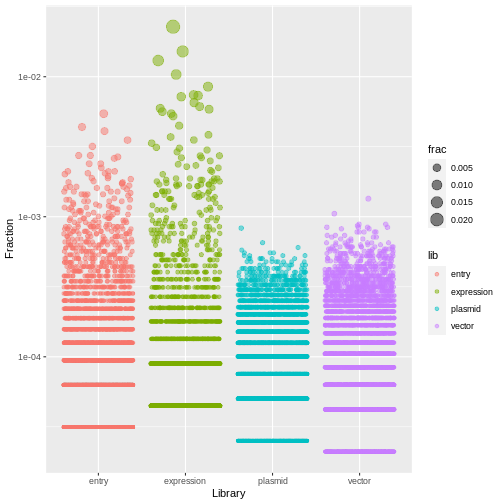
R
counts %>%
ggplot(aes(x=lib, y=frac, size=frac, color=lib)) +
geom_jitter(alpha=0.5, height=0) +
scale_y_log10() +
labs(x="Library", y="Fraction")
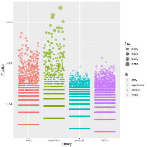
R
counts <- counts %>%
arrange(desc(frac)) %>%
group_by(lib) %>%
mutate(rank = row_number())
glimpse(counts)
OUTPUT
Rows: 40,000
Columns: 5
Groups: lib [4]
$ peptide <chr> "NKLAPNL", "DNPLDPY", "VEDTTFA", "HSCKITP", "RRRMETN", "DLGQGD…
$ count <int> 509, 339, 292, 232, 190, 166, 164, 161, 146, 137, 133, 131, 12…
$ lib <chr> "expression", "expression", "expression", "expression", "expre…
$ frac <dbl> 0.022756740, 0.015156257, 0.013054947, 0.010372424, 0.00849465…
$ rank <int> 1, 2, 3, 4, 5, 6, 7, 8, 9, 10, 11, 12, 13, 14, 1, 15, 16, 2, 3…Challenge
Make a table where there is one row for each peptide, and a column for the rank of the peptide in each library.
That is, there’s one column containing the counts for the plasmid library, one column for the counts in the vector library, and so on.
In this table, assign a unique ID (using row_number()) to each peptide, ranking by count in the expression library. That is, the peptide ranked 1 in the expression library should have ID 1, the peptide ranked 2 in the expression library should have ID 2, and so on.
Assign this new table to a variable ranked.
R
ranked <- counts %>%
select(lib, peptide, rank) %>%
pivot_wider(id_cols = "peptide", names_from="lib", values_from = "rank") %>%
arrange(expression) %>%
mutate(id = row_number())
ranked
OUTPUT
# A tibble: 10,000 × 6
peptide expression entry vector plasmid id
<chr> <int> <int> <int> <int> <int>
1 NKLAPNL 1 35 902 1807 1
2 DNPLDPY 2 80 171 396 2
3 VEDTTFA 3 92 189 301 3
4 HSCKITP 4 141 434 757 4
5 RRRMETN 5 186 541 909 5
6 DLGQGDE 6 226 766 2197 6
7 DLCLKKT 7 219 780 1930 7
8 PHGMDPM 8 4 131 266 8
9 CGHLPGF 9 288 1097 2934 9
10 HDIIKQH 10 275 1224 2754 10
# … with 9,990 more rows
R
ranked %>%
pivot_longer(expression:plasmid, names_to="lib", values_to="rank") %>%
ggplot(aes(x=lib, y=id, fill=rank)) +
geom_raster() +
scale_fill_viridis_c()+
labs(x="Library", y="Peptide ID")

Challenge
Create a new table (called expr_enrich) in which you calculate the ‘enrichment score’ of each peptide in the expression library relative to the vector library (that is, \(\frac{\text{fraction in expression library}}{\text{fraction in vector library}}\)). Add a column called rank which ranks the peptides based on this enrichment score
R
expr_enrich <- counts %>%
filter(lib %in% c("expression", "vector")) %>%
select(peptide, lib, frac) %>%
pivot_wider(names_from = lib, values_from = frac) %>%
mutate(enrichment = expression / vector) %>%
arrange(desc(enrichment)) %>%
mutate(rank = row_number())
expr_enrich
OUTPUT
# A tibble: 10,000 × 5
peptide expression vector enrichment rank
<chr> <dbl> <dbl> <dbl> <int>
1 NKLAPNL 0.0228 0.000231 98.4 1
2 DNPLDPY 0.0152 0.000442 34.3 2
3 CGHLPGF 0.00653 0.000210 31.0 3
4 HSCKITP 0.0104 0.000336 30.8 4
5 VEDTTFA 0.0131 0.000442 29.6 5
6 DLGQGDE 0.00742 0.000252 29.4 6
7 HDIIKQH 0.00613 0.000210 29.1 7
8 DLCLKKT 0.00733 0.000252 29.1 8
9 RRRMETN 0.00849 0.000294 28.9 9
10 PGTAPIT 0.00300 0.000105 28.5 10
# … with 9,990 more rowsR
vec_enrich <- counts %>%
filter(lib %in% c("plasmid", "vector")) %>%
select(peptide, lib, frac) %>%
pivot_wider(names_from = lib, values_from = frac) %>%
mutate(enrichment = vector / plasmid) %>%
arrange(desc(enrichment)) %>%
mutate(rank = row_number())
poor_packagers <- vec_enrich %>%
filter(enrichment < 1)
poor_packagers
OUTPUT
# A tibble: 5,668 × 5
peptide vector plasmid enrichment rank
<chr> <dbl> <dbl> <dbl> <int>
1 MLCGFYC 0.0000421 0.0000503 0.837 4333
2 VGCWDVE 0.0000421 0.0000503 0.837 4334
3 KWVRLEQ 0.0000421 0.0000503 0.837 4335
4 YMRPDEV 0.0000421 0.0000503 0.837 4336
5 SFCASIY 0.0000421 0.0000503 0.837 4337
6 CPLGTGF 0.0000421 0.0000503 0.837 4338
7 PYNDHMH 0.0000421 0.0000503 0.837 4339
8 NFNNSQI 0.0000421 0.0000503 0.837 4340
9 ERVRIFK 0.0000421 0.0000503 0.837 4341
10 RFWAGYK 0.0000421 0.0000503 0.837 4342
# … with 5,658 more rowsR
good_peptides <- expr_enrich %>%
filter(!peptide %in% poor_packagers$peptide) %>%
slice_max(order_by=enrichment, n=500)
good_peptides
OUTPUT
# A tibble: 541 × 5
peptide expression vector enrichment rank
<chr> <dbl> <dbl> <dbl> <int>
1 NKLAPNL 0.0228 0.000231 98.4 1
2 DNPLDPY 0.0152 0.000442 34.3 2
3 CGHLPGF 0.00653 0.000210 31.0 3
4 HSCKITP 0.0104 0.000336 30.8 4
5 VEDTTFA 0.0131 0.000442 29.6 5
6 DLGQGDE 0.00742 0.000252 29.4 6
7 HDIIKQH 0.00613 0.000210 29.1 7
8 DLCLKKT 0.00733 0.000252 29.1 8
9 RRRMETN 0.00849 0.000294 28.9 9
10 PGTAPIT 0.00300 0.000105 28.5 10
# … with 531 more rowsR
write_tsv(good_peptides, file=here::here("good_peptides.tsv"))