Data visualization
Last updated on 2023-01-24 | Edit this page
Overview
Questions
- How do you visualize data using
ggplot2? - How can you combine individual plots?
Objectives
- Understand how to use aesthetics to create plots
- Use geoms to create visualizations
- Know how to facet to split by grouping variables
- Modify visual elements using themes
- Combine plots using
patchwork
Do I need to do this lesson?
If you’ve already used ggplot2 for making plots, chances are you already know most of the material covered.
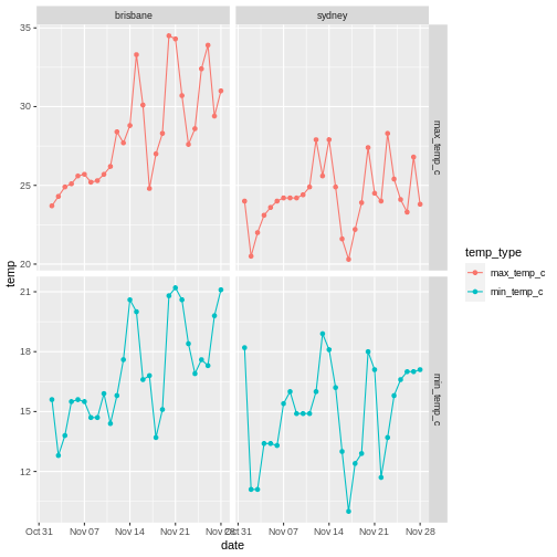
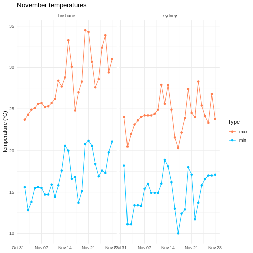
Load the weather data we used in the previous lesson, and then make a plot (with points and lines) of the temperature on each day. Show both the minimum and maximum temperature on the same axes (using different colours for each), and facet on city. Remove the x axis title, change the colours to something other than the default, set the y axis label and title manually, and use a custom theme.
R
# pivot longer
weather %>%
  select(city, date, max_temp_c, min_temp_c) %>%
  pivot_longer(contains("temp"), names_to = "temp_type", values_to="temp") %>%
  # compare minimum and maximum temps in two cities
  ggplot(aes(x=date, y=temp, colour=temp_type)) +
  geom_point() +
  geom_line() +
  # facet on city
  facet_wrap(vars(city)) +
  # add label
  labs(y="Temperature (°C)", title = "November temperatures") +
  # change colour scale
  scale_colour_discrete(type=c("coral", "deepskyblue"), name = "Type", labels=c("max", "min")) +
  # custom theme
  theme_minimal() +
  # remove x axis label
  theme(axis.title.x = element_blank())
WARNING
Warning: Removed 2 rows containing missing values (`geom_point()`).WARNING
Warning: Removed 1 row containing missing values (`geom_line()`).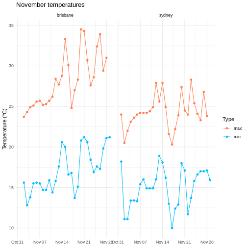
After all of that data manipulation perhaps you, like me, are a bit sick of looking at tables. Using visualizations is essential for communicating your results, because summary statistics can be misleading, and because large datasets don’t display well in tables.
I won’t go into too much theory here about the best way of visually representing different kinds of datasets, but I’d recommend everyone take a look at Claus Wilke’s excellent book ‘Fundamentals of data visualization’.
One popular framework for generating plots is the ‘grammar of graphics’ approach. The idea here is to build up a graphic from multiple layers of components, including:
- data and aesthetic mappings
- geometric objects
- scales
- facets
In this lesson we explore how to use these elements to make informative and visually appealing graphs.
We’ll again use the weather data for Brisbane and Sydney, so let’s load this dataset.
R
# load tidyverse
library(tidyverse)

# data files - readr can also read data from the internet
data_dir <- "https://raw.githubusercontent.com/szsctt/cmri_R_workshop/main/episodes/data/"
data_files <- file.path(data_dir, c("weather_sydney.csv", "weather_brisbane.csv"))

# column types
col_types <- list(
  date = col_date(format="%Y-%m-%d"),
  min_temp_c = col_double(),
  max_temp_c = col_double(),
  rainfall_mm = col_double(),
  evaporation_mm = col_double(),
  sunshine_hours = col_double(),
  dir_max_wind_gust = col_character(),
  speed_max_wind_gust_kph = col_double(),
  time_max_wind_gust = col_time(),
  temp_9am_c = col_double(),
  rel_humid_9am_pc = col_integer(),
  cloud_amount_9am_oktas = col_double(),
  wind_direction_9am = col_character(),
  wind_speed_9am_kph = col_double(),
  MSL_pressure_9am_hPa = col_double(),
  temp_3pm_c = col_double(),
  rel_humid_3pm_pc = col_double(),
  cloud_amount_3pm_oktas = col_double(),
  wind_direction_3pm = col_character(),
  wind_speed_3pm_kph = col_double(),
  MSL_pressure_3pm_hPa = col_double()
)

# read in data
weather <- readr::read_csv(data_files, skip=10,
                           col_types=col_types, col_names = names(col_types),
                           id="file") %>%
  mutate(city = stringr::str_extract(file, "brisbane|sydney")) %>%
  select(-file)

glimpse(weather)
OUTPUT
Rows: 57
Columns: 22
$ date                    <date> 2022-11-01, 2022-11-02, 2022-11-03, 2022-11-0…
$ min_temp_c              <dbl> 18.2, 11.1, 11.1, 13.4, 13.4, 13.3, 15.4, 16.0…
$ max_temp_c              <dbl> 24.0, 20.5, 22.0, 23.1, 23.6, 24.0, 24.2, 24.2…
$ rainfall_mm             <dbl> 0.2, 0.6, 0.0, 1.0, 0.2, 0.0, 0.0, 1.2, 0.2, 0…
$ evaporation_mm          <dbl> 4.6, 13.0, 7.8, 6.0, 4.4, 4.0, 9.8, 8.0, 8.0, …
$ sunshine_hours          <dbl> 9.5, 12.8, 8.9, 5.7, 11.8, 12.1, 12.3, 11.0, 1…
$ dir_max_wind_gust       <chr> "WNW", "W", "W", "SSE", "ENE", "ENE", "NE", "E…
$ speed_max_wind_gust_kph <dbl> 69, 67, 56, 26, 37, 39, 41, 35, 33, 43, 39, 26…
$ time_max_wind_gust      <time> 06:50:00, 12:54:00, 07:41:00, 23:24:00, 15:20…
$ temp_9am_c              <dbl> 19.2, 14.0, 15.9, 15.8, 17.7, 19.0, 20.4, 21.1…
$ rel_humid_9am_pc        <int> 45, 44, 50, 82, 76, 75, 80, 67, 77, 76, 60, 77…
$ cloud_amount_9am_oktas  <dbl> 2, 1, 1, 6, 3, 1, 5, 4, 7, 7, 4, 1, 8, 1, 2, 2…
$ wind_direction_9am      <chr> "WNW", "W", "WSW", "E", "WSW", "ESE", "E", "EN…
$ wind_speed_9am_kph      <dbl> 35, 31, 31, 6, 4, 6, 15, 15, 6, 7, 7, 4, 2, 11…
$ MSL_pressure_9am_hPa    <dbl> 992.9, 1003.2, 1014.7, 1026.9, 1029.7, 1026.6,…
$ temp_3pm_c              <dbl> 23.1, 19.7, 20.0, 22.8, 22.2, 23.1, 23.4, 24.0…
$ rel_humid_3pm_pc        <dbl> 30, 29, 42, 55, 60, 59, 58, 59, 46, 55, 56, 51…
$ cloud_amount_3pm_oktas  <dbl> 2, 1, 7, 5, 2, 1, 2, 2, 1, 1, 7, 3, 7, 2, 7, 7…
$ wind_direction_3pm      <chr> "WNW", "SW", "SE", "ENE", "ENE", "E", "ENE", "…
$ wind_speed_3pm_kph      <dbl> 31, 22, 20, 17, 24, 26, 24, 24, 26, 24, 17, 19…
$ MSL_pressure_3pm_hPa    <dbl> 992.0, 1005.9, 1016.6, 1026.8, 1026.9, 1023.3,…
$ city                    <chr> "sydney", "sydney", "sydney", "sydney", "sydne…
Data and aesthetic mappings
Any graph has to start with a dataset - and in the case of ggplot, this has to be a data frame (or tibble). We also start by specifying the aesthetic using aes(), which tells ggplot which columns should go on the x and y axes.
Let’s say that we want to plot the daily maximum temperature over the month for both cities. You can pipe the data into ggplot().
R
weather %>%
  ggplot(aes(x=date, y=max_temp_c))
But we just get a blank graph! We have to tell ggplot how we want the data to be plotted (lines, points, violins, density, etc).
geoms
We use geoms to tell ggplot how we want to plot the data. In this case, we can use points:
R
weather %>%
  ggplot(aes(x=date, y=max_temp_c)) +
  geom_point()
WARNING
Warning: Removed 2 rows containing missing values (`geom_point()`).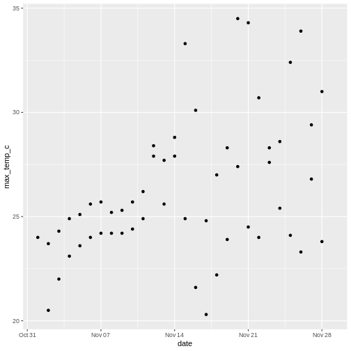
Note that we use a + to add layers to a ggplot, not the pipe (%>%). The ggplot2 package was developed before the magrittr package that contains %>%, so it uses the addition operator instead.
ggplot doesn’t know how to plot missing values, so it removes those rows and warns you that it’s doing so. Those warnings about missing values are going to get annoying, so I use a tidyr function to remove rows with NA in any column.
R
weather <- weather %>%
  # everything() means do this on all columns
  drop_na(everything())
There are a large number of geoms for displaying data in different ways - we will explore some here, but you can find more in the ggplot documentation.
Geoms and aesthetics
There are also other aesthetics you can specify, including colour (e.g. the colour of lines), fill (e.g. the colour used to fill a boxplot), size (e.g. the size of a point) and shape (e.g. the shape of a point).
Not all aesthetics are used by all geoms. In the documentation for each geom there will always be a section that tells you which aesthetics a geom understands. For example, the reference page for geom_point() tells us that this geom understands:
- x
- y
- alpha (transparency)
- colour
- fill
- group
- shape
- size
- stroke
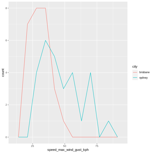
R
weather %>%
  ggplot(aes(x=speed_max_wind_gust_kph, colour=city)) +
  geom_freqpoly(bins=10)
Layering geoms
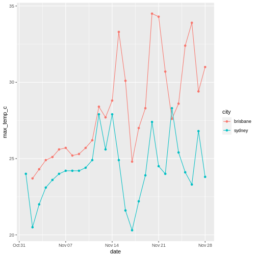
Our initial graph looks OK, but we might want to know which temperature belongs to which city. Let’s add some colour to the aesthetic so we can compare the temperatures, as well as some lines to make it easier to see the change in temperature over time.
R
# plot temp over time with lines and points
weather %>%
  ggplot(aes(x=date, y=max_temp_c, colour=city)) +
  geom_point() +
  geom_line()
If we didn’t care about the time aspect and just wanted to compare the distribution of temperatures instead, we could plot city on the x axis, temperature on the y axis. To avoid points being on top of each other when the temperature is the same , I use geom_jitter() instead of geom_point(), which adds random jitter to each point before plotting.
R
# show differences between temps in Brisbane and Sydney
weather %>%
  ggplot(aes(x=city, y=max_temp_c, colour=city)) +
  geom_violin() +
  geom_jitter(height=0, width=0.1)
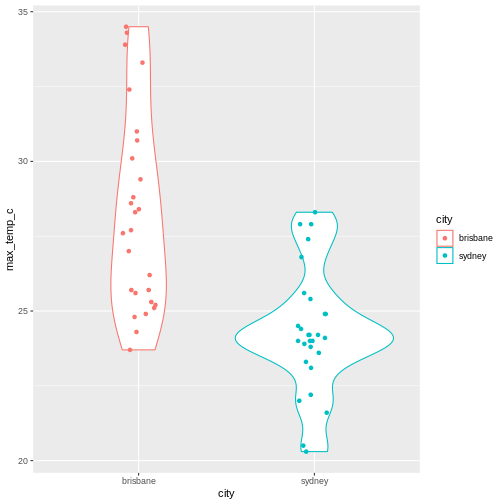
Notice that the geoms can also take arguments - for example, I’ve used geom_jitter(height=0, width=0.1 to control the amount of jitter added to each point (none in the y direction, a little bit in the x direction).
R
weather %>%
  ggplot(aes(x = max_temp_c, colour=city)) +
  geom_density() +
  geom_rug()
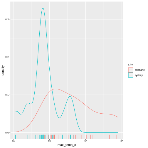
Summary statistics
Also notice that ggplot automatically calculates the density for us when it plots the violins. There are a number of other statistical transformations that ggplot can calculate for us. For example, we can plot the proportion of wind directions at 9am for each city:
R
# count number of observation of each direction in each city
weather %>%
  group_by(city, wind_direction_9am) %>%
  summarise(count = n()) %>%
  # make plot
  ggplot(aes(x=city, y = count, fill=wind_direction_9am)) +
  geom_col(position="fill")
OUTPUT
`summarise()` has grouped output by 'city'. You can override using the
`.groups` argument.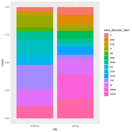
Notice that although we summarized the count of observations of each direction (i.e. number of days), ggplot plots the proportion of observations.
R
# count number of observation of each direction in each city
weather %>%
  group_by(city, wind_direction_9am) %>%
  summarise(count = n()) %>%
  # make plot
  ggplot(aes(x=city, y = count, fill=wind_direction_9am)) +
  geom_col()
OUTPUT
`summarise()` has grouped output by 'city'. You can override using the
`.groups` argument.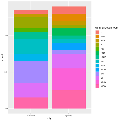
Now we get a count rather than a proportion - the y axis has a different scale and the bars are different heights.
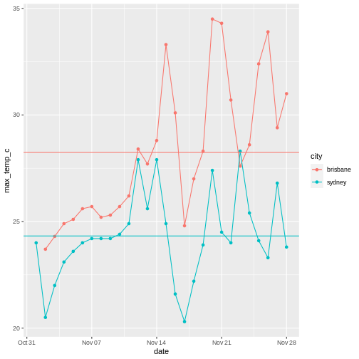
Using multiple datasets
You can also use independent data and aesthetics for different geoms. For example, returning to our plot of temperature over time, we could add a horizontal line for each city to show the mean temperature.
R
# get mean temp for each city
mean_temps <- weather %>%
  group_by(city) %>%
  summarise(mean_temp = mean(max_temp_c, na.rm=TRUE))

# make plot
weather %>%
  ggplot(aes(x=date, y=max_temp_c, colour=city)) +
  # data and aesthetics are inherited from ggplot call
  geom_point() +
  geom_line() +
  # add horizontal line with different data and aesthetic
  geom_hline(data = mean_temps, mapping = aes(yintercept=mean_temp, colour=city))
Non-gglot geoms
With the popularity of ggplot2, there are a number of other packages that provide geoms that you can use in your ggplot.
I won’t go into any detail about these, but a few that I’ve used include ggforce::geom_sina(), ggbeeswarm::geom_beeswarm() and ggwordcloud::geom_wordcloud(). If you want to make a particular kind of graph, somebody has probably made a geom for it.
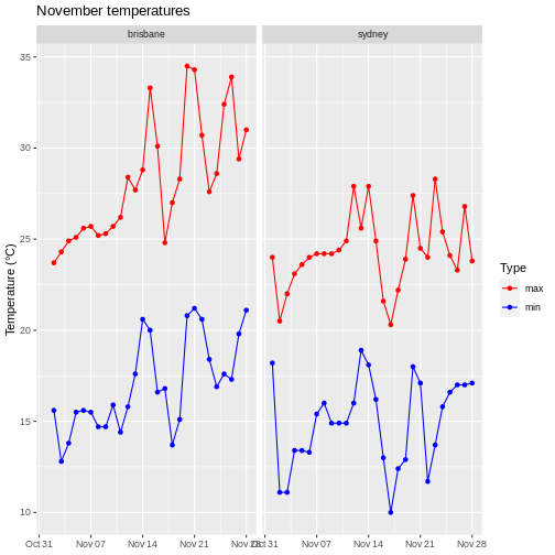
Facets
Let’ say we want to compare the minimum and maximum temperatures for the two cities over time. We could make a plot with time on the x axis and temperature on the y axis, where the shape of the point indicates the city and the colour indicates whether the temperature was minimum or maximum.
However, currently our temperature data is spread out over two columns: mean_temp_c and max_temp_c, but in ggplot we need to assign the colour using colour=temp_type. So in order to make this plot, we need to rearrange the data a little using dplyr functions.
R
# pivot longer to facilitate plotting
weather %>%
  select(city, date, max_temp_c, min_temp_c) %>%
  pivot_longer(contains("temp"), names_to = "temp_type", values_to="temp") %>%
  # compare minimum and maximum temps in two cities
  ggplot(aes(x=date, y=temp, shape=city, colour=temp_type)) +
  geom_point() +
  geom_line()
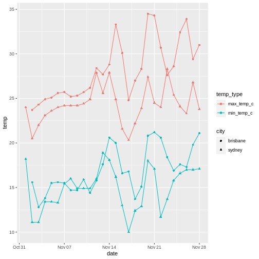
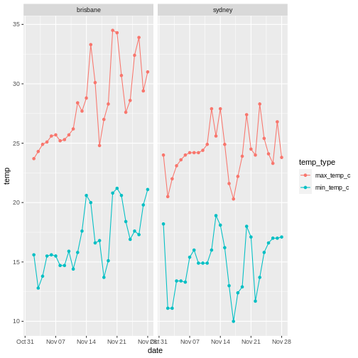
This works, but it’s a little difficult to tell the circles and the triangles apart. Instead, we can use facets to plot the data from each city side by side.
R
# pivot longer
weather %>%
  select(city, date, max_temp_c, min_temp_c) %>%
  pivot_longer(contains("temp"), names_to = "temp_type", values_to="temp") %>%
  # compare minimum and maximum temps in two cities
  ggplot(aes(x=date, y=temp, colour=temp_type)) +
  geom_point() +
  geom_line() +
  # facet on city
  facet_wrap(vars(city))
You can facet on multiple variables, for example:
R
# pivot longer
weather %>%
  select(city, date, max_temp_c, min_temp_c) %>%
  pivot_longer(contains("temp"), names_to = "temp_type", values_to="temp") %>%
  # compare minimum and maximum temps in two cities
  ggplot(aes(x=date, y=temp, colour=temp_type)) +
  geom_point() +
  geom_line() +
  # facet on city
  facet_grid(cols=vars(city), rows=vars(temp_type), scales="free_y")
The scales="free_y" argument allows the y-axis scales on each row to be different.
In this case I think the comparison is clearer without the extra faceting variable. Don’t go too crazy with your faceting, but instead think about what story you are trying to tell.
R
weather %>%
  ggplot(aes(x=speed_max_wind_gust_kph, colour=dir_max_wind_gust)) +
  geom_density() +
  facet_grid(rows = vars(city), scales="free")
WARNING
Warning: Groups with fewer than two data points have been dropped.
Groups with fewer than two data points have been dropped.
Groups with fewer than two data points have been dropped.
Groups with fewer than two data points have been dropped.
Groups with fewer than two data points have been dropped.
Groups with fewer than two data points have been dropped.
Groups with fewer than two data points have been dropped.
Groups with fewer than two data points have been dropped.
Groups with fewer than two data points have been dropped.
Groups with fewer than two data points have been dropped.
WARNING
Warning in max(ids, na.rm = TRUE): no non-missing arguments to max; returning
-Inf

Warning in max(ids, na.rm = TRUE): no non-missing arguments to max; returning
-Inf

Warning in max(ids, na.rm = TRUE): no non-missing arguments to max; returning
-Inf

Warning in max(ids, na.rm = TRUE): no non-missing arguments to max; returning
-Inf

Warning in max(ids, na.rm = TRUE): no non-missing arguments to max; returning
-Inf

Warning in max(ids, na.rm = TRUE): no non-missing arguments to max; returning
-Inf

Warning in max(ids, na.rm = TRUE): no non-missing arguments to max; returning
-Inf

Warning in max(ids, na.rm = TRUE): no non-missing arguments to max; returning
-Inf

Warning in max(ids, na.rm = TRUE): no non-missing arguments to max; returning
-Inf

Warning in max(ids, na.rm = TRUE): no non-missing arguments to max; returning
-Inf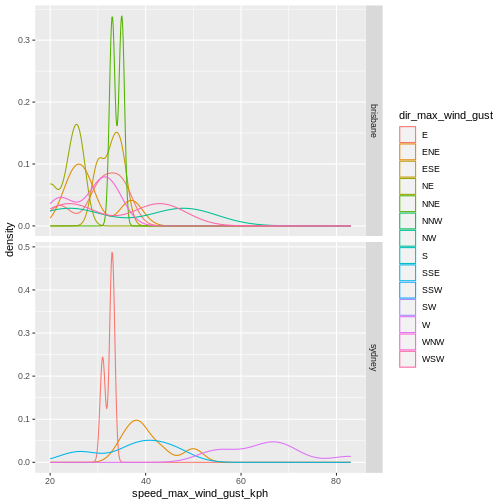
This is not a particularly informative graphs because there are so few points for each direction.
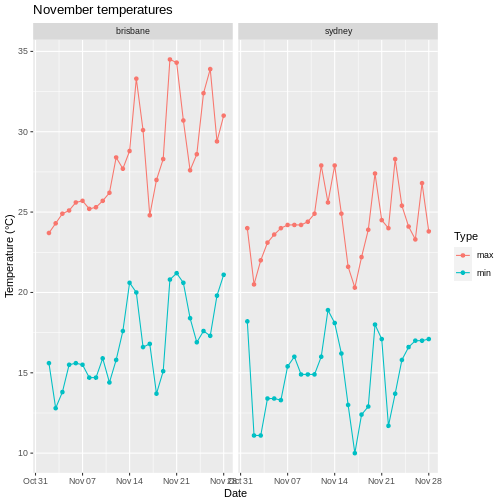
Visual customization: Labels, themes and scales
There are a number of other customization that you can use to display your data more clearly.
Axes labels
It’s important to always label your x and y axes - ggplot does this for you using the column names, but usually the column names are short for ease of coding but you want your labels to be more informative/pretty.
Use the labs() function to add labels, and scale_colour_discrete() to change the title and label for the legend.
R
# pivot longer
weather %>%
  select(city, date, max_temp_c, min_temp_c) %>%
  pivot_longer(contains("temp"), names_to = "temp_type", values_to="temp") %>%
  # compare minimum and maximum temps in two cities
  ggplot(aes(x=date, y=temp, colour=temp_type)) +
  geom_point() +
  geom_line() +
  # facet on city
  facet_wrap(vars(city)) +
  # add label
  labs(x="Date", y="Temperature (°C)", title = "November temperatures") +
  # change legend
  scale_colour_discrete(name = "Type", labels=c("max", "min"))
Note that when changing the legend, you have to match the function to the aesthetic. So scale_colour_disrete() acts on a discrete colour scale, scale_colour_continuous() acts on a continuous colour scale, scale_fill_discrete() acts on a discrete fill scale, etc.
If you’re trying to change a legend but it doesn’t seem to be working, check that you used the correct function for your data type and aesthetic!
Scales
We used scale_colour_disrete() to change the labels in the legend earlier, but there are a number of scale functions in ggplot2 that can be used to change many other aspects of graphs.
Colour scales
If you are unhappy with the default colour scale that ggplot provides, you can change it using an appropriate scaling function - for example, scale_colour_discrete() for discrete colour scales, scale_fill_continuous for continuous fill scales, etc.
R
# pivot longer
weather %>%
  select(city, date, max_temp_c, min_temp_c) %>%
  pivot_longer(contains("temp"), names_to = "temp_type", values_to="temp") %>%
  # compare minimum and maximum temps in two cities
  ggplot(aes(x=date, y=temp, colour=temp_type)) +
  geom_point() +
  geom_line() +
  # facet on city
  facet_wrap(vars(city)) +
  # add label
  labs(x="Date", y="Temperature (°C)", title = "November temperatures") +
  # change colour scale
  scale_colour_discrete(type=c("red", "blue"), name = "Type", labels=c("max", "min"))
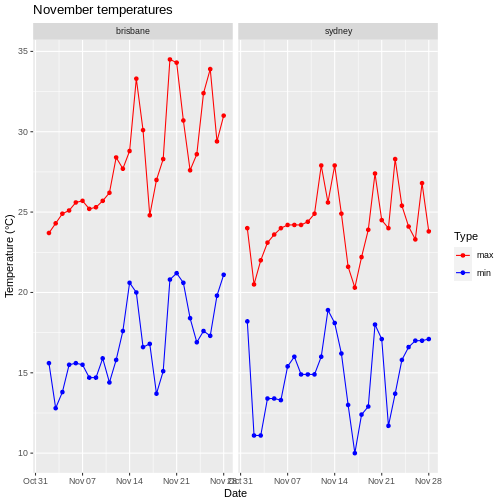
Specifying colors
There are a number of different ways you can specify colours to use. One is to use colour names, as above, although this requires you to know what the allowed colour names are. I tend to use this list of colour names for R.
Another is to use a package to generate colour names for you. For example, I tend to use virids for continuous scales because it’s colourblind-friendly. Another favourite is wesanderson, which makes palettes from Wes Anderson movies.
Finally, you can also use RGB hexidecimal values to specify colours (as a string, e.g. ‘#52934D’). There are several websites you can use to create colours and find their codes, for example htmlcolorcodes.com.
When choosing colors, it’s worth thinking about how colour blind people might see your plot. There are lots of resources on the internet about colourblind-friendly palettes, and you can upload your plot to coblis to see how it might appear to people with various kinds of colorblindness.
Applying logarithmic scales
Let’s say we now have exponentially distributed data. None of our weather data really is, so let’s simulate some by drawing from two different exponential distributions with different rates.
R
exp_data <- tibble(
  # two groups
  group = c(rep("a", 50),
            rep("b", 50)),
  # rexp samples from exponential distribution
  freq = c(rexp(n=50, rate=500),
            rexp(n=50, rate=10))
)

# compare freq between groups
exp_data %>%
  ggplot(aes(x=group, y=freq)) +
  geom_violin() +
  geom_jitter(height = 0, width=0.1)
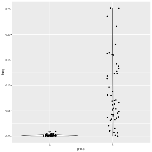
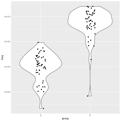
This plot isn’t so nice because the two groups are on different scales. Changing the scale on your plot to logarithmic is easy with ggplot. Just add scale_x_log10(), scale_y_log10(), etc:
R
# compare freq between groups on log scale
exp_data %>%
  ggplot(aes(x=group, y=freq)) +
  geom_violin() +
  geom_jitter(height = 0, width=0.1) +
  scale_y_log10()
Themes
ggplot also allows you to customize the appearance of the plot in other ways. Getting back to our weather example, if you wanted to remove the x axis labels because you decided that it’s already clear what is on that axis, you can do that with theme().
R
# pivot longer
weather %>%
  select(city, date, max_temp_c, min_temp_c) %>%
  pivot_longer(contains("temp"), names_to = "temp_type", values_to="temp") %>%
  # plot lines and points
  ggplot(aes(x=date, y=temp, colour=temp_type)) +
  geom_point() +
  geom_line() +
  # facet on city
  facet_wrap(vars(city)) +
  # add label
  labs(x="Date", y="Temperature (°C)", title = "November temperatures") +
  # change colour scale
  scale_colour_discrete(type=c("red", "blue"), name = "Type", labels=c("max", "min")) +
  # remove x axis label
  theme(axis.title.x = element_blank())
There are many aspects of the plot you can customize this way: check the ggplot2 documentation for more information.
You can also change many aspects of the plot at once with pre-configured themes, for example theme_light().
R
# pivot longer
weather %>%
  select(city, date, max_temp_c, min_temp_c) %>%
  pivot_longer(contains("temp"), names_to = "temp_type", values_to="temp") %>%
  # plot lines and points
  ggplot(aes(x=date, y=temp, colour=temp_type)) +
  geom_point() +
  geom_line() +
  # facet on city
  facet_wrap(vars(city)) +
  # add label
  labs(x="Date", y="Temperature (°C)", title = "November temperatures") +
  # change colour scale
  scale_colour_discrete(type=c("red", "blue"), name = "Type", labels=c("max", "min")) +
  # change to theme classic
  theme_light() +
  # remove x axis label
  theme(axis.title.x = element_blank())
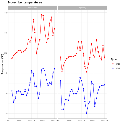
Note that we have to do this before we remove the x axis label, because in theme_light(), the axis.title.x parameter is set to something other than element_blank(), so this would overwrite our call to theme().
You can find out more about the other available themes in the ggplot2 documentation.
This is open-ended, but one solution is:
R
# pivot longer
weather %>%
  select(city, date, max_temp_c, min_temp_c) %>%
  pivot_longer(contains("temp"), names_to = "temp_type", values_to="temp") %>%
  # compare minimum and maximum temps in two cities
  ggplot(aes(x=date, y=temp, colour=temp_type)) +
  geom_point() +
  geom_line() +
  # facet on city
  facet_wrap(vars(city)) +
  # add label
  labs(x="Date", y="Temperature (°C)", title = "November temperatures") +
  # change colour scale
  scale_colour_discrete(type=c("coral", "deepskyblue"), name = "Type", labels=c("max", "min")) +
  # add minimal theme
  theme_minimal() +
  # remove x axis label
  theme(axis.title.x = element_blank())
Saving plots
Saving plots with ggplot is easy - just use ggsave(). This will either save the last plot you generated, or you can assign the plot to a variable and use that to tell the function while plot to save.
It works with a variety of formats - I usually use .pdf as a vector format (e.g. for publications) and .png as a raster format (e.g. for slides). The function will infer the format you want from the file name you provide. You can also specify the width and height of the output file (you’ll probably want units="cm").
R
# assign the result to variable p
 p <- weather %>%
  # pivot longer
  select(city, date, max_temp_c, min_temp_c) %>%
  pivot_longer(contains("temp"), names_to = "temp_type", values_to="temp") %>%
  # plot lines and points
  ggplot(aes(x=date, y=temp, colour=temp_type)) +
  geom_point() +
  geom_line() +
  # facet on city
  facet_wrap(vars(city)) +
  # add label
  labs(x="Date", y="Temperature (°C)", title = "November temperatures") +
  # change colour scale
  scale_colour_discrete(type=c("red", "blue"), name = "Type", labels=c("max", "min")) +
  # change to theme classic
  theme_light() +
  # remove x axis label
  theme(axis.title.x = element_blank())

ggsave(here::here("my_great_plot.png"), plot=p, height=10, width=17, units="cm")
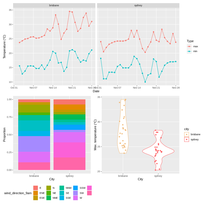
Combining plots with patchwork
Making individual plots is well and good, but sometime it’s useful to combine them together to make a figure with multiple panels. Although it’s possible to do this with Illustrator, doing your whole figure generation process in R (or another language) will allow you to easily reproduce your figures (for example, when adding new data or for visual tweaks). To quote Claus Wilke
I think figures should be autogenerated as part of the data analysis pipeline (which should also be automated), and they should come out of the pipeline ready to be sent to the printer, no manual post-processing needed. I see a lot of trainees autogenerate rough drafts of their figures, which they then import into Illustrator for sprucing up. There are several reasons why this is a bad idea. First, the moment you manually edit a figure, your final figure becomes irreproducible. A third party cannot generate the exact same figure you did. While this may not matter much if all you did was change the font of the axis labels, the lines are blurry, and it’s easy to cross over into territory where things are less clear cut. As an example, let’s say you want to manually replace cryptic labels with more readable ones. A third party may not be able to verify that the label replacement was appropriate. Second, if you add a lot of manual post-processing to your figure-preparation pipeline then you will be more reluctant to make any changes or redo your work. Thus, you may ignore reasonable requests for change made by collaborators or colleagues, or you may be tempted to re-use an old figure even though you actually regenerated all the data. These are not made-up examples. I’ve seen all of them play out with real people and real papers. Third, you may yourself forget what exactly you did to prepare a given figure, or you may not be able to generate a future figure on new data that exactly visually matches your earlier figure.
To combine plots together, I often use the patchwork package (although there are also good alternatives, such as cowplot for the aforementioned Claus Wilke). In this package, we can combine plots using the + and / operators.
R
# import patchwork library
library(patchwork)

# plot max and min temperatures
p1 <- weather %>%
  select(city, date, max_temp_c, min_temp_c) %>%
  pivot_longer(contains("temp"), names_to = "temp_type", values_to="temp") %>%
  # compare minimum and maximum temps in two cities
  ggplot(aes(x=date, y=temp, colour=temp_type)) +
  geom_point() +
  geom_line() +
  # facet on city
  facet_wrap(vars(city)) +
  # add label
  labs(x="Date", y="Temperature (°C)") +
  # change colour scale
  scale_colour_discrete(name = "Type", labels=c("max", "min"))

# plot wind directions
p2 <- weather %>%
  # count number of observation of each direction in each city
  group_by(city, wind_direction_9am) %>%
  summarise(count = n(), .groups="drop") %>%
  # make plot
  ggplot(aes(x=city, y = count, fill=wind_direction_9am)) +
  geom_bar(position="fill", stat="identity") +
  # move legend to bottom
  theme(legend.position = "bottom") +
  # axis labels
  labs(x = "City", y="Proportion")

# plot temperatures
p3 <- weather %>%
  #  compare max temps between cities
  ggplot(aes(x=city, y=max_temp_c, colour=city)) +
  geom_violin() +
  geom_jitter(height=0, width=0.1) +
  # change colours to avoid confusion with p1
  scale_colour_discrete(type=wesanderson::wes_palette("GrandBudapest1", n=2)) +
  # axis labels
  labs(x = "City", y="Max. temperature (°C)")

combined_plot <- p1 / (p2 + p3)
combined_plot
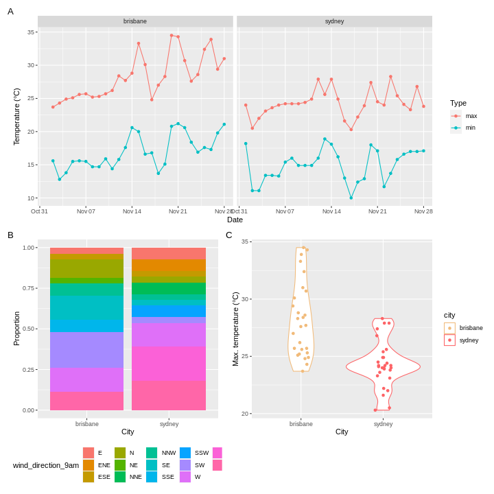
Patchwork also allows you to add annotation to your combined plot, for example labels ‘A’, ‘B’, ‘C’.
R
combined_plot +
  plot_annotation(tag_levels = 'A')
There are many more features of patchwork which I will leave you to explore - the documentation is linked in the resources section. For example, patchwork will combine things other than ggplots if you can convert them to a form that it understands using ggplotify::as_ggplot().
Resources
- ggplot2 cheatsheet
- Fundamentals of data vizualization by Claus Wilke
- ggplot documentation
- patchwork documentation
- wesanderson documentation
- ggplotify documentation
Keypoints
- Use
ggplot()to create a plot and specify the default dataset and aesthetic (aes()) - Use
geomsto specify how the data should be displayed - Use
facet_wrap()andfacet_grid()to create facets - Use
scalesto change the scales in your plot - Use
theme()and theme presets to modify plot appearance - Use
patchworkorcowplotto combine plots into one figure